
CodeWF.AvaloniaControls 新增了 Guide 引导控件,用来在 Avalonia 桌面应用里做新手引导、功能漫游和局部提示。
它参考了 AtomUI 的 Tour 思路,但落地重点更偏桌面软件:菜单、二级菜单、弹层、TabItem、目标延迟出现、窗口尺寸变化,这些都要能稳定定位。
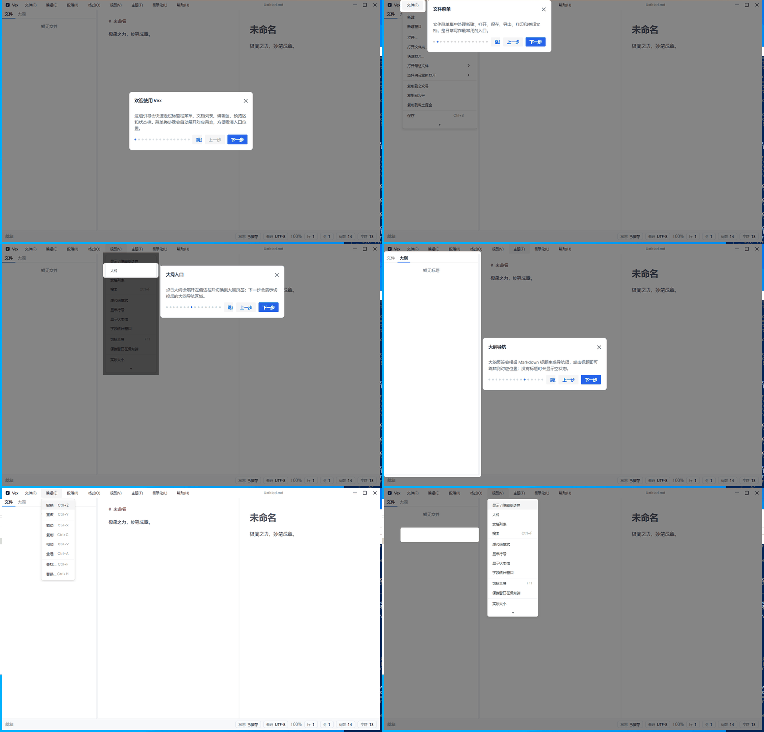
先看 Vex 中的完整落地。首次启动会自动出现引导,之后也可以从帮助菜单再次打开:
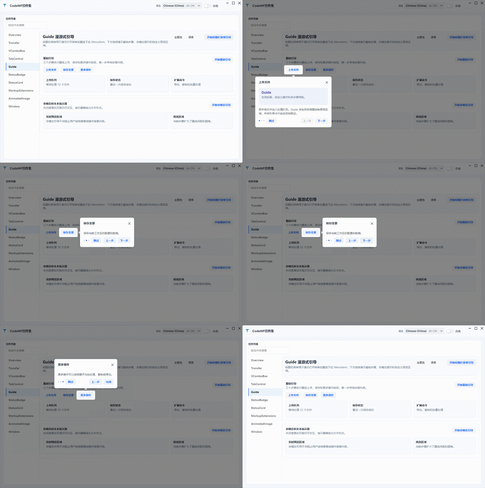
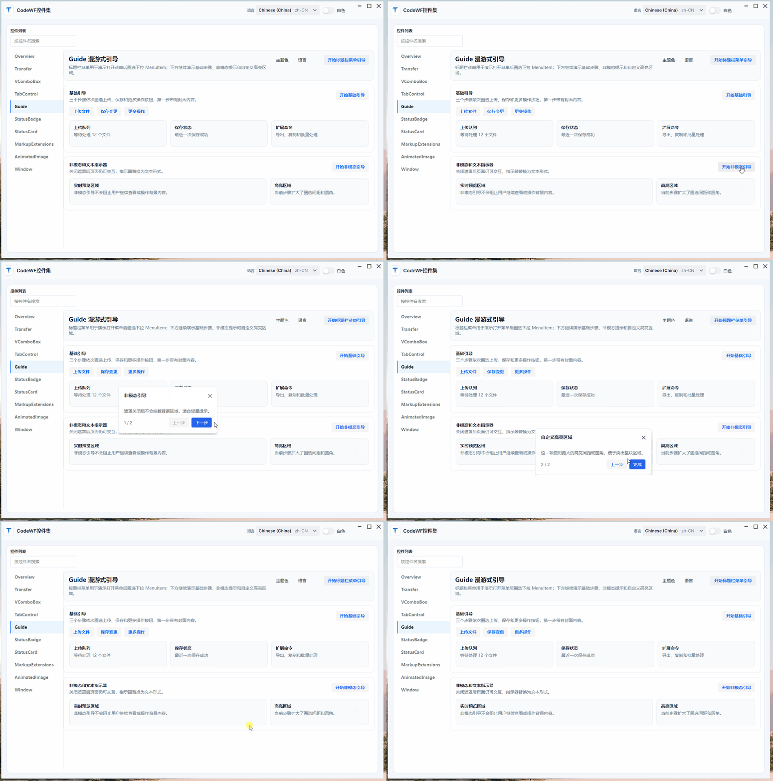
控件库 Demo 里也补了两个更小的例子:基础多步骤引导、封面内容、自定义按钮,以及非模态提示和文本进度。
Guide 解决什么
普通页面按钮的高亮不难,真正麻烦的是桌面应用里的动态入口。
Guide 当前覆盖这些场景:
- 多步骤引导:上一页、下一页、完成、关闭。
- 每一步绑定不同目标控件,也支持无目标居中说明。
- 遮罩挖洞、高亮圆角、目标间距和卡片方向控制。
- 目标在滚动区域内时自动滚动到可见位置。
- 目标晚一点出现时延迟解析并重试。
- 目标位于
Menu、Popup、Flyout等弹层里时仍可定位。 - 进入步骤前执行命令或事件,适合主动展开菜单、切换页签。
- 布局变化、窗口大小变化后刷新高亮位置。
源码位置:
https://github.com/dotnet9/CodeWF.AvaloniaControls/tree/main/src/CodeWF.AvaloniaControls/Controls/Guide
https://github.com/dotnet9/CodeWF.AvaloniaControls/tree/main/src/CodeWF.AvaloniaControls.Themes/Themes/Controls/Guide.axaml
控件结构
核心类型不多:
Guide:主控件,管理打开、关闭、当前步骤、弹层和目标解析。GuideStep:XAML 声明式步骤。GuideStepOption/IGuideStepOption:代码创建步骤时使用。GuideOverlay:绘制遮罩和高亮洞。DefaultGuideIndicator/TextGuideIndicator:圆点或文本进度。GuidePlacementMode:卡片位置。GuideMissingTargetBehavior:目标缺失时居中、跳过或关闭。
模板里有三个关键弹层:
PART_MaskPopup:主窗口遮罩。PART_TargetMaskPopup:目标在其他弹层宿主里时使用。PART_Popup:引导卡片。
这个结构让业务侧只声明“引导哪几个控件”,遮罩、定位、按钮、指示器和清理都交给控件内部。
基础用法
把 Guide 放在页面根布局里,为每个 GuideStep 指定目标控件即可:
<Grid>
    <StackPanel Orientation="Horizontal" Spacing="10">
        <Button x:Name="UploadButton" Content="上传文件" />
        <Button x:Name="SaveButton" Content="保存变更" />
        <Button x:Name="MoreButton" Content="更多操作" />
    </StackPanel>

    <codewf:Guide x:Name="BasicGuide" Placement="Bottom" PopupOffset="14">
        <codewf:GuideStep
            Target="{Binding ElementName=UploadButton}"
            Title="上传文件"
            Description="把本地文件加入处理队列。" />
        <codewf:GuideStep
            Target="{Binding ElementName=SaveButton}"
            Placement="Right"
            Title="保存变更"
            Description="保存当前工作区。" />
        <codewf:GuideStep
            Target="{Binding ElementName=MoreButton}"
            Placement="Top"
            Title="更多操作"
            Description="继续展开导出、复制或批处理。" />
    </codewf:Guide>
</Grid>
打开引导:
BasicGuide.GoTo(0);
BasicGuide.Show();
非模态提示只需要关闭遮罩,也可以换成文本指示器:
<codewf:Guide
    x:Name="NonMaskGuide"
    IsShowMask="False"
    Placement="Top"
    StyleType="Primary">
    <codewf:Guide.Indicator>
        <codewf:TextGuideIndicator />
    </codewf:Guide.Indicator>
</codewf:Guide>
单个步骤也能调整高亮范围:
<codewf:GuideStep
    Target="{Binding ElementName=PreviewPanel}"
    Placement="Left"
    GapOffsetX="16"
    GapOffsetY="16"
    GapRadius="14"
    Title="自定义高亮区域"
    Description="扩大圈选间距和圆角,突出整块区域。" />
遮罩与定位
GuideOverlay 用 EvenOdd 几何规则挖洞:先画整屏矩形,再把目标区域作为第二个矩形加入同一个 GeometryGroup,设置 FillRule.EvenOdd 后,目标区域就会保持透明。
目标坐标没有直接依赖 TranslatePoint,而是先取屏幕坐标,再转回对应 TopLevel 的客户区坐标:
var targetTopLeft = target.PointToScreen(new Point(0, 0));
var origin = relativeTopLevel.PointToClient(targetTopLeft);
var rect = new Rect(origin, target.Bounds.Size);
var result = rect.Inflate(new Thickness(gapX, gapY));
这样处理是为了兼容菜单、Popup、Flyout 这类可能挂在其他弹层宿主下的目标。
动态菜单引导
菜单项引导是这次最重要的增强。下面这段 GIF 只保留菜单步骤:文件菜单、打开文件夹、导出子菜单、段落菜单、格式菜单、视图菜单和主题二级菜单。
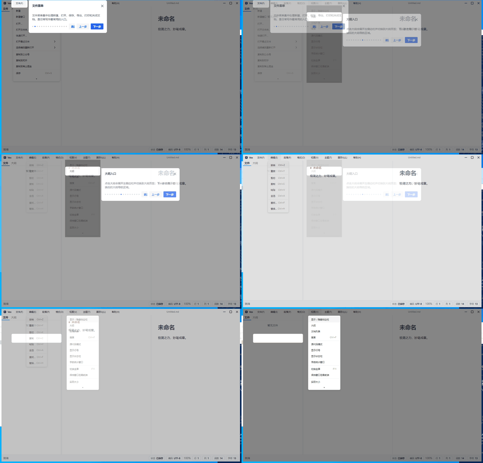
菜单项的问题在于:子级 MenuItem 只有父菜单打开以后才会进入视觉树。做法是进入步骤前打开父菜单,再让 Guide 延迟解析目标。
Demo 里的简化写法:
<Menu>
    <MenuItem x:Name="GuideThemeMenu" Header="主题色">
        <MenuItem x:Name="GuideThemeBlueItem" Header="蓝色" />
        <MenuItem x:Name="GuideThemeGreenItem" Header="绿色" />
        <MenuItem x:Name="GuideThemePurpleItem" Header="紫色" />
    </MenuItem>
</Menu>

<codewf:Guide
    x:Name="DynamicGuide"
    TargetResolveDelay="00:00:00.220"
    StepOpening="DynamicGuide_OnStepOpening">
    <codewf:GuideStep
        Target="{Binding ElementName=GuideThemeMenu}"
        Title="主题色菜单" />
    <codewf:GuideStep
        Target="{Binding ElementName=GuideThemeBlueItem}"
        Placement="RightBottom"
        Title="蓝色主题" />
</codewf:Guide>
进入菜单项步骤时打开父菜单:
private void DynamicGuide_OnStepOpening(object? sender, GuideStepEventArgs e)
{
    GuideThemeMenu.IsSubMenuOpen = e.Index is >= 1 and <= 3;
    Dispatcher.UIThread.Post(
        () => GuideThemeMenu.IsSubMenuOpen = true,
        DispatcherPriority.Background);
}
这里的关键是 TargetResolveDelay。菜单弹层创建和布局不是完全同步的,延迟一点再解析目标,定位会稳定很多。
Vex 中的落地
Vex 的标题栏菜单在 ShellTitleMenuView.axaml,关键菜单项都给了名字,并在 code-behind 里暴露给主窗口:
public MenuItem FileMenuTarget => FileMenuItem;
public MenuItem OpenFolderMenuTarget => OpenFolderMenuItem;
public MenuItem ExportMenuTarget => ExportMenuItem;
public MenuItem TableMenuTarget => TableMenuItem;
public MenuItem LinkMenuTarget => LinkMenuItem;
public MenuItem SourceModeMenuTarget => SourceModeMenuItem;
public MenuItem OutlineMenuTarget => OutlineMenuItem;
public MenuItem ThemeDarkMenuTarget => ThemeDarkMenuItem;
public MenuItem BeginGuideMenuTarget => BeginGuideMenuItem;
主窗口启动引导前,把这些控件赋给对应步骤:
private void ConfigureOnboardingGuideTargets()
{
    GuideFileMenuStep.Target = TitleMenuView.FileMenuTarget;
    GuideFileOpenStep.Target = TitleMenuView.OpenFolderMenuTarget;
    GuideFileExportStep.Target = TitleMenuView.ExportMenuTarget;
    GuideParagraphMenuStep.Target = TitleMenuView.TableMenuTarget;
    GuideFormatMenuStep.Target = TitleMenuView.LinkMenuTarget;
    GuideViewMenuStep.Target = TitleMenuView.SourceModeMenuTarget;
    GuideViewOutlineMenuStep.Target = TitleMenuView.OutlineMenuTarget;
    GuideThemeMenuStep.Target = TitleMenuView.ThemeDarkMenuTarget;
    GuideHelpMenuStep.Target = TitleMenuView.BeginGuideMenuTarget;
}
每次步骤切换时,先关闭所有菜单,再打开当前步骤需要的菜单。主题色这种二级菜单则连续打开父级和子级:
case ThemeColorGuideMenu:
    ThemeMenuItem.IsSubMenuOpen = true;
    ThemeColorMenuItem.IsSubMenuOpen = true;
    break;
整个链路可以压成五步:
GuideStep.Target指向具体MenuItem。StepOpening打开父菜单。TargetResolveDelay等待弹层布局。Guide解析目标、绘制遮罩、显示卡片。- 步骤结束或引导关闭时收起菜单。
TabItem 切换
Vex 左侧侧边栏是 TabControl,引导要分别说明“文件”和“大纲”。两个步骤复用同一个侧栏目标,但进入步骤前会先切换页签。
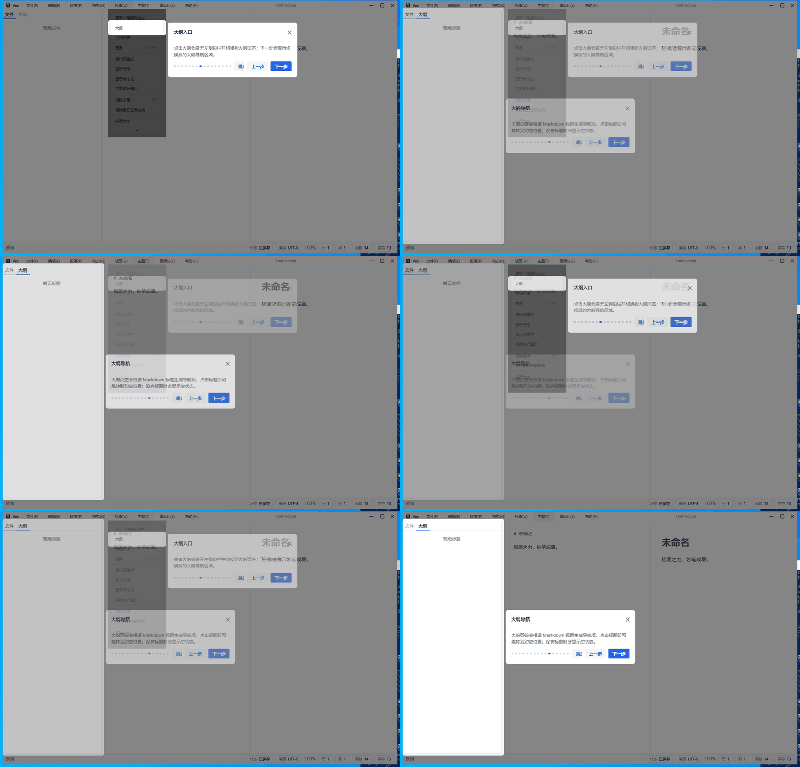
步骤目标仍然是同一个 SidebarGuideTarget:
<codewf:GuideStep
    x:Name="GuideSidebarFilesStep"
    Target="{Binding ElementName=SidebarGuideTarget}"
    Title="{i18n:I18n {x:Static l:VexL.GuideSidebarFilesTitle}}" />

<codewf:GuideStep
    x:Name="GuideSidebarOutlineStep"
    Target="{Binding ElementName=SidebarGuideTarget}"
    Title="{i18n:I18n {x:Static l:VexL.GuideSidebarOutlineTitle}}" />
进入步骤时切换业务状态,然后把刷新投递到 UI 后台队列:
private void PrepareOnboardingGuideStep(IGuideStepOption step)
{
    if (DataContext is not MainWindowViewModel viewModel)
    {
        return;
    }

    if (ReferenceEquals(step, GuideSidebarFilesStep))
    {
        viewModel.Layout.ShowFiles();
        QueueOnboardingGuideRefresh();
        return;
    }

    if (ReferenceEquals(step, GuideSidebarOutlineStep))
    {
        viewModel.Layout.ShowOutline();
        QueueOnboardingGuideRefresh();
    }
}

private void QueueOnboardingGuideRefresh()
{
    Dispatcher.UIThread.Post(OnboardingGuide.Refresh, DispatcherPriority.Background);
}
这一步很关键。页签内容需要等布局刷新后才能拿到正确尺寸,否则高亮区域容易停在旧位置。
首次启动
Vex 不会每次启动都弹引导。配置里有一个状态:
<add key="HasSeenOnboardingGuide" value="false" />
窗口打开后,如果用户还没看过,就标记为已看并投递一次引导:
private void QueueFirstRunOnboardingGuide()
{
    if (_settingsStore is null || _settingsStore.Current.HasSeenOnboardingGuide == true)
    {
        return;
    }

    _settingsStore.Update(settings => settings with { HasSeenOnboardingGuide = true });
    Dispatcher.UIThread.Post(BeginOnboardingGuide, DispatcherPriority.Background);
}
之后用户可以从帮助菜单再次打开。重新打开时回到第一步:
private void BeginOnboardingGuide()
{
    ConfigureOnboardingGuideTargets();
    TitleMenuView.CloseGuideMenus();
    OnboardingGuide.GoTo(0);
    OnboardingGuide.Show();
}
已知限制
动态菜单引导还有一个边界:如果引导过程中应用失去焦点,Avalonia 的 light-dismiss 可能先收起菜单弹层,后续引导也可能跟着消失。
当前实现已经对上一步、下一步、完成按钮做了 PointerPressed 优先导航处理,避免点击引导按钮时被菜单关闭抢先打断。但真正窗口失焦时,菜单弹层仍可能按平台规则关闭。
后续可以考虑两条路:
- 在
Guide内部继续加强弹层目标保持和焦点恢复。 - 菜单弹出完成后捕获一张静态快照,贴回遮罩层,再按快照位置引导。这个方案更稳,但不能响应真实菜单项交互。
小结
Guide 现在已经覆盖桌面应用里常见的新手引导场景:基础多步骤、居中说明、封面内容、自定义按钮、非模态提示、菜单项引导、二级菜单、TabItem 切换、目标延迟出现和首次启动只展示一次。
这次在 Vex 里落地后,最明确的结论是:桌面应用的新手引导不能只做静态按钮高亮。真实入口经常藏在菜单、弹层和页签后面,引导控件必须能跟业务状态一起变化。
相关地址:
- CodeWF.AvaloniaControls:https://github.com/dotnet9/CodeWF.AvaloniaControls
- Vex:https://github.com/dotnet9/Vex
- AtomUI:https://github.com/AtomUI/AtomUI
- Issues:https://github.com/dotnet9/CodeWF.AvaloniaControls/issues