

当你想画一个流程图的时候,你会发现,很多软件要么需要秘钥,要么需要会员,这时我就在想,可不可自己制作一款流程图软件呢?本文以一个简单的小例子,简述如何利用 WPF 制作属于自己的流程图软件,仅供学习分享使用,如有不足之处,还请指正。
涉及知识点
本示例主要通过 WPF 技术进行开发,涉及知识点如下:
- WPF 绘图,如矩形,直线等功能的相关图形技术。
- Thumb 控件,本控件可以由用户自由拖动,示例中所用到的可移动的图形控件,都继承于 Thumb 控件。
Thumb 控件简介
Thumb 控件是 WPF 提供的用于用户拖动的控件。默认情况下,Thumb 控件并不在工具箱中,需要手动添加,如下所示:
工具箱-->常规-->右键-->选择项,然后打开【选择工具箱对话框】,如下所示:

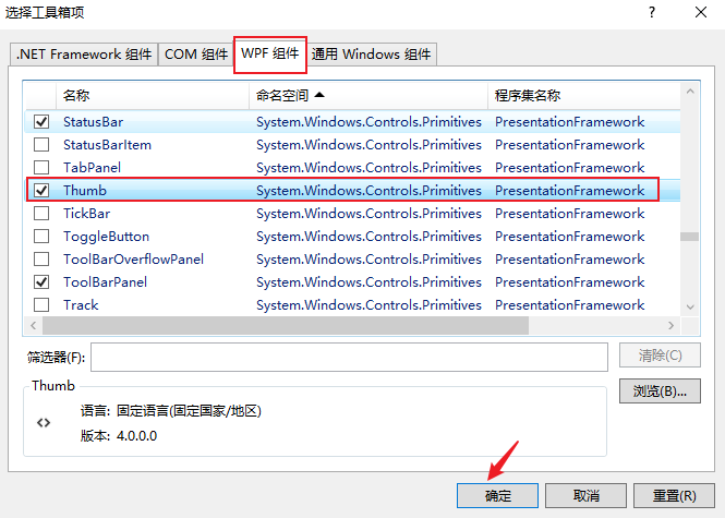
在选【择工具箱项】页面,打开 WPF 组件-->选择 Thumb-->点击确定按钮,如下所示:
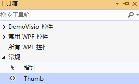
添加成功后,即可从工具箱拖动到页面,如下所示:
关于 Thumb 控件的简介,如下所示:
namespace System.Windows.Controls.Primitives
{
    //
    // 摘要:
    //     表示可以由用户拖动的控件。
    [DefaultEvent("DragDelta")]
    [Localizability(LocalizationCategory.NeverLocalize)]
    public class Thumb : Control
    {
        //
        // 摘要:
        //     标识 System.Windows.Controls.Primitives.Thumb.DragStarted 路由事件。
        //
        // 返回结果:
        //     System.Windows.Controls.Primitives.Thumb.DragStarted 路由事件的标识符。
        public static readonly RoutedEvent DragStartedEvent;
        //
        // 摘要:
        //     标识 System.Windows.Controls.Primitives.Thumb.DragDelta 路由事件。
        //
        // 返回结果:
        //     System.Windows.Controls.Primitives.Thumb.DragDelta 路由事件的标识符。
        public static readonly RoutedEvent DragDeltaEvent;
        //
        // 摘要:
        //     标识 System.Windows.Controls.Primitives.Thumb.DragCompleted 路由事件。
        //
        // 返回结果:
        //     System.Windows.Controls.Primitives.Thumb.DragCompleted 路由事件的标识符。
        public static readonly RoutedEvent DragCompletedEvent;
        //
        // 摘要:
        //     标识 System.Windows.Controls.Primitives.Thumb.IsDragging 依赖属性。
        //
        // 返回结果:
        //     System.Windows.Controls.Primitives.Thumb.IsDragging 依赖项属性的标识符。
        public static readonly DependencyProperty IsDraggingProperty;

        //
        // 摘要:
        //     初始化 System.Windows.Controls.Primitives.Thumb 类的新实例。
        public Thumb();

        //
        // 摘要:
        //     获取是否 System.Windows.Controls.Primitives.Thumb 控件具有逻辑焦点和捕获鼠标并按下鼠标左键。
        //
        // 返回结果:
        //     true 如果 System.Windows.Controls.Primitives.Thumb 控件具有焦点且鼠标捕获; 否则为 false。 默认值为
        //     false。
        [Bindable(true)]
        [Browsable(false)]
        [Category("Appearance")]
        public bool IsDragging { get; protected set; }

        //
        // 摘要:
        //     发生时 System.Windows.Controls.Primitives.Thumb 控件接收逻辑焦点和鼠标捕获。
        [Category("Behavior")]
        public event DragStartedEventHandler DragStarted;
        //
        // 摘要:
        //     根据鼠标位置更改时出现了一个或多个次 System.Windows.Controls.Primitives.Thumb 控件具有逻辑焦点和鼠标捕获。
        [Category("Behavior")]
        public event DragDeltaEventHandler DragDelta;
        //
        // 摘要:
        //     发生时 System.Windows.Controls.Primitives.Thumb 控件失去鼠标捕获。
        [Category("Behavior")]
        public event DragCompletedEventHandler DragCompleted;

        //
        // 摘要:
        //     取消的拖动操作 System.Windows.Controls.Primitives.Thumb。
        public void CancelDrag();
        //
        // 摘要:
        //     创建 System.Windows.Automation.Peers.AutomationPeer 为 System.Windows.Controls.Primitives.Thumb
        //     控件。
        //
        // 返回结果:
        //     一个 System.Windows.Automation.Peers.ThumbAutomationPeer 为 System.Windows.Controls.Primitives.Thumb
        //     控件。
        protected override AutomationPeer OnCreateAutomationPeer();
        //
        // 摘要:
        //     响应 System.Windows.Controls.Primitives.Thumb.IsDragging 属性值的更改。
        //
        // 参数:
        //   e:
        //     事件数据。
        protected virtual void OnDraggingChanged(DependencyPropertyChangedEventArgs e);
        //
        // 摘要:
        //     提供类处理 System.Windows.ContentElement.MouseLeftButtonDown 事件。
        //
        // 参数:
        //   e:
        //     事件数据。
        protected override void OnMouseLeftButtonDown(MouseButtonEventArgs e);
        //
        // 摘要:
        //     提供类处理 System.Windows.ContentElement.MouseLeftButtonUp 事件。
        //
        // 参数:
        //   e:
        //     事件数据。
        protected override void OnMouseLeftButtonUp(MouseButtonEventArgs e);
        //
        // 摘要:
        //     提供类处理 System.Windows.UIElement.MouseMove 事件。
        //
        // 参数:
        //   e:
        //     事件数据。
        protected override void OnMouseMove(MouseEventArgs e);
    }
}
通过上述摘要简介,发现 Thumb 控件提供了三个事件,分别是:
- 拖动开始事件:public event DragStartedEventHandler DragStarted;
- 拖动进行事件:public event DragDeltaEventHandler DragDelta;
- 拖动完成事件:public event DragCompletedEventHandler DragCompleted;
Thumb 控件示例
首先在窗口页面上添加一个 Thumb 控件,然后分别添加三个事件,如下所示:
<Window
  x:Class="DemoVisio.MainWindow1"
  xmlns="http://schemas.microsoft.com/winfx/2006/xaml/presentation"
  xmlns:x="http://schemas.microsoft.com/winfx/2006/xaml"
  xmlns:d="http://schemas.microsoft.com/expression/blend/2008"
  xmlns:mc="http://schemas.openxmlformats.org/markup-compatibility/2006"
  xmlns:local="clr-namespace:DemoVisio"
  mc:Ignorable="d"
  Title="Thumb示例"
  Height="450"
  Width="800"
>
  <canvas>
    <Thumb
      x:Name="thumb"
      Canvas.Left="0"
      Canvas.Top="0"
      Height="100"
      Width="100"
      DragStarted="thumb_DragStarted"
      DragDelta="thumb_DragDelta"
      DragCompleted="thumb_DragCompleted"
    />
  </canvas>
</Window>
然后在三个事件中添加代码,终点是 DragDelta 事件,如下所示:
namespace DemoVisio
{
    /// <summary>
    /// MainWindow1.xaml 的交互逻辑
    /// </summary>
    public partial class MainWindow1 : Window
    {
        public MainWindow1()
        {
            InitializeComponent();
        }

        private void thumb_DragStarted(object sender, DragStartedEventArgs e)
        {
            //开始拖动
        }

        /// <summary>
        /// 拖动
        /// </summary>
        /// <param name="sender"></param>
        /// <param name="e"></param>
        private void thumb_DragDelta(object sender, System.Windows.Controls.Primitives.DragDeltaEventArgs e)
        {
            Thumb myThumb = (Thumb)sender;
            double nTop = Canvas.GetTop(myThumb) + e.VerticalChange;
            double nLeft = Canvas.GetLeft(myThumb) + e.HorizontalChange;
            Canvas.SetTop(myThumb, nTop);
            Canvas.SetLeft(myThumb, nLeft);
        }

        private void thumb_DragCompleted(object sender, DragCompletedEventArgs e)
        {
            //拖动完成
        }
    }
}
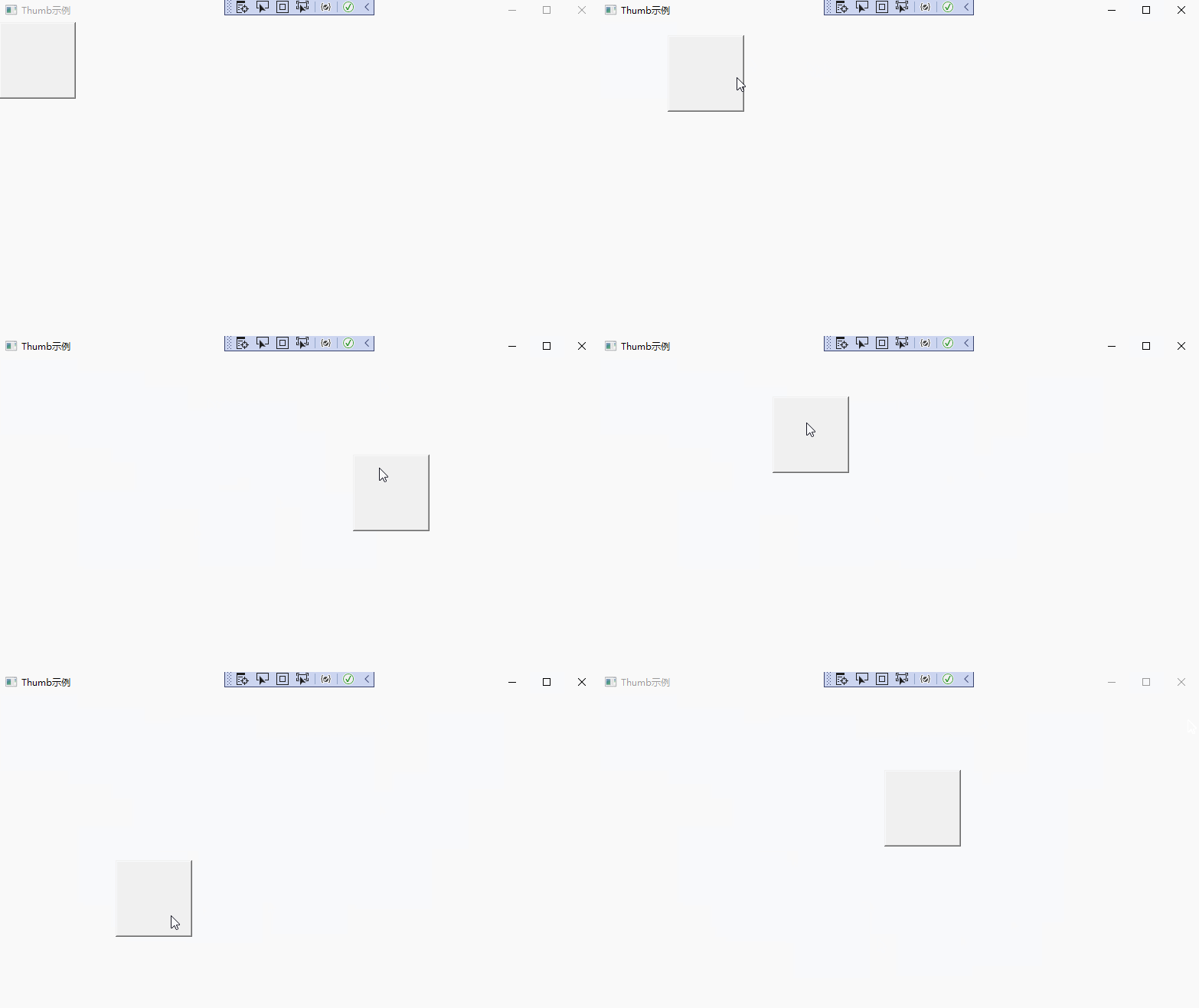
注意,在 XAML 中,Thumb 一定是在 Canvas 布局容器中,且一定要设置【Canvas.Left="0" Canvas.Top="0"】两个属性,如果不设置,在值为 NaN,无法进行拖动。
默认情况下,Thumb 控件就是一个丑丑的方块,如下所示:
拖动控件基类
在本示例中,流程图需要多种控件(如:圆形,矩形,线等),不能每一个控件都去实现那三个事件【DragStarted,DragDelta,DragCompleted】,所以需要定义一个基类 ThumbControl,统一实现方案。具体如下所示:
namespace DemoVisio
{
    public class ThumbControl : Thumb
    {
        /// <summary>
        /// 是否可以输入
        /// </summary>
        public bool IsEnableInput { get { return (bool)GetValue(IsEnableInputProperty); } set {SetValue( IsEnableInputProperty, value); } }

        /// <summary>
        /// 依赖属性
        /// </summary>
        public static readonly DependencyProperty IsEnableInputProperty = DependencyProperty.Register("IsEnableInput",typeof(bool),typeof(ThumbControl));

        public ThumbControl():base() {
            this.DragStarted += ThumbControl_DragStarted;
            this.DragDelta += ThumbControl_DragDelta;
            this.DragCompleted += ThumbControl_DragCompleted;
            this.MouseDoubleClick += ThumbControl_MouseDoubleClick;
            this.IsKeyboardFocusedChanged += ThumbControl_IsKeyboardFocusedChanged;
        }

        public void SetIsEnableInput(bool flag)
        {
            this.IsEnableInput = flag;
        }

        /// <summary>
        /// 是否具有键盘焦点
        /// </summary>
        /// <param name="sender"></param>
        /// <param name="e"></param>
        private void ThumbControl_IsKeyboardFocusedChanged(object sender, DependencyPropertyChangedEventArgs e)
        {

            this.IsEnableInput = this.IsKeyboardFocused;

        }

        /// <summary>
        /// 双击事件
        /// </summary>
        /// <param name="sender"></param>
        /// <param name="e"></param>
        private void ThumbControl_MouseDoubleClick(object sender, System.Windows.Input.MouseButtonEventArgs e)
        {
            this.IsEnableInput = true;
        }

        private void ThumbControl_DragStarted(object sender, DragStartedEventArgs e)
        {
            //开始移动
        }

        private void ThumbControl_DragDelta(object sender, DragDeltaEventArgs e)
        {
            Thumb myThumb = (Thumb)sender;
            double nTop = Canvas.GetTop(myThumb) + e.VerticalChange;
            double nLeft = Canvas.GetLeft(myThumb) + e.HorizontalChange;
            Canvas.SetTop(myThumb, nTop);
            Canvas.SetLeft(myThumb, nLeft);
        }

        private void ThumbControl_DragCompleted(object sender, DragCompletedEventArgs e)
        {
            //移动结束
        }
    }
}
具体图形控件
封装了基类以后,其他控件可以在此基础上进行使用,通过 ControlTemplate 展现不同的形态,如下所示:
- 矩形方块
在流程图中,矩形方块一般表示过程,实现代码如下所示:
<UserControl
  x:Class="DemoVisio.SquareControl"
  xmlns="http://schemas.microsoft.com/winfx/2006/xaml/presentation"
  xmlns:x="http://schemas.microsoft.com/winfx/2006/xaml"
  xmlns:mc="http://schemas.openxmlformats.org/markup-compatibility/2006"
  xmlns:d="http://schemas.microsoft.com/expression/blend/2008"
  xmlns:local="clr-namespace:DemoVisio"
  mc:Ignorable="d"
  d:DesignHeight="450"
  d:DesignWidth="800"
>
  <canvas>
    <local:ThumbControl
      x:Name="s"
      BorderThickness="1"
      Canvas.Top="0"
      Canvas.Left="0"
      Width="100"
      Height="60"
      Background="AliceBlue"
    >
      <Thumb.Template>
        <ControlTemplate>
          <Border
            Width="{Binding ElementName=s, Path=Width}"
            Height="{Binding ElementName=s, Path=Height}"
            BorderBrush="Black"
            Background="{Binding ElementName=s, Path=Background}"
            BorderThickness="{Binding ElementName=s, Path=BorderThickness}"
            Padding="2"
          >
            <TextBox
              Background="{Binding ElementName=s, Path=Background}"
              BorderThickness="0"
              VerticalAlignment="Center"
              IsEnabled="{Binding ElementName=s, Path=IsEnableInput}"
              MinLines="3"
              MaxLines="3"
              HorizontalContentAlignment="Center"
              VerticalContentAlignment="Center"
            ></TextBox>
          </Border>
        </ControlTemplate>
      </Thumb.Template>
    </local:ThumbControl>
  </canvas>
</UserControl>
- 圆形图
在流程图中,圆形一般表示开始和结束,如下所示:
<UserControl
  x:Class="DemoVisio.CircleControl"
  xmlns="http://schemas.microsoft.com/winfx/2006/xaml/presentation"
  xmlns:x="http://schemas.microsoft.com/winfx/2006/xaml"
  xmlns:mc="http://schemas.openxmlformats.org/markup-compatibility/2006"
  xmlns:d="http://schemas.microsoft.com/expression/blend/2008"
  xmlns:local="clr-namespace:DemoVisio"
  mc:Ignorable="d"
  d:DesignHeight="450"
  d:DesignWidth="800"
>
  <canvas>
    <local:ThumbControl
      x:Name="s"
      Canvas.Top="0"
      Canvas.Left="0"
      Width="60"
      Height="60"
      Background="AliceBlue"
      BorderThickness="1"
    >
      <local:ThumbControl.Template>
        <ControlTemplate>
          <Grid>
            <Border
              Width="{Binding Width}"
              Height="{Binding Height}"
              CornerRadius="30"
              BorderThickness="{Binding ElementName=s, Path=BorderThickness}"
              BorderBrush="Black"
              Background="{Binding ElementName=s, Path=Background}"
            >
              <TextBox
                VerticalAlignment="Center"
                HorizontalContentAlignment="Center"
                VerticalContentAlignment="Center"
                MaxLines="2"
                MinLines="1"
                Width="{Binding Width}"
                Height="{Binding Height}"
                Background="{Binding ElementName=s, Path=Background}"
                BorderThickness="0"
                IsEnabled="{Binding ElementName=s, Path=IsEnableInput}"
              ></TextBox>
            </Border>
          </Grid>
        </ControlTemplate>
      </local:ThumbControl.Template>
    </local:ThumbControl>
  </canvas>
</UserControl>
- 菱形图
在流程图中,菱形一般表示选择,表达程序中的布尔值。如下所示:
<UserControl
  x:Class="DemoVisio.RhombusControl"
  xmlns="http://schemas.microsoft.com/winfx/2006/xaml/presentation"
  xmlns:x="http://schemas.microsoft.com/winfx/2006/xaml"
  xmlns:mc="http://schemas.openxmlformats.org/markup-compatibility/2006"
  xmlns:d="http://schemas.microsoft.com/expression/blend/2008"
  xmlns:local="clr-namespace:DemoVisio"
  mc:Ignorable="d"
  d:DesignHeight="450"
  d:DesignWidth="800"
>
  <canvas>
    <local:ThumbControl
      x:Name="s"
      Canvas.Left="0"
      Canvas.Top="0"
      Width="80"
      Height="80"
      Background="AliceBlue"
      BorderThickness="1"
    >
      <Thumb.Template>
        <ControlTemplate>
          <Border
            Width="{Binding ElementName=s, Path=Width}"
            Height="{Binding ElementName=s, Path=Height}"
            BorderBrush="Black"
            Background="{Binding ElementName=s, Path=Background}"
            BorderThickness="{Binding ElementName=s, Path=BorderThickness}"
            Padding="1"
          >
            <TextBox
              Background="{Binding ElementName=s, Path=Background}"
              BorderThickness="0"
              VerticalAlignment="Center"
              IsEnabled="{Binding ElementName=s, Path=IsEnableInput}"
              Width="50"
              Height="50"
              HorizontalContentAlignment="Center"
              VerticalContentAlignment="Center"
            >
              <TextBox.RenderTransform>
                <RotateTransform
                  CenterX="25"
                  CenterY="25"
                  Angle="-45"
                ></RotateTransform>
              </TextBox.RenderTransform>
            </TextBox>
          </Border>
        </ControlTemplate>
      </Thumb.Template>
      <Thumb.RenderTransform>
        <TransformGroup>
          <RotateTransform
            CenterX="40"
            CenterY="40"
            Angle="45"
          ></RotateTransform>
          <ScaleTransform
            CenterX="40"
            CenterY="40"
            ScaleX="0.8"
          ></ScaleTransform>
          <TranslateTransform X="10" Y="15"></TranslateTransform>
        </TransformGroup>
      </Thumb.RenderTransform>
    </local:ThumbControl>
  </canvas>
</UserControl>
- 直线
在流程图中,直线一般表示两个过程之间的连接,如下所示:
<UserControl
  x:Class="DemoVisio.LineArrowControl"
  xmlns="http://schemas.microsoft.com/winfx/2006/xaml/presentation"
  xmlns:x="http://schemas.microsoft.com/winfx/2006/xaml"
  xmlns:mc="http://schemas.openxmlformats.org/markup-compatibility/2006"
  xmlns:d="http://schemas.microsoft.com/expression/blend/2008"
  xmlns:local="clr-namespace:DemoVisio"
  mc:Ignorable="d"
  d:DesignHeight="450"
  d:DesignWidth="800"
>
  <canvas>
    <local:ThumbControl
      x:Name="s"
      Canvas.Left="0"
      Canvas.Top="0"
      Width="100"
      Height="100"
      Background="AliceBlue"
      IsEnableInput="False"
    >
      <local:ThumbControl.Template>
        <ControlTemplate>
          <Grid>
            <Line
              X1="0"
              Y1="0"
              X2="0"
              Y2="100"
              Stroke="Black"
              StrokeThickness="2"
              HorizontalAlignment="Center"
            >
            </Line>
            <Line
              X1="-5"
              Y1="90"
              X2="1"
              Y2="100"
              StrokeThickness="2"
              Stroke="Black"
              HorizontalAlignment="Center"
            ></Line>
            <Line
              X1="8"
              Y1="90"
              X2="3"
              Y2="100"
              StrokeThickness="2"
              Stroke="Black"
              HorizontalAlignment="Center"
            ></Line>
            <TextBox
              VerticalAlignment="Center"
              Height="30"
              HorizontalContentAlignment="Center"
              BorderThickness="0"
              VerticalContentAlignment="Center"
              MinLines="1"
              MaxLines="2"
              IsEnabled="{Binding ElementName=s, Path=IsEnableInput}"
              Opacity="0"
              Visibility="{Binding ElementName=s, Path=IsEnableInput}"
            ></TextBox>
          </Grid>
        </ControlTemplate>
      </local:ThumbControl.Template>
    </local:ThumbControl>
  </canvas>
</UserControl>
主窗体
主窗体主要用于绘制流程图,分为左右两部分,左边是控件列表,右边是布局容器,如下所示:
<Window
  x:Class="DemoVisio.MainWindow"
  xmlns="http://schemas.microsoft.com/winfx/2006/xaml/presentation"
  xmlns:x="http://schemas.microsoft.com/winfx/2006/xaml"
  xmlns:d="http://schemas.microsoft.com/expression/blend/2008"
  xmlns:mc="http://schemas.openxmlformats.org/markup-compatibility/2006"
  xmlns:local="clr-namespace:DemoVisio"
  mc:Ignorable="d"
  Title="流程图"
  Height="800"
  Width="800"
  MouseDown="Window_MouseDown"
  Loaded="Window_Loaded"
>
  <Window.Resources>
    <style TargetType="TextBlock">
      <Setter Property="HorizontalAlignment" Value="Center"></Setter>
    </style>
  </Window.Resources>
  <Grid ShowGridLines="True">
    <Grid.ColumnDefinitions>
      <ColumnDefinition Width="Auto" MinWidth="150"></ColumnDefinition>
      <ColumnDefinition Width="*"></ColumnDefinition>
    </Grid.ColumnDefinitions>
    <StackPanel Grid.Column="0" x:Name="left" Orientation="Vertical">
      <Rectangle
        Width="80"
        Height="50"
        Fill="AliceBlue"
        Stroke="Black"
        Margin="5"
        x:Name="rectangle"
        MouseLeftButtonDown="rectangle_MouseLeftButtonDown"
      ></Rectangle>
      <TextBlock Text="矩形"></TextBlock>
      <Rectangle
        Width="100"
        Height="100"
        Fill="AliceBlue"
        Stroke="Black"
        Margin="5"
        x:Name="rhombus"
        MouseLeftButtonDown="rhombus_MouseLeftButtonDown"
      >
        <Rectangle.RenderTransform>
          <TransformGroup>
            <RotateTransform
              CenterX="50"
              CenterY="50"
              Angle="45"
            ></RotateTransform>
            <ScaleTransform
              CenterX="50"
              CenterY="50"
              ScaleX="0.5"
              ScaleY="0.7"
            ></ScaleTransform>
          </TransformGroup>
        </Rectangle.RenderTransform>
      </Rectangle>
      <TextBlock Text="菱形" Margin="0,5"></TextBlock>
      <Line
        X1="0"
        Y1="0"
        X2="0"
        Y2="80"
        Stroke="Black"
        StrokeThickness="2"
        HorizontalAlignment="Center"
        Margin="5"
        x:Name="line"
        MouseLeftButtonDown="line_MouseLeftButtonDown"
      ></Line>
      <TextBlock Text="直线"></TextBlock>
      <Ellipse
        Width="60"
        Height="60"
        Fill="AliceBlue"
        Stroke="Black"
        Margin="5"
        x:Name="circle"
        MouseLeftButtonDown="circle_MouseLeftButtonDown"
      ></Ellipse>
      <TextBlock Text="圆形"></TextBlock>
    </StackPanel>
    <canvas Grid.Column="1" x:Name="right"> </canvas>
  </Grid>
</Window>
当点击左边基础控件时,在右边容器中,生成新的控件。如下所示:
namespace DemoVisio
{
    /// <summary>
    /// MainWindow.xaml 的交互逻辑
    /// </summary>
    public partial class MainWindow : Window
    {
        /// <summary>
        /// 控件列表
        /// </summary>
        private List<Control> rightControls = new List<Control>();

        public MainWindow()
        {
            InitializeComponent();
        }

        private void Window_MouseDown(object sender, MouseButtonEventArgs e)
        {
            //this.Focus();
            //this.one.SetIsEnableInput(false);
            foreach (var control in this.right.Children) {
                var thumb = control as ThumbControl;
                if (thumb != null)
                {
                    thumb.SetIsEnableInput(false);
                }
            }
        }

        private void Window_Loaded(object sender, RoutedEventArgs e)
        {
            var width = this.right.ActualWidth;
            var height = this.right.ActualHeight;

            int x = 0;
            int y = 0;
            //横线
            while (y<height) {
                Line line = new Line();
                line.X1 = x;
                line.Y1 = y;
                line.X2 = width;
                line.Y2 = y;
                line.Stroke = Brushes.LightGray;
                line.StrokeThickness = 1;
                this.right.Children.Add(line);
                y = y + 10;
            }
            //重新初始化值
            x = 0;
            y = 0;
            //竖线
            while (x < width) {
                Line line = new Line();
                line.X1 = x;
                line.Y1 = y;
                line.X2 = x;
                line.Y2 = height;
                line.Stroke = Brushes.LightGray;
                line.StrokeThickness = 1;
                this.right.Children.Add(line);
                x = x + 10;
            }
        }

        private void rectangle_MouseLeftButtonDown(object sender, MouseButtonEventArgs e)
        {
            SquareControl squareControl = new SquareControl();
            this.right.Children.Add(squareControl);
        }

        private void rhombus_MouseLeftButtonDown(object sender, MouseButtonEventArgs e)
        {
            RhombusControl rhombusControl = new RhombusControl();
            this.right.Children.Add(rhombusControl);
        }

        private void line_MouseLeftButtonDown(object sender, MouseButtonEventArgs e)
        {
            LineArrowControl lineArrowControl = new LineArrowControl();
            this.right.Children.Add(lineArrowControl);
        }

        private void circle_MouseLeftButtonDown(object sender, MouseButtonEventArgs e)
        {
            CircleControl circleControl = new CircleControl();
            this.right.Children.Add(circleControl);
        }
    }
}
示例截图
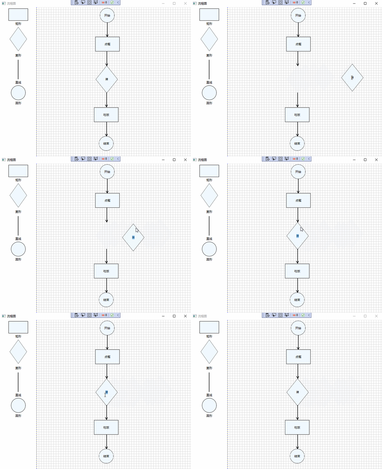
示例基础截图如下所示:
备注
以上示例只是基础,功能并不完善,旨在抛砖引玉,共同学习,一起进步,希望可以对大家有所启发。
贺新郎·九日

【作者】刘克庄 【朝代】宋
湛湛长空黑。更那堪、斜风细雨,乱愁如织。
老眼平生空四海,赖有高楼百尺。
看浩荡、千崖秋色。
白发书生神州泪,尽凄凉、不向牛山滴。
追往事,去无迹。

少年自负凌云笔。到而今、春华落尽,满怀萧瑟。
常恨世人新意少,爱说南朝狂客。
把破帽、年年拈出。
若对黄花孤负酒,怕黄花、也笑人岑寂。
鸿北去,日西匿。