本文经原作者授权以原创方式二次分享,欢迎转载、分享。
原文作者:眾尋
原文链接:https://www.cnblogs.com/ZXdeveloper/p/8391864.html
这两天不忙,所以,做了一个简易的新手引导小 Demo。因为,不是项目上应用,所以,做的很粗糙,也就是给需要的人,一个思路而已。
新手引导功能的话,就是告诉用户,页面上操作的顺序,第一步要做什么,第二步要做什么,以此类推,然后,最终关闭新手引导页面。
以我的习惯,还是先给大家看看效果。
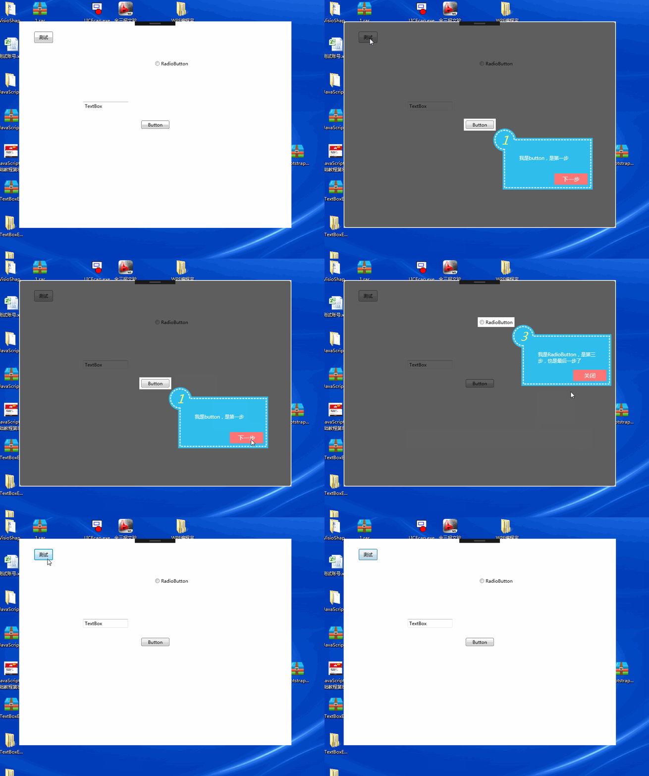
效果展示的很简单,就是将要告诉用户操作的控件做一个提示。
要实现这个功能化,那思路就是大概以下几项:
一、遮罩窗体
将主窗体进行遮罩,半透明的效果,常用的做遮罩的话,一般是设置一个底色,然后设置透明度,类似于这篇博客 WPF 透明窗体制作,但是,在实际的操作用就会遇到问题,如果使用正常的半透明方式的话,黄色框部分,是不发透出白色的主窗体内容的,因为已经有底色了,所以,本文使用的半透明方法是 Clip 的擦除,效果如下图,参考的博客WPF 用 Clip 属性实现蒙板特效。
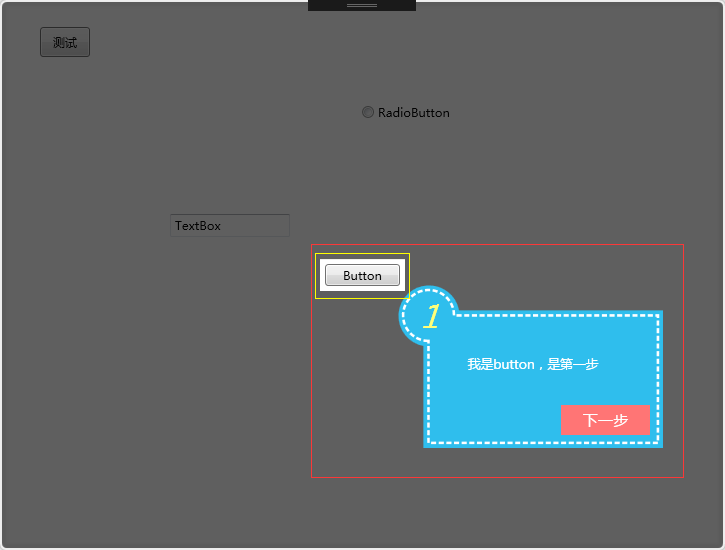
先设置一个透明的窗体
<Window x:Class="SimpleGuide.GuideWin" xmlns="http://schemas.microsoft.com/winfx/2006/xaml/presentation" xmlns:x="http://schemas.microsoft.com/winfx/2006/xaml" xmlns:d="http://schemas.microsoft.com/expression/blend/2008" xmlns:mc="http://schemas.openxmlformats.org/markup-compatibility/2006" xmlns:local="clr-namespace:SimpleGuide" mc:Ignorable="d" Title="GuideWin" WindowStyle="None" AllowsTransparency="True" x:Name="gw" Background="#01FFFFFF" ShowInTaskbar="False">
  <Grid>
    <Border x:Name="bor" BorderBrush="White" BorderThickness="2" CornerRadius="5" Opacity="0.8">
      <Border.Effect>
        <DropShadowEffect ShadowDepth="0" Color="#FF414141" BlurRadius="8" />
      </Border.Effect>
      <Border Background="Black" Opacity="0.5" Margin="0" CornerRadius="5" />
    </Border>
    <Canvas x:Name="can"></Canvas>
  </Grid>
</Window>
从 XAML 的代码中,可以看到 Background 这个属性没用“Transparent”而用的是“#01FFFFFF”,因为如果用 Transparent 的话,那真的就是透明了,可以直接点击到主窗体里的控件,这个是我们所不希望的,所以,设置了“#01FFFFFF”,一个近乎透明的颜色。
二、显示要操作的控件
既然要对某个控件进行指引的话,那就要把控件先给圈起来,圈起来的首要任务,就是获得控件在当前窗体的坐标位置。
Point point = fe.TransformToAncestor(Window.GetWindow(fe)).Transform(new Point(0, 0));
当获取完坐标以后,则需要将控件给圈起来,我的方法,就是取当前的坐标-5,宽和高+10,来绘制一个空白的区域,其实,这个部分应该是指擦除
RectangleGeometry rg1 = new RectangleGeometry();
rg1.Rect = new Rect(point.X - 5, point.Y - 5, fe.ActualWidth + 10, fe.ActualHeight + 10);
borGeometry = Geometry.Combine(borGeometry, rg1, GeometryCombineMode.Exclude, null);
三、绘制一个指引的 UC
指引 UC,设计起来就比较方便了,样子其实挺简单的
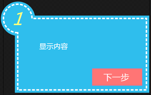
就是用 Path,绘制一个范围,但是虚线框,最开始的想法是用 Line 去做,但是感觉太费事了,就直接用的 StrokeDashArray 这个属性,Stroke 是 Path 本身的边框线,当然,真的是边框,所以,又不好设置 Margin 或者 Padding,所以,最后的做法,就是,在外层又绘制了一个区域,只是这个区域不包含边框线而已,填充色相同
<Path Fill="#FF2FBEED">
  <Path.Data>
    <GeometryGroup>
      <PathGeometry Figures="M 8,22 A 12,12 0 1 1 22,8 L 102 8 L 102 62 L 8 62 Z" />
    </GeometryGroup>
  </Path.Data>
</Path>
<Path StrokeThickness="1" Stroke="White" StrokeDashArray="2,1" Fill="#FF2FBEED">
  <Path.Data>
    <GeometryGroup>
      <PathGeometry Figures="M 10,20 A 10,10 0 1 1 20,10 L 100 10 L 100 60 L 10 60 Z" />
    </GeometryGroup>
  </Path.Data>
</Path>
显示内容的部分是一个 Textblock,当时遇到了一个问题,就是换行问题,Textblock 必须要有 Width,才会换行,但是由于最外层是 Viewbox,所以,尝试过获取 UC 的 Width 或者 ActualWidth,都不行,所以,最后的解决办法是,传入一个窗体的宽度和高度进来,而不是在外部设置此 UC 的宽和高。
public HintUC(string xh, string content, Visibility vis = Visibility.Visible, int width = 260, int height = 160)
{
    InitializeComponent();
    this.Width = width;
    this.Height = height;
    this.tb_nr.Width = width / 4;

    this.tb_xh.Text = xh;
    this.tb_nr.Text = content;
    this.btn_next.Visibility = vis;
}
四、下一步的触发
触发下一步,相当于是子控件调用主控件的事件,这样的话,就是写一个委托,在主窗体里去实现具体的方法。
private void show(int xh, FrameworkElement fe, string con, Visibility vis = Visibility.Visible)
{
    Point point = fe.TransformToAncestor(Window.GetWindow(fe)).Transform(new Point(0, 0));//获取控件坐标点

    RectangleGeometry rg = new RectangleGeometry();
    rg.Rect = new Rect(0, 0, this.Width, this.Height);
    borGeometry = Geometry.Combine(borGeometry, rg, GeometryCombineMode.Union, null);
    bor.Clip = borGeometry;

    RectangleGeometry rg1 = new RectangleGeometry();
    rg1.Rect = new Rect(point.X - 5, point.Y - 5, fe.ActualWidth + 10, fe.ActualHeight + 10);
    borGeometry = Geometry.Combine(borGeometry, rg1, GeometryCombineMode.Exclude, null);

    bor.Clip = borGeometry;

    HintUC hit = new HintUC(xh.ToString(), con, vis);
    Canvas.SetLeft(hit, point.X + fe.ActualWidth + 3);
    Canvas.SetTop(hit, point.Y + fe.ActualHeight + 3);
    hit.nextHintEvent -= Hit_nextHintEvent;
    hit.nextHintEvent += Hit_nextHintEvent;
    can.Children.Add(hit);

    index++;
}
private void Hit_nextHintEvent()
{
    if (list[index - 1] != null)
    {
        can.Children.Clear();
    }
    if (index == list.Count - 1)
        show(index + 1, list[index].Uc, list[index].Content, Visibility.Collapsed);
    else
        show(index + 1, list[index].Uc, list[index].Content);
}
我们要在外部声明一个 index 的变量来记录当前的 List 集合的索引,首先要判断,当前的内容里,是否不为空,如果是的话,要清除掉,如果不清除的话,就会看到一堆的提示框,然后,判别是否是 List 集合里的最后一个控件了,如果是的话,那就不再显示“下一步按钮了”。
五、扩展部分
由于是一个小 Demo,所以发现了一些问题,但是就没有再解决了,例如如果主窗体不是无边框的话,取值定位会有问题。
这是由于弹出的引导窗体获取了主窗体的大小,但是 Point 去获取控件坐标位置的时候,主窗体是不包含头部的,由于遮罩没有头部,所以定位出错了,这个我还没有找到好的解决办法,如果有大神知道如何解决的话,请赐教,谢谢了。
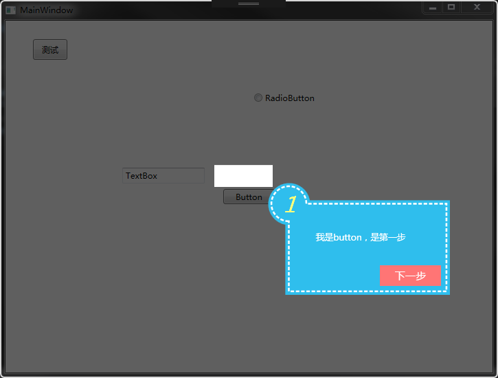
显示引导内容的部分,也可以换成一个 Grid,这样的话,就可以传入 UserControl 了,有兴趣的朋友可以自行修改。
源码:Demo
站长使用体验
效果确实不错,站长通过原作者的源码改了一点(代码),需要遮罩的控件换成 Image 控件也是相同效果,nice: