
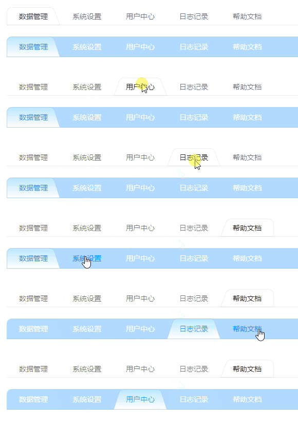
背景
感谢微信【Avalonia开发交流群】的 @kankankan 大佬提供的代码示例:

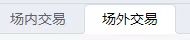
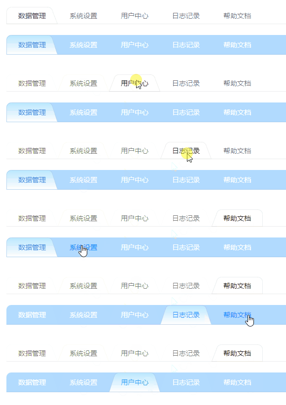
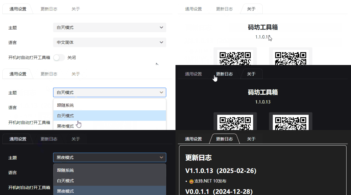
下图是按个性化要求修改效果:
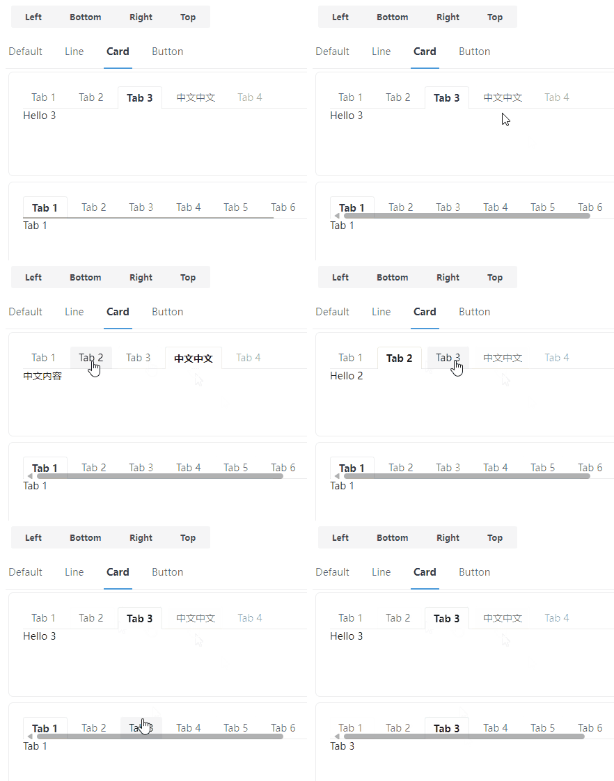
为了兼容Semi.Avalonia主题风格,我们的TabControl控件主题从参考Semi的Card风格控件主题开始,Semi的效果如下:
我们修改后,在各主题切换时,展示效果如下:
使用
建议复制本文控件代码自行维护,本控件不一定更新及时。
本控件是在Semi的基础上二次开发,所以需要安装以下NuGet包:
Install-Package Semi.Avalonia -Version 11.2.1.8
Install-Package CodeWF.AvaloniaControls -Version 0.1.1.6
<Application xmlns="https://github.com/avaloniaui"
             xmlns:x="http://schemas.microsoft.com/winfx/2006/xaml"
             x:Class="CodeWF.AvaloniaControls.Demo.App"
             xmlns:semi="https://irihi.tech/semi"
             xmlns:codewf="https://codewf.com">
    <Application.Styles>
        <semi:SemiTheme Locale="zh-CN" />
		<codewf:CodeWFTheme />
    </Application.Styles>
</Application>
使用参考,效果在前面已经展示,代码如下:
<UserControl xmlns="https://github.com/avaloniaui"
             xmlns:x="http://schemas.microsoft.com/winfx/2006/xaml"
             xmlns:d="http://schemas.microsoft.com/expression/blend/2008"
             xmlns:mc="http://schemas.openxmlformats.org/markup-compatibility/2006"
             mc:Ignorable="d" d:DesignWidth="800" d:DesignHeight="450"
             x:Class="CodeWF.AvaloniaControls.Demo.Pages.TabControlDemo">

    <Grid RowDefinitions="20 Auto 20 Auto" ColumnDefinitions="20 * 20">


        <TabControl Grid.Row="1" Grid.Column="1" VerticalAlignment="Top"
                    Theme="{StaticResource TrapezoidShapedTabControl}"
                    CornerRadius="10 10 0 0" TabStripPlacement="Top">
            <TabControl.Styles>
                <Style Selector="TabItem">
                    <Setter Property="CornerRadius" Value="10 10 0 0" />
                    <Setter Property="Padding" Value="12 8" />
                </Style>
            </TabControl.Styles>
            <TabItem Header="数据管理" />
            <TabItem Header="系统设置" />
            <TabItem Header="用户中心" />
            <TabItem Header="日志记录" />
            <TabItem Header="帮助文档" />
        </TabControl>


        <TabControl Grid.Row="3" Grid.Column="1" VerticalAlignment="Top"
                    Theme="{StaticResource TrapezoidShapedTabControl}"
                    CornerRadius="10 10 0 0" TabStripPlacement="Top">
            <TabControl.Styles>
                <Style Selector="TabControl">
                    <Setter Property="Background" Value="#551890FF"></Setter>
                </Style>
                <Style Selector="TabItem">
                    <Setter Property="CornerRadius" Value="10 10 0 0" />
                    <Setter Property="Foreground" Value="#FFFFFF" />
                    <Setter Property="Padding" Value="12 8" />
                    <Setter Property="MinHeight" Value="40" />
                    <Setter Property="BorderThickness" Value="1" />
                    <Setter Property="VerticalContentAlignment" Value="Center" />
                    <Setter Property="Background">
                        <Setter.Value>
                            <LinearGradientBrush StartPoint="50%, 0%"
                                                 EndPoint="50%, 100%">
                                <GradientStops>
                                    <GradientStop Color="#BAE7FF" Offset="0" />
                                    <GradientStop Color="#FFFFFF" Offset="1" />
                                </GradientStops>
                            </LinearGradientBrush>
                        </Setter.Value>
                    </Setter>
                </Style>
            </TabControl.Styles>
            <TabControl.Resources>
                <SolidColorBrush x:Key="TabItemLineHeaderPointeroverForeground">#1890FF</SolidColorBrush>
                <SolidColorBrush x:Key="TabItemLineHeaderSelectedForeground">#1890FF</SolidColorBrush>
            </TabControl.Resources>
            <TabItem Header="数据管理" />
            <TabItem Header="系统设置" />
            <TabItem Header="用户中心" />
            <TabItem Header="日志记录" />
            <TabItem Header="帮助文档" />
        </TabControl>
    </Grid>
</UserControl>
实现
讲代码总是枯燥的,讲个大概吧。
这是Semi的TabControl的ControlTheme代码:
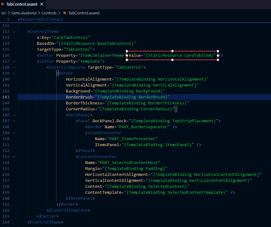
我们主要是修改TabItem的边框风格,所以将Semi的这段代码直接复制粘贴,给ControlTheme换个Key,再把图中框选部分ItemContainerTheme的Value指向另一个TabItem的控件主题,其他部分代码按需修改,我这没动其他代码,下图是修改后代码截图:
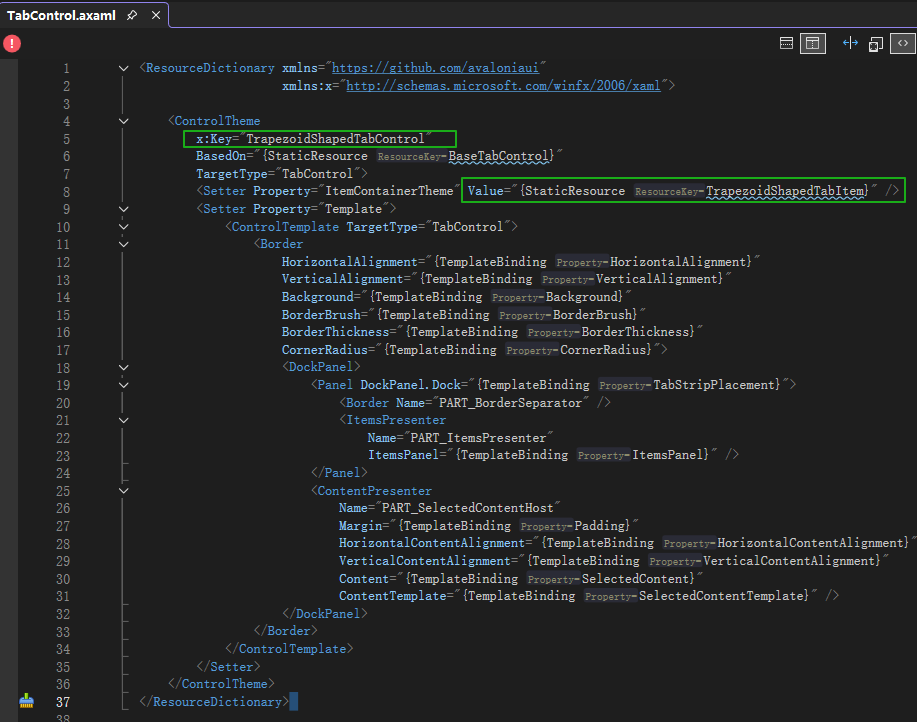
TabItem的控件主题代码如下,关键代码是自定义的边框代码位置:
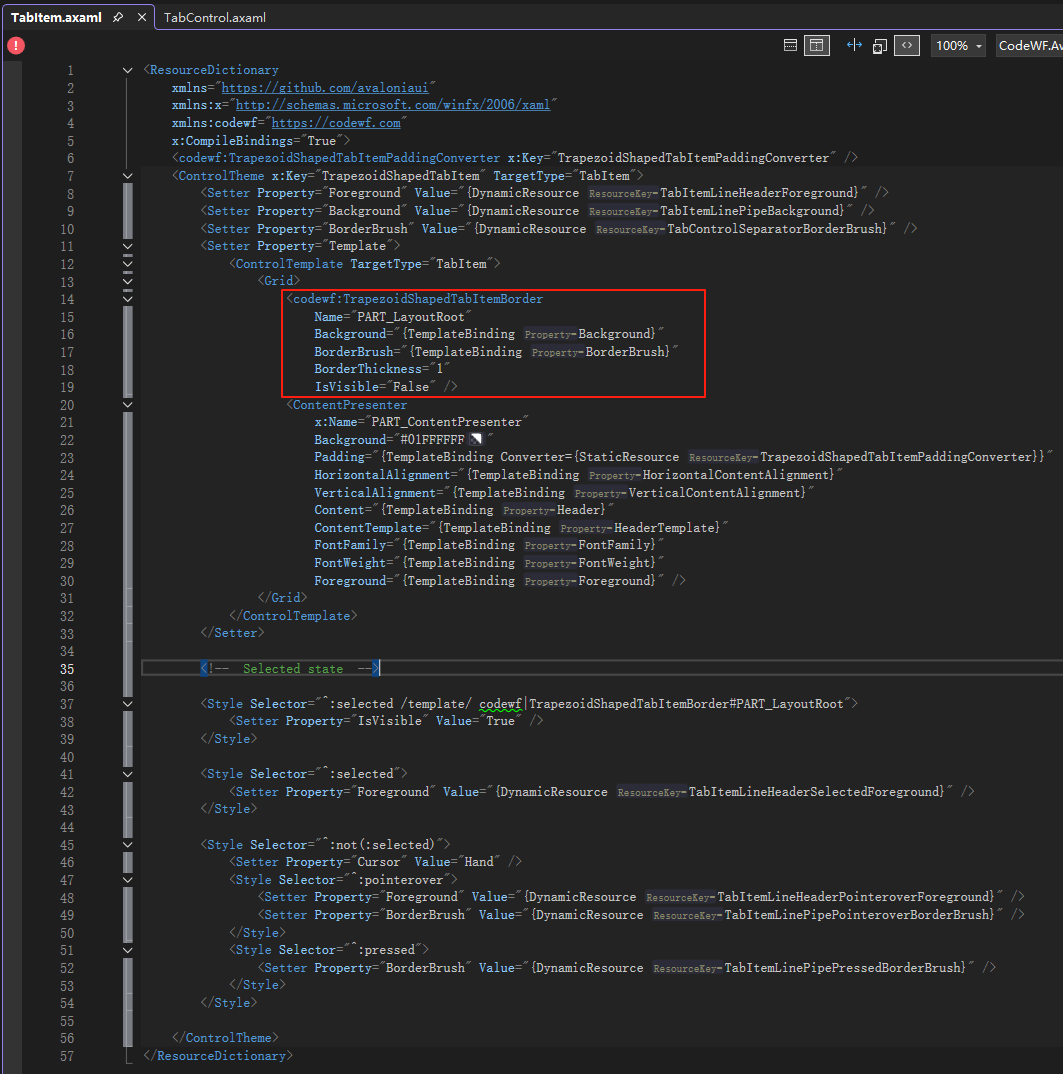
其中TrapezoidShapedTabItemBorder继承自Control,主要是重写它的Render方法:
public partial class TrapezoidShapedTabItemBorder : Control
{
    public const double DiagonalFilletRatio = 0.8;

    public static readonly StyledProperty<IBrush> BorderBrushProperty =
        AvaloniaProperty.Register<TrapezoidShapedTabItemBorder, IBrush>(nameof(BorderBrush),
            new SolidColorBrush(Color.Parse("#05CCCCCC")));

    public static readonly StyledProperty<double> BorderThicknessProperty =
        AvaloniaProperty.Register<TrapezoidShapedTabItemBorder, double>(nameof(BorderThickness), 1);

    public static readonly StyledProperty<IBrush> BackgroundProperty =
        AvaloniaProperty.Register<TrapezoidShapedTabItemBorder, IBrush>(nameof(Background), Brushes.DarkGreen);

    public IBrush BorderBrush
    {
        get => GetValue(BorderBrushProperty);
        set => SetValue(BorderBrushProperty, value);
    }

    public double BorderThickness
    {
        get => GetValue(BorderThicknessProperty);
        set => SetValue(BorderThicknessProperty, value);
    }

    public IBrush Background
    {
        get => GetValue(BackgroundProperty);
        set => SetValue(BackgroundProperty, value);
    }

    public override void Render(DrawingContext context)
    {
        base.Render(context);
        if (BorderThickness < 1)
        {
            return;
        }

        if (Parent?.Parent?.Parent is not TabControl tabControl ||
            Parent?.Parent is not TabItem currentTabItem)
        {
            return;
        }

        var index = tabControl.Items.IndexOf(currentTabItem);
        var isFirst = index == 0;
        var isLast = index == tabControl.Items.Count - 1;
        var radius = currentTabItem.CornerRadius;

        // 获取控件的尺寸
        var rect = new Rect(Bounds.Size);
        var borderThickness = BorderThickness;
        // 偏移路径使线条对齐像素网格
        var halfBorder = borderThickness / 2.0;
        var adjustedRect = rect.Deflate(halfBorder);

        // 设置边框路径
        var pathGeometry = new StreamGeometry();
        using (var ctx = pathGeometry.Open())
        {
            if (isFirst & !isLast)
            {
                if (tabControl.TabStripPlacement == Dock.Top)
                {
                    DrawTopFirstTabItemBorder(ctx, adjustedRect, radius, rect);
                }
            }
            else if (!isFirst && isLast)
            {
                if (tabControl.TabStripPlacement == Dock.Top)
                {
                    DrawTopLastTabItemBorder(ctx, adjustedRect, radius, rect);
                }
            }
            else
            {
                if (tabControl.TabStripPlacement == Dock.Top)
                {
                    DrawTopOtherTabItemBorder(ctx, adjustedRect, radius, rect);
                }
            }

            // 底边消失(不绘制)
            // 这里直接跳过底边路径,确保底边消失
            ctx.EndFigure(isClosed: true);
        }

        // 绘制边框
        context.DrawGeometry(Background, new Pen(BorderBrush, BorderThickness)
        {
            Thickness = BorderThickness,
            LineJoin = PenLineJoin.Round, // 圆角连接
            LineCap = PenLineCap.Round // 圆角端点
        }, pathGeometry);
    }
}
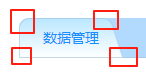
Render中,根据当前TabItem是TabControl的第一个、最后一个、中间部分,调用不同的方法绘制边框,比如绘制第一个TabItem,效果图如下:
先分析:
- 这是一个直角梯形
- 左边线是竖直直线
- 左上角是一个1/4内圆
- 右上角又是一个内圆(可按比例绘制)
- 右边线是带斜率的斜线
- 左下角和右下角可带外圆弧
边框绘制代码如下:
private static void DrawTopFirstTabItemBorder(StreamGeometryContext ctx, Rect adjustedRect, CornerRadius radius,
    Rect rect)
{
    var x = adjustedRect.Left;
    var y = adjustedRect.Bottom;

    // 左下角开始
    ctx.BeginFigure(new Point(x, y), isFilled: true);

    // 左下角外圆
    if (radius.BottomLeft > 0)
    {
        x = rect.Left + radius.BottomLeft;
        y = adjustedRect.Bottom - radius.BottomLeft;
        ctx.ArcTo(
            new Point(x, y),
            new Size(radius.BottomLeft, radius.BottomLeft),
            0,
            false,
            SweepDirection.CounterClockwise);
    }

    // 左边直线
    y = adjustedRect.Top + radius.TopLeft;
    ctx.LineTo(new Point(x, y));

    // 左上角内圆角
    if (radius.TopLeft > 0)
    {
        x += radius.TopLeft;
        y = adjustedRect.Top;
        ctx.ArcTo(
            new Point(x, y),
            new Size(radius.TopLeft, radius.TopLeft),
            0,
            false,
            SweepDirection.Clockwise);
    }

    // 上边直线
    x = adjustedRect.Right - radius.TopRight * 2 - radius.BottomRight * 2;
    ctx.LineTo(new Point(x, y));

    // 右上角内圆角
    if (radius.TopRight > 0)
    {
        x += radius.TopRight;
        y += radius.TopRight * DiagonalFilletRatio;
        ctx.ArcTo(
            new Point(x, y),
            new Size(radius.TopRight, radius.TopRight),
            0,
            false,
            SweepDirection.Clockwise);
    }

    // 右边斜线
    x = adjustedRect.Right - radius.BottomRight;
    y = adjustedRect.Bottom - radius.BottomRight;
    ctx.LineTo(new Point(x, y));

    // 右下角外圆
    if (radius.BottomRight > 0)
    {
        x = rect.Right;
        y = adjustedRect.Bottom;
        ctx.ArcTo(
            new Point(x, y),
            new Size(radius.BottomRight, radius.BottomRight),
            0,
            false,
            SweepDirection.CounterClockwise);
    }
}
通过StreamGeometryContext调用LineTo方法绘制直线,调用ArcTo方法绘制圆弧(内圆、外圆),各种风格的边框都能画了,最后一个TabItem、中间的TabItem绘制方法类似了。
Edge的TabItem效果好实现了吧?

总结
本文只说个大概,大家可以看具体的实现代码,举一反三,其他控件效果可以使用类似的方式实现。
仓库:
CodeWF.AvaloniaControls:https://github.com/dotnet9/CodeWF.AvaloniaControls
CodeF.ToolBox:https://github.com/dotnet9/CodeWF.Toolbox