
Wpf Design And Animation Lab
这是一个 WPF 项目,用于创作及收集一些好玩的设计和动画。目前已有数十个 Demo,部分 Demo 有相关博客介绍详细的实现步骤和原理:
通过这些博客,你将会了解到如何实现一些酷酷的 WPF 动画和设计,以及一些 WPF 的技术细节。
1. 已实现的设计和动画
1.1 使用三种方式实现弧形进度条
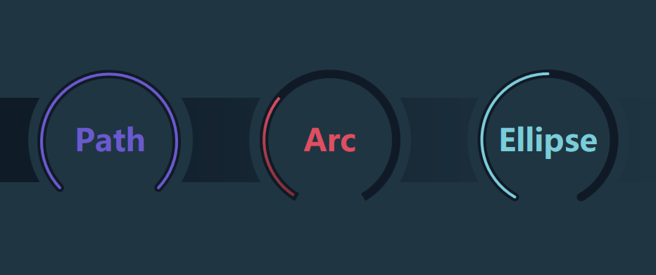
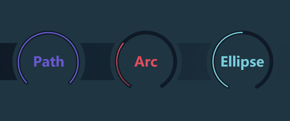
实现弧形进度条的方案有很多种,通过用 Path 和 ArcSegment、Arc、Ellipse 这三个方案,可以了解各种 Shape 的基本用法。
1.2 仅用 Rectangle 实现圆柱形进度条
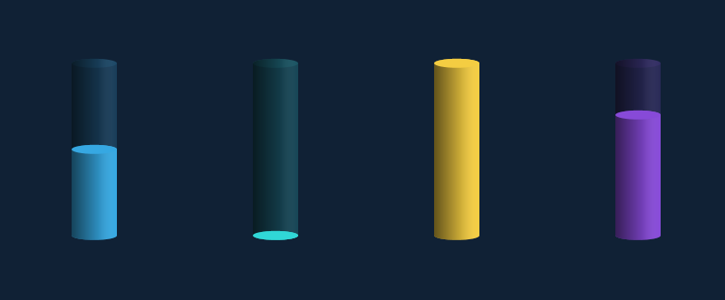
圆柱形进度条不难实现,不过有趣的是上图完全由代表矩形的 Rectangle 组成,这稍微有点反直觉。
首先我们需要重温一些基础知识:Rectangle 显示带圆角的矩形。用 RadiusX 和 RadiusY 可分别指定用于使矩形的角变圆的椭圆的 X 轴和 Y 轴半径。
如下面这个例子,可以看到 RadiusX="50" RadiusY="20" 的 Rectangle 的圆角和 Width="100" Height="40" 的 Ellipse (X 轴半径 50,Y 轴半径 20 )完全重合在一起。
<Rectangle  Height="100"
            Width="100"
            Fill="#FF7E9EC0"
            Stroke="#FFFF0EC4"
            StrokeThickness="5"
            RadiusX="50"
            RadiusY="20" />
<Ellipse HorizontalAlignment="Left"
         VerticalAlignment="Top"
         StrokeThickness="5"
         Stroke="Yellow"
         Fill="Red"
         Width="100"
         Height="40"
         Opacity="0.5" />
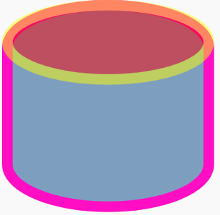
现在我们把上面的 Rectangle 拉长,就成了圆柱的基本形状;反过来将它压扁,就成了圆柱的截面。再把它们设置成半透明的,就成了圆柱形进度条的背景:

<Grid.Resources>
   <Style TargetType="Rectangle">
       <Setter Property="Fill" Value="#36a8e2" />
       <Setter Property="RadiusX" Value="25" />
       <Setter Property="RadiusY" Value="5" />
   </Style>
</Grid.Resources>
<Rectangle Opacity="0.2" />
<Rectangle Height="10"
          VerticalAlignment="Top"
          Opacity="0.1" />
之后再添加一层半透明的渐变,以及另一个截面,就完成了圆柱形的进度条。
1.3 玩玩彩虹文字及动画
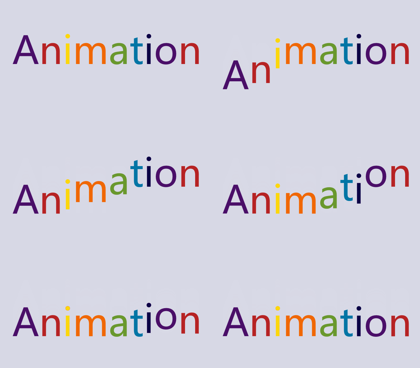
用 ItemsControl 拆分文字实现彩虹文字是一个很好玩的方案,因为可以对每个文字做不同的变形和动画,实现很多种玩法。首先,因为 string 是个集合,其实它可以用作 ItemsControl 的 ItemsSource。但在 Xaml 上直接写 ItemsSource="somestring"` 会报错,可以用 ContentControl 包装一下,写成这样:
<ContentControl Content="ItemsControl" >
    <ContentControl.Template>
        <ControlTemplate TargetType="ContentControl">
            <ItemsControl ItemsSource="{TemplateBinding Content}" >
            </ItemsControl>
        </ControlTemplate>
    </ContentControl.Template>
</ContentControl>
然后设置 ItemsControl 的 ItemsPanel,让内容横向排列;设置 DataTemplate,让拆分后的字符显示在 TextBlock 上:
<ItemsControl ItemsSource="{TemplateBinding Content}" >
    <ItemsControl.ItemsPanel>
        <ItemsPanelTemplate>
            <StackPanel Orientation="Horizontal" />
        </ItemsPanelTemplate>
    </ItemsControl.ItemsPanel>
    <ItemsControl.ItemTemplate>
        <DataTemplate>
            <TextBlock Text="{Binding}" />
        </DataTemplate>
    </ItemsControl.ItemTemplate>
</ItemsControl>
接下来,为了让每个字符显示不同的颜色,需要实现一个 Collection 类并在 Xaml 上实例化它,将用到的颜色放进去:
<common:RepeatCollection x:Key="RepeatCollection">
    <SolidColorBrush>#4a0e68</SolidColorBrush>
    <SolidColorBrush>#b62223</SolidColorBrush>
    <SolidColorBrush>#fdd70c</SolidColorBrush>
    <SolidColorBrush>#f16704</SolidColorBrush>
    <SolidColorBrush>#69982d</SolidColorBrush>
    <SolidColorBrush>#0075a5</SolidColorBrush>
    <SolidColorBrush>#0b0045</SolidColorBrush>
</common:RepeatCollection>
这个 RepeatCollection 的代码如下,它其实是个循环队列,每次调用 Next 的 getter 方法就拿下一个元素(叫 CircleCollection 会不会好些?):
public class RepeatCollection : Collection<object>
{
    private int _offset;

    public object Next
    {
        get
        {
            if (this.Count == 0)
                return null;

            var result = this[_offset];
            _offset++;
            if (_offset > this.Count - 1)
                _offset = 0;

            return result;
        }
    }
}
最后,TextBlock 的 Foreground 绑定到集合的 Next 属性,实现每一个 TextBlock 都使用不同的颜色:
<TextBlock Foreground="{Binding Next, Source={StaticResource RepeatCollection}}" Text="{Binding}" />

修改一下上面的代码,就可以实现彩虹文字的动画:
1.4 制作一个彩虹按钮
将 LinearGradientBrush 应用在文字上,文字就变成了彩虹色。如果两个 GradientStop 之间 Color 相同就不会发生渐变,如果两个 GradientStop 之间 Offset 就会马上变。利用这种手法,再加上我使用了等宽字体,所以可以制造出每个字颜色不一样的彩虹文字:
<LinearGradientBrush x:Name="RainbowBrush" StartPoint="0,0.5" EndPoint="1,.5">
    <GradientStop x:Name="G1" Offset="0" Color="#65b849" />
    <GradientStop x:Name="G2" Offset=".166" Color="#65b849" />
    <GradientStop x:Name="G3" Offset=".166" Color="#f7b423" />
    <GradientStop x:Name="G4" Offset=".3333" Color="#f7b423" />
    <GradientStop x:Name="G5" Offset="0.3333" Color="#f58122" />
    <GradientStop x:Name="G6" Offset="0.5" Color="#f58122" />
    <GradientStop x:Name="G7" Offset="0.5" Color=" #f8f8f8" />
    <GradientStop x:Name="G8" Offset="0.5" Color=" #f8f8f8" />
    <GradientStop x:Name="G9" Offset="0.50" Color="#de3a3c" />
    <GradientStop x:Name="G10" Offset="0.666" Color="#de3a3c" />
    <GradientStop x:Name="G11" Offset="0.666" Color="#943f96" />
    <GradientStop x:Name="G12" Offset="0.8633" Color="#943f96" />
    <GradientStop x:Name="G13" Offset="0.8633" Color="#009fd9" />
    <GradientStop x:Name="G14" Offset="01" Color="#009fd9" />
</LinearGradientBrush>

在 MouseOver 的 Storyboard 里控制 LinearGradientBrush 改变方向。有两种方式可以改变它的方向,其中一种是用 PointAnimation 改变 StartPoint 和 EndPoint,另一种是用 DoubleAnimation 直接改变 LinearGradientBrush.RelativeTransform。后一种的写法如下:
<Storyboard>
    <DoubleAnimation Storyboard.TargetName="textBlock"
                     Storyboard.TargetProperty="(TextBlock.Foreground).(Brush.RelativeTransform).(RotateTransform.Angle)"
                     To="90"
                     Duration="0:0:0.5">
        <DoubleAnimation.EasingFunction>
            <QuarticEase EasingMode="EaseOut" />
        </DoubleAnimation.EasingFunction>
    </DoubleAnimation>
</Storyboard>


<LinearGradientBrush x:Name="RainbowBrush" StartPoint="0,0.5" EndPoint="1,.5">
    <LinearGradientBrush.RelativeTransform>
        <RotateTransform Angle="0" CenterX="0.5" CenterY="0.5" />
    </LinearGradientBrush.RelativeTransform>
运行起来的效果就是将所有颜色旋转 90 度,看起来就像以前的 Apple 的 Logo 配色。在上面的 LinearGradientBrush 里,我偷偷藏了两个白色的 GradientStop (名为 G6 和 G7 那两个),它们的 Offset 都是 0.5,处于正中间的位置。在按钮的 Pressed 状态中,用 DoubleAnimation 将它们前后的所有 GradientStop 的 Offset 都设置为 0 或 1,效果是将所有颜色向两边推。因为现在旋转了 90 度,所以实际上是向上下两个方向推:

1.5 实现两个任天堂 Switch 的加载动画
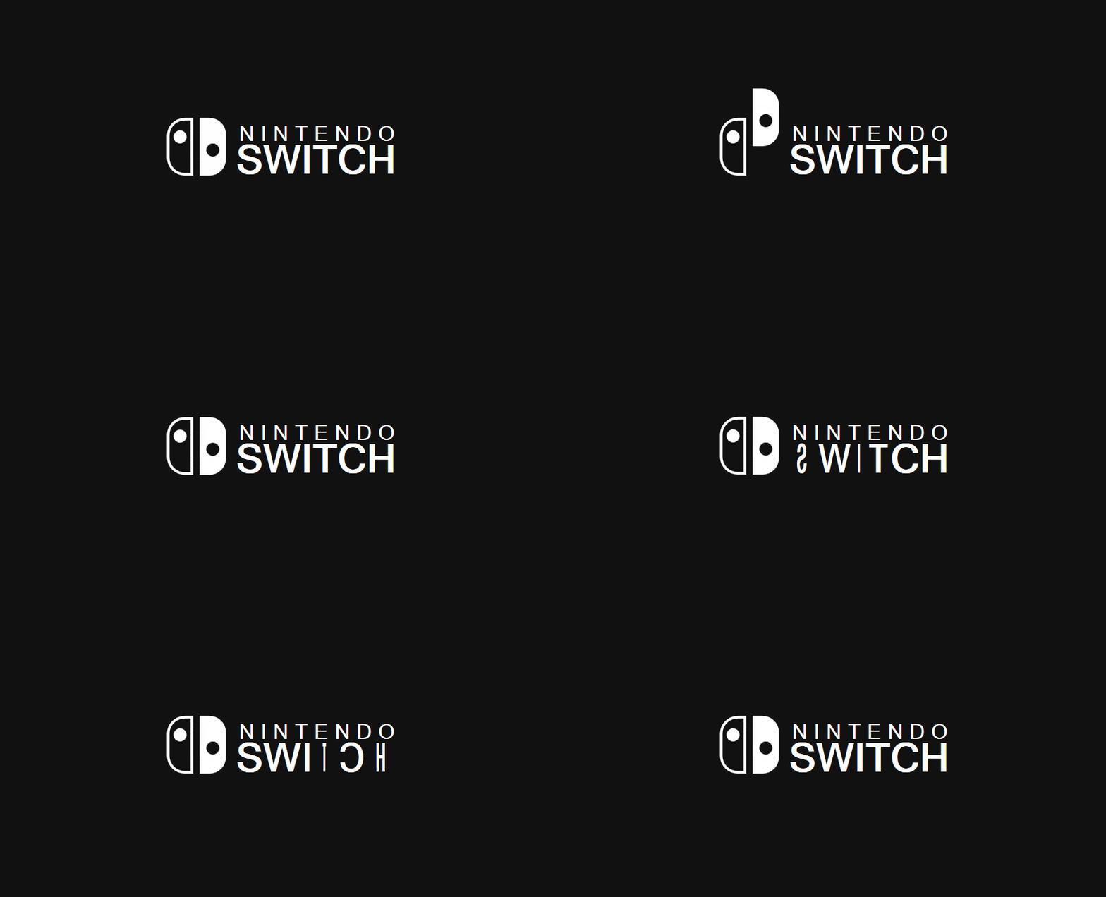
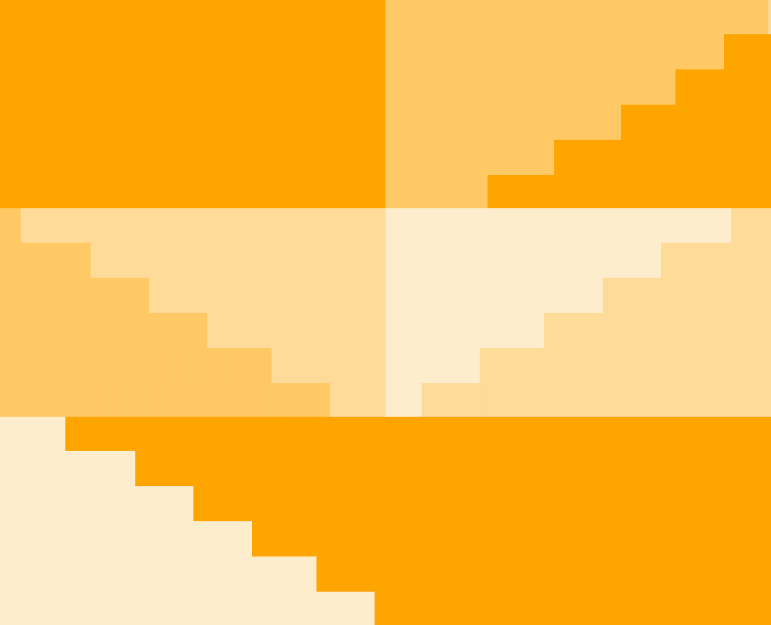
用拆分文字和 TimeSpanIncreaser 的方案,实现了两个在任天堂 Switch 中最常见的动画。
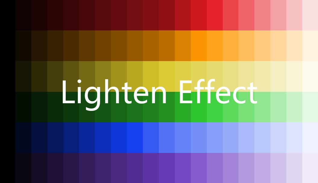
1.6 使用 Shazzam Shader Editor 编写一个 Lighten Effect
在上面的动画里为了实现不同亮度的 Grid,使用了一个 LightenConverter 类,但是它只能处理 SolidColorBrush。为了可以应用在更多场合,接下来自己写一个 Effect 来实现相同 Lighten 的效果。
1.7 实现 WPF 的 Inner Shadow
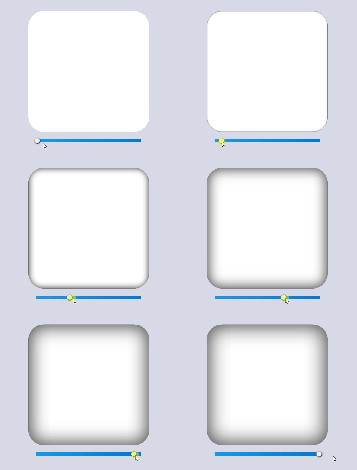
在 WPF 中,我们通常用 DropShadow 做阴影效果,但都是做外阴影。内阴影(Inner Shadow)的话其实也不是不可以,就是有些曲折。实现内阴影的方案有几种,其中我最喜欢用另一个元素的 VisualBrush 来做 OpacityMask 的方案。
<Grid Width="100"
      Height="100"
      Margin="10">
    <Rectangle x:Name="Rectangle2"
               Fill="White"
               RadiusX="8"
               RadiusY="8" />
    <Border Margin="0">
        <Border.Effect>
            <DropShadowEffect BlurRadius="8" ShadowDepth="0" />
        </Border.Effect>
        <ContentControl HorizontalAlignment="Center"
                        VerticalAlignment="Center"
                        Content="OpacityMask" />
    </Border>
    <Grid.OpacityMask>
        <VisualBrush Stretch="None" Visual="{Binding ElementName=Rectangle2}" />
    </Grid.OpacityMask>
</Grid>
但这样做出来的阴影都不会太粗,如果需要更大更粗的内阴影,可以使用一个负数的 Margin 配合同样粗细的 BorderThickness 实现。以 OpacityMask 的方案为例,用下面的代码可以做个又粗又大的内阴影:
private void Slider_ValueChanged(object sender, RoutedPropertyChangedEventArgs<double> e)
{
    ShadowElement.Margin = new Thickness(-e.NewValue);
    ShadowElement.BorderThickness = new Thickness(e.NewValue);
    (ShadowElement.Effect as DropShadowEffect).BlurRadius = e.NewValue * 2;
}
1.8 用 OpacityMask 模仿 UWP 的 Text Shimmer 动画
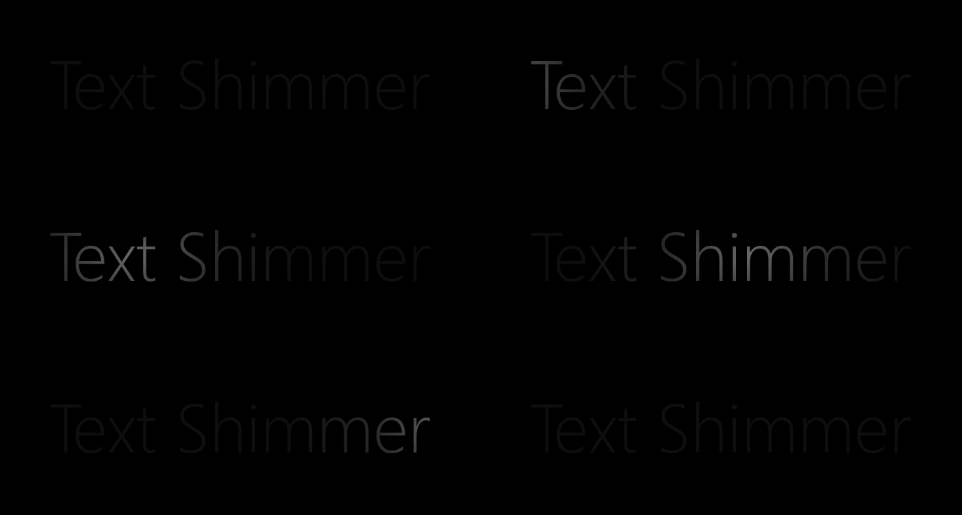
在 UWP 的 Windows Composition Samples 中有一个 Text Shimmer 动画,它用于展示如何使用 Composition Light。这个动画很简单,就是用 PointLight 从左到右扫过一行文字。虽然 WPF 没有 Composition Light,但要玩这个简单的动画任然没问题,就是用 OpacityMask 模仿一下而已。
RadialGradientBrush 代表一个圆形的渐变画刷,在这里我们要关心它的三个属性:
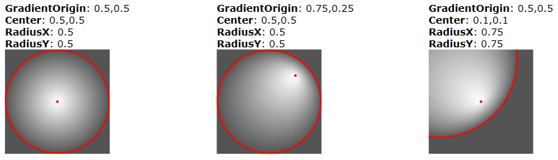
RadiusX/RadiusY: 圆形的水平/垂直半径。 Center: 圆形的最外围的中心。 GradientOrigin: 渐变开始的二位焦点的位置。
这三个属性的作用可以参考下图:
用一个 RadialGradientBrush 作为 OpacityMask 让 TextBlock 从中心点向外渐渐变得透明:
<TextBlock HorizontalAlignment="Center"
           VerticalAlignment="Center"
           FontFamily="SegoeUI"
           FontSize="100"
           FontWeight="Thin"
           Foreground="DimGray"
           Text="Text Shimmer">
    <TextBlock.OpacityMask>
        <RadialGradientBrush x:Name="Brush" Center=".5,.5" GradientOrigin=".5,.5" RadiusX=".43" RadiusY="2">
            <GradientStop Color="Black" />
            <GradientStop Offset=".5" Color="#6000" />
            <GradientStop Offset="1" Color="#2000" />
        </RadialGradientBrush>
    </TextBlock.OpacityMask>
</TextBlock>
然后对 Center 和 GradientOrigin 做 PointAnimation,实现 OpacityMask 的水平移动,就可以模仿出 PointLight 扫过的效果:
<PointAnimation RepeatBehavior="Forever"
                Storyboard.TargetName="Brush"
                Storyboard.TargetProperty="Center"
                From="-2,.5"
                To="3,.5"
                Duration="0:0:3.3" />
<PointAnimation RepeatBehavior="Forever"
                Storyboard.TargetName="Brush"
                Storyboard.TargetProperty="GradientOrigin"
                From="-2,.5"
                To="3,.5"
                Duration="0:0:3.3" />
1.9 抄一个 CSS3 实现的按钮
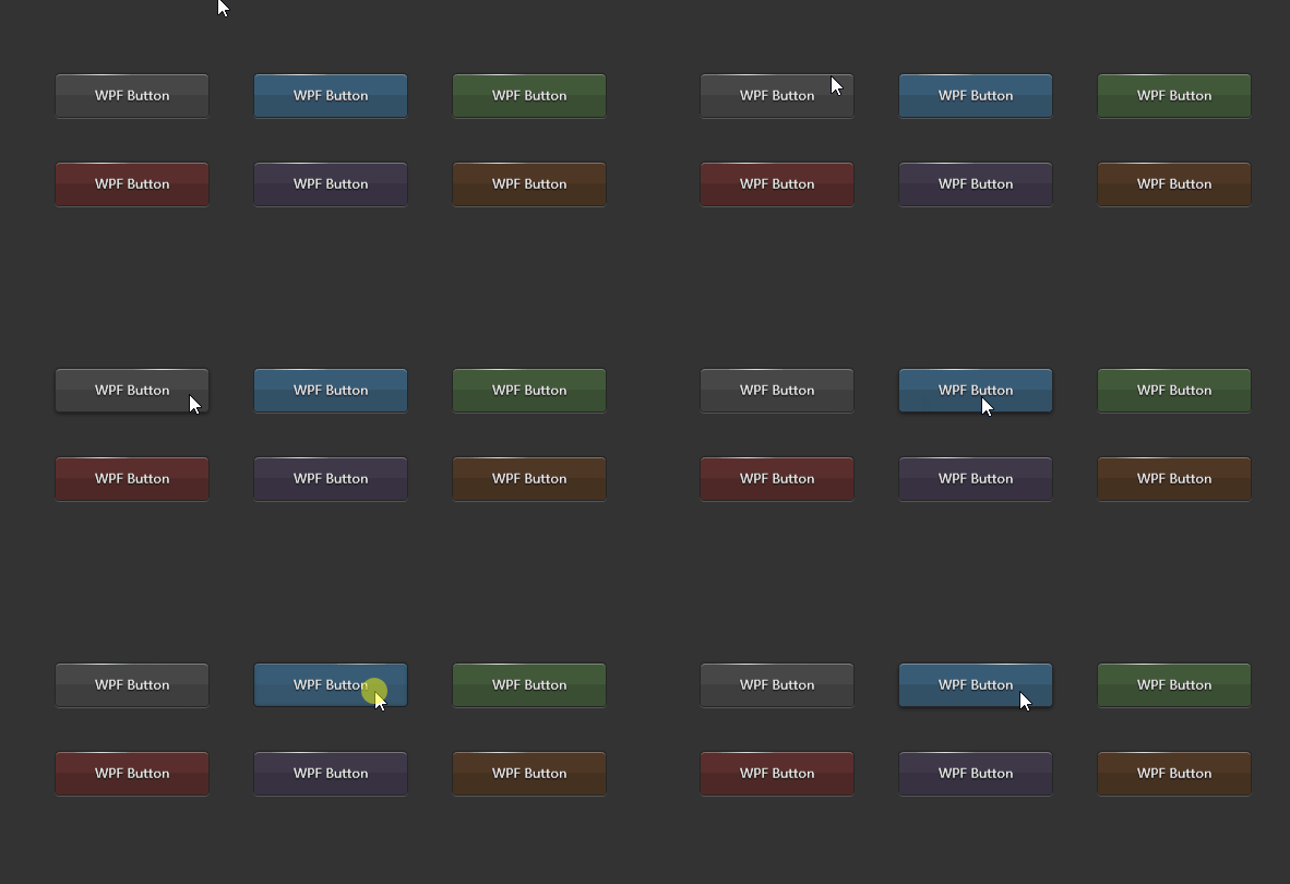
抄一个 CSS3 实现的按钮,顺便熟习下 CSS3。
1.10 用 Effect 实现线条光影效果
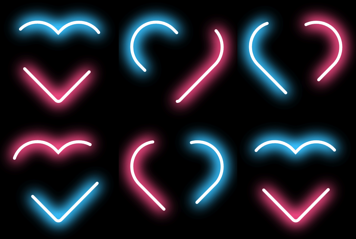
为了实现这个效果我用到这些知识和技巧:
- Segoe Fluent 图标字体
- 在 Blend 中创建 Path
- 计算 Path 的长途
- Path 的边框动画
- VisualStudio 的设计时数据支持
- 自定义 Effect
2. License
The project is released under MIT License.
3. UWP 的版本
另外,我有另一个用于玩 UWP 动画的项目:
https://github.com/DinoChan/uwp_design_and_animation_lab

转载自 GitHub
作者:dino.c
仓库地址:https://github.com/DinoChan/wpf_design_and_animation_lab