
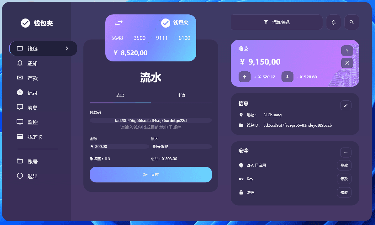
阅读目录
- 效果展示
- 准备
- 简单说明 + 源码
- 结尾(视频及源码仓库)
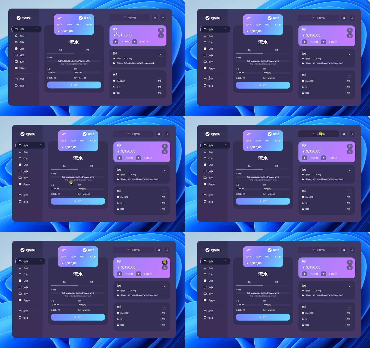
1. 效果展示
欣赏效果:
2. 准备
创建一个 WPF 工程,比如站长使用 .NET 7 创建名为 WalletPayment 的 WPF 项目。
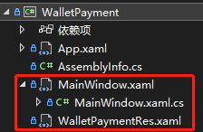
这次我们不添加任何图片,只添加了一个 NuGet 包 MaterialDesignThemes:
<PackageReference Include="MaterialDesignThemes" Version="4.6.0-ci176" />
原文作者使用的
FontAwesome.WPF作为图标库,但该库自 17 年起就没升级了,对.NET 5\6\7 编译有不兼容提示
已使用“.NETFramework,Version=v4.6.1, .NETFramework,Version=v4.6.2, .NETFramework,Version=v4.7, .NETFramework,Version=v4.7.1, .NETFramework,Version=v4.7.2, .NETFramework,Version=v4.8”而不是项目目标框架“net7.0-windows7.0”还原包“FontAwesome.WPF 4.7.0.9”。此包可能与项目不完全兼容。
对于上文 《WPF|如何在 WPF 中设计漂亮的社交媒体信息仪表板》 使用到的该图标库站长也做了修改(仓库链接)。
3. 简单说明 + 源码
该仪表盘整体配色和布局非常优秀,给出几张站长觉得不错的部分截图:
左侧菜单
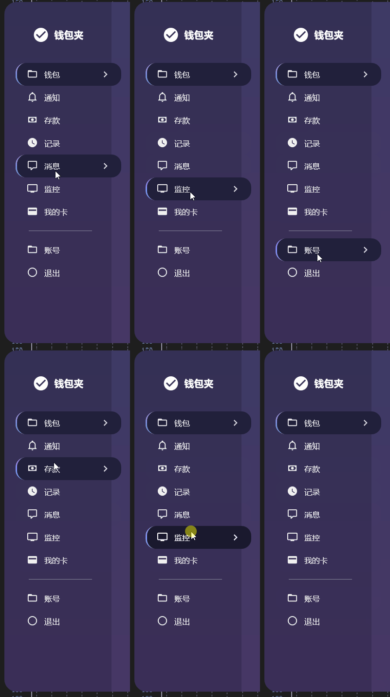
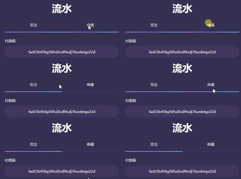
按钮切换
MainWindow.xaml
界面的整体布局都在这个文件内:
<Window x:Class="WalletPayment.MainWindow"
xmlns="http://schemas.microsoft.com/winfx/2006/xaml/presentation"
xmlns:x="http://schemas.microsoft.com/winfx/2006/xaml"
xmlns:d="http://schemas.microsoft.com/expression/blend/2008"
xmlns:mc="http://schemas.openxmlformats.org/markup-compatibility/2006"
xmlns:materialDesign="http://materialdesigninxaml.net/winfx/xaml/themes"
mc:Ignorable="d"
WindowStartupLocation="CenterScreen"
WindowStyle="None"
AllowsTransparency="True"
Background="Transparent"
Height="700"
Width="1180">
<Window.Resources>
<ResourceDictionary>
<ResourceDictionary.MergedDictionaries>
<ResourceDictionary Source="pack://application:,,,/WalletPayment;component/WalletPaymentRes.xaml" />
</ResourceDictionary.MergedDictionaries>
</ResourceDictionary>
</Window.Resources>
<Grid>
<!--Grid Background-->
<Grid>
<Grid.ColumnDefinitions>
<ColumnDefinition Width="auto" />
<ColumnDefinition Width="*" />
</Grid.ColumnDefinitions>
<Border CornerRadius="25 0 0 25" Width="220">
<Border.Background>
<LinearGradientBrush StartPoint="0,0" EndPoint="0,1">
<GradientStop Color="#343155" Offset="0" />
<GradientStop Color="#3B2E58" Offset="1" />
</LinearGradientBrush>
</Border.Background>
</Border>
<Border CornerRadius="0 25 25 0" MouseDown="Border_MouseDown" Grid.Column="1">
<Border.Background>
<LinearGradientBrush StartPoint="0,0" EndPoint="0,1">
<GradientStop Color="#3E3A65" Offset="0" />
<GradientStop Color="#473765" Offset="1" />
</LinearGradientBrush>
</Border.Background>
</Border>
</Grid>
<!--Grid Controls-->
<Grid>
<Grid.ColumnDefinitions>
<ColumnDefinition Width="auto" />
<ColumnDefinition Width="*" />
<ColumnDefinition Width="*" />
</Grid.ColumnDefinitions>
<!--Main Menu-->
<StackPanel Width="240">
<StackPanel Orientation="Horizontal" Margin="0 50 20 40" HorizontalAlignment="Center">
<materialDesign:PackIcon Kind="CheckCircle" Foreground="White" Width="35" Height="35" />
<TextBlock Text="钱包夹" FontWeight="Bold" FontSize="20" VerticalAlignment="Center" Margin="10 0 0 0"
Foreground="#FFFFFF" />
</StackPanel>
<Button Style="{StaticResource activeMenuButton}">
<Grid>
<StackPanel Orientation="Horizontal" HorizontalAlignment="Left">
<materialDesign:PackIcon Kind="FolderOutline" Style="{StaticResource buttonIcon}" />
<TextBlock Text="钱包" Style="{StaticResource buttonText}" />
</StackPanel>
<materialDesign:PackIcon Kind="ChevronRight" Visibility="Visible"
Style="{StaticResource buttonIconExpand}" />
</Grid>
</Button>
<Button Style="{StaticResource menuButton}">
<Grid>
<StackPanel Orientation="Horizontal" HorizontalAlignment="Left">
<materialDesign:PackIcon Kind="BellOutline" Style="{StaticResource buttonIcon}" />
<TextBlock Text="通知" Style="{StaticResource buttonText}" />
</StackPanel>
<materialDesign:PackIcon Name="sal" Kind="ChevronRight"
Style="{StaticResource buttonIconExpand}" />
</Grid>
</Button>
<Button Style="{StaticResource menuButton}">
<Grid>
<StackPanel Orientation="Horizontal" HorizontalAlignment="Left">
<materialDesign:PackIcon Kind="Money" Style="{StaticResource buttonIcon}" />
<TextBlock Text="存款" Style="{StaticResource buttonText}" />
</StackPanel>
<materialDesign:PackIcon Kind="ChevronRight" Style="{StaticResource buttonIconExpand}" />
</Grid>
</Button>
<Button Style="{StaticResource menuButton}">
<Grid>
<StackPanel Orientation="Horizontal" HorizontalAlignment="Left">
<materialDesign:PackIcon Kind="Clock" Style="{StaticResource buttonIcon}" />
<TextBlock Text="记录" Style="{StaticResource buttonText}" />
</StackPanel>
<materialDesign:PackIcon Kind="ChevronRight" Style="{StaticResource buttonIconExpand}" />
</Grid>
</Button>
<Button Style="{StaticResource menuButton}">
<Grid>
<StackPanel Orientation="Horizontal" HorizontalAlignment="Left">
<materialDesign:PackIcon Kind="CommentOutline" Style="{StaticResource buttonIcon}" />
<TextBlock Text="消息" Style="{StaticResource buttonText}" />
</StackPanel>
<materialDesign:PackIcon Kind="ChevronRight" Style="{StaticResource buttonIconExpand}" />
</Grid>
</Button>
<Button Style="{StaticResource menuButton}">
<Grid>
<StackPanel Orientation="Horizontal" HorizontalAlignment="Left">
<materialDesign:PackIcon Kind="Television" Style="{StaticResource buttonIcon}" />
<TextBlock Text="监控" Style="{StaticResource buttonText}" />
</StackPanel>
<materialDesign:PackIcon Kind="ChevronRight" Style="{StaticResource buttonIconExpand}" />
</Grid>
</Button>
<Button Style="{StaticResource menuButton}">
<Grid>
<StackPanel Orientation="Horizontal" HorizontalAlignment="Left">
<materialDesign:PackIcon Kind="CreditCard" Style="{StaticResource buttonIcon}" />
<TextBlock Text="我的卡" Style="{StaticResource buttonText}" />
</StackPanel>
<materialDesign:PackIcon Kind="ChevronRight" Style="{StaticResource buttonIconExpand}" />
</Grid>
</Button>
<Separator Background="#e0e0e0" Opacity="0.5" Margin="50 15 60 15" />
<Button Style="{StaticResource menuButton}">
<Grid>
<StackPanel Orientation="Horizontal" HorizontalAlignment="Left">
<materialDesign:PackIcon Kind="FolderOutline" Style="{StaticResource buttonIcon}" />
<TextBlock Text="账号" Style="{StaticResource buttonText}" />
</StackPanel>
<materialDesign:PackIcon Kind="ChevronRight" Style="{StaticResource buttonIconExpand}" />
</Grid>
</Button>
<Button Style="{StaticResource menuButton}">
<Grid>
<StackPanel Orientation="Horizontal" HorizontalAlignment="Left">
<materialDesign:PackIcon Kind="CircleOutline" Style="{StaticResource buttonIcon}" />
<TextBlock Text="退出" Style="{StaticResource buttonText}" />
</StackPanel>
<materialDesign:PackIcon Kind="ChevronRight" Style="{StaticResource buttonIconExpand}" />
</Grid>
</Button>
</StackPanel>
<!--Transaction Panel-->
<Grid Grid.Column="1">
<!--Transfer Panel-->
<Border Style="{StaticResource border}" Margin="20 120 20 20">
<StackPanel Margin="10 88 10 20">
<TextBlock Text="流水" Foreground="#fcfcfc" TextAlignment="Center" FontSize="34"
FontWeight="SemiBold" />
<Grid Margin="0 12 0 22">
<Grid.ColumnDefinitions>
<ColumnDefinition Width="*" />
<ColumnDefinition Width="*" />
</Grid.ColumnDefinitions>
<Button Style="{StaticResource activeTabButton}" Content="支出" />
<Button Style="{StaticResource tabButton}" Content="申请" Grid.Column="1" />
</Grid>
<TextBlock Text="付款码" Style="{StaticResource textLabel}" />
<TextBox Margin="0 10 0 5" Text="fad23b456g56fsd2sdf4sdj76urdetgx22d" TextAlignment="Center" />
<TextBlock Text="请输入钱包id或目的地电子邮件" FontSize="14" Foreground="#e0e0e0" TextAlignment="Center"
Opacity="0.5" Margin="0 0 0 20" />
<Grid>
<Grid.ColumnDefinitions>
<ColumnDefinition Width="*" />
<ColumnDefinition Width="*" />
</Grid.ColumnDefinitions>
<Grid.RowDefinitions>
<RowDefinition Height="auto" />
<RowDefinition Height="*" />
<RowDefinition Height="*" />
</Grid.RowDefinitions>
<TextBlock Text="金额" Style="{StaticResource textLabel}" />
<TextBox Grid.Row="1" Margin="0 10 5 20" Text="¥ 300.00" />
<TextBlock Text="原因" Style="{StaticResource textLabel}" Grid.Column="1" />
<TextBox Grid.Row="1" Grid.Column="1" Margin="5 10 0 20" Text="购买游戏" />
<TextBlock Text="手续费 : ¥3" Style="{StaticResource textLabel}" Grid.Row="2" Margin="0 4 0 3" />
<TextBlock Text="总共 : ¥303.00" Style="{StaticResource textLabel}" Grid.Row="2"
Grid.Column="1" Margin="0 4 0 3" />
</Grid>
<Button Style="{StaticResource sendButton}">
<StackPanel Orientation="Horizontal">
<materialDesign:PackIcon Kind="SendOutline" Style="{StaticResource whiteIcon}"
VerticalAlignment="Center" />
<TextBlock Text="支付" Margin="10 0 0 0" FontWeight="SemiBold" />
</StackPanel>
</Button>
</StackPanel>
</Border>
<!--Bank Card-->
<Border Style="{StaticResource cardBorder}" Margin="90 40 90 0">
<Border.Background>
<LinearGradientBrush StartPoint="0,0" EndPoint="1,1">
<GradientStop Color="#D489FF" Offset="-0.2" />
<GradientStop Color="#7985FF" Offset="0.5" />
<GradientStop Color="#6AD8FD" Offset="1" />
</LinearGradientBrush>
</Border.Background>
<Grid>
<materialDesign:PackIcon Kind="Exchange" HorizontalAlignment="Left" VerticalAlignment="Top"
Foreground="White" Opacity="0.9" Width="35" Height="35"
Margin="15 0 0 0" />
<materialDesign:PackIcon Kind="CheckCircle" HorizontalAlignment="Right" VerticalAlignment="Top"
Foreground="White" Width="35" Height="35" Margin="0 0 70 0" />
<TextBlock Text="钱包夹" FontWeight="Bold" Foreground="#FFFFFF" FontSize="16"
HorizontalAlignment="Right" VerticalAlignment="Top" Margin="0 5 15 0" />
<StackPanel Orientation="Horizontal" VerticalAlignment="Center" HorizontalAlignment="Center">
<TextBlock Text="5648" Style="{StaticResource bankCardNumber}" />
<TextBlock Text="3500" Style="{StaticResource bankCardNumber}" />
<TextBlock Text="9111" Style="{StaticResource bankCardNumber}" />
<TextBlock Text="6100" Style="{StaticResource bankCardNumber}" />
</StackPanel>
<TextBlock Text="¥ 8,520,00" Style="{StaticResource textLabel}" FontSize="20"
FontWeight="SemiBold" VerticalAlignment="Bottom" Margin="13 0 0 5" />
</Grid>
</Border>
</Grid>
<!--Info Panel-->
<StackPanel Grid.Column="2" Margin="0 0 20 0">
<!--Top Menu-->
<StackPanel Orientation="Horizontal" Margin="20 40 20 0" HorizontalAlignment="Right">
<Button Style="{StaticResource topMenuButton}" Margin="10 0 0 0" Width="300" Height="50">
<StackPanel Orientation="Horizontal">
<materialDesign:PackIcon Kind="Filter" Style="{StaticResource topMenuIcon}" />
<TextBlock Text="添加筛选" VerticalAlignment="Center" FontSize="14" Margin="8 0 0 0" />
</StackPanel>
</Button>
<Button Style="{StaticResource topMenuButton}" Margin="10 0 0 0">
<materialDesign:PackIcon Kind="BellOutline" Style="{StaticResource topMenuIcon}" />
</Button>
<Button Style="{StaticResource topMenuButton}" Margin="10 0 0 0">
<materialDesign:PackIcon Kind="Search" Style="{StaticResource topMenuIcon}" />
</Button>
</StackPanel>
<!--Info Card-->
<Border Style="{StaticResource cardBorder}" Margin="20 31 20 0">
<Border.Background>
<LinearGradientBrush StartPoint="0,0" EndPoint="1,1">
<GradientStop Color="#9D85FA" Offset="0" />
<GradientStop Color="#C77AFF" Offset="1" />
</LinearGradientBrush>
</Border.Background>
<Grid>
<TextBlock Text="收支" Style="{StaticResource textLabel}" VerticalAlignment="Top"
Margin="15 8 0 0" FontSize="16" FontWeight="SemiBold" />
<TextBlock Text="¥ 9,150,00" Style="{StaticResource textLabel}" FontSize="24"
FontWeight="SemiBold" VerticalAlignment="Center" Margin="15 0 0 10" />
<StackPanel VerticalAlignment="Top" HorizontalAlignment="Right" Margin="0 8 10 0">
<Button Style="{StaticResource fillButton}">
<materialDesign:PackIcon Kind="Renminbi" Style="{StaticResource whiteIcon}" />
</Button>
<Button Style="{StaticResource fillButton}" Margin="0 5 0 0">
<materialDesign:PackIcon Kind="Percent" Style="{StaticResource whiteIcon}" />
</Button>
</StackPanel>
<StackPanel Orientation="Horizontal" VerticalAlignment="Bottom" Margin="15 0 0 5">
<Button Style="{StaticResource fillButton}">
<materialDesign:PackIcon Kind="ArrowUpBold" Style="{StaticResource whiteIcon}" />
</Button>
<TextBlock Text="+ ¥ 620.12" Style="{StaticResource textLabel}" Margin="10 0 20 0"
FontWeight="SemiBold" VerticalAlignment="Center" />
<Button Style="{StaticResource fillButton}">
<materialDesign:PackIcon Kind="ArrowDownBold" Style="{StaticResource whiteIcon}" />
</Button>
<TextBlock Text="- ¥ 920.60" Style="{StaticResource textLabel}" Margin="10 0 0 0"
FontWeight="SemiBold" VerticalAlignment="Center" />
</StackPanel>
</Grid>
</Border>
<!--Information Card-->
<Border Style="{StaticResource border}" Margin="20">
<Grid Margin="15 13">
<Grid.ColumnDefinitions>
<ColumnDefinition Width="auto" />
<ColumnDefinition Width="auto" />
<ColumnDefinition Width="*" />
</Grid.ColumnDefinitions>
<Grid.RowDefinitions>
<RowDefinition Height="*" />
<RowDefinition Height="*" />
<RowDefinition Height="*" />
</Grid.RowDefinitions>
<TextBlock Text="信息" Foreground="#fcfcfc" FontSize="16" FontWeight="SemiBold"
Grid.ColumnSpan="3" Margin="0 0 0 18" />
<Button Style="{StaticResource button}" HorizontalAlignment="Right" VerticalAlignment="Top"
Grid.ColumnSpan="3">
<materialDesign:PackIcon Kind="Edit" Style="{StaticResource whiteIcon}" Width="14"
Height="14" />
</Button>
<materialDesign:PackIcon Kind="MapMarker" Style="{StaticResource whiteIcon}" Grid.Row="1"
VerticalAlignment="Top" />
<materialDesign:PackIcon Kind="Folder" Style="{StaticResource whiteIcon}" Grid.Row="2"
VerticalAlignment="Top" />
<TextBlock Text="地址 :" Style="{StaticResource textLabel}" Grid.Column="1" Grid.Row="1"
Margin="10 0 10 18" />
<TextBlock Text="钱包ID :" Style="{StaticResource textLabel}" Grid.Column="1" Grid.Row="2"
Margin="10 0 10 0" />
<TextBlock Text="Si Chuang" Style="{StaticResource textLabel}" Grid.Column="2" Grid.Row="1" />
<TextBlock Text="3d2csd9ut7fvcepr65v83ndeyqt89bczb" Style="{StaticResource textLabel}"
Grid.Column="2" Grid.Row="2" />
</Grid>
</Border>
<!--Security Card-->
<Border Style="{StaticResource border}" Margin="20 0 20 0">
<Grid Margin="15 10">
<Grid.ColumnDefinitions>
<ColumnDefinition Width="auto" />
<ColumnDefinition Width="auto" />
<ColumnDefinition Width="*" />
</Grid.ColumnDefinitions>
<Grid.RowDefinitions>
<RowDefinition Height="*" />
<RowDefinition Height="*" />
<RowDefinition Height="*" />
<RowDefinition Height="*" />
</Grid.RowDefinitions>
<TextBlock Text="安全" Foreground="#fcfcfc" FontWeight="SemiBold" FontSize="16"
Grid.ColumnSpan="3" Margin="0 0 0 15" />
<Button Style="{StaticResource button}" HorizontalAlignment="Right" VerticalAlignment="Top"
Grid.ColumnSpan="3">
<materialDesign:PackIcon Kind="MoreHoriz" Style="{StaticResource whiteIcon}" Width="14"
Height="14" />
</Button>
<materialDesign:PackIcon Kind="Shield" Style="{StaticResource whiteIcon}" Grid.Row="1"
VerticalAlignment="Center" />
<materialDesign:PackIcon Kind="Key" Style="{StaticResource whiteIcon}" Grid.Row="2"
VerticalAlignment="Center" />
<materialDesign:PackIcon Kind="Lock" Style="{StaticResource whiteIcon}" Grid.Row="3"
VerticalAlignment="Center" />
<TextBlock Text="2FA 已启用" Style="{StaticResource textLabel}" Grid.Column="1" Grid.Row="1"
Margin="10 0 0 0" VerticalAlignment="Center" />
<TextBlock Text="Key" Style="{StaticResource textLabel}" Grid.Column="1" Grid.Row="2"
Margin="10 0 0 0" VerticalAlignment="Center" />
<TextBlock Text="密码" Style="{StaticResource textLabel}" Grid.Column="1" Grid.Row="3"
Margin="10 0 0 0" VerticalAlignment="Center" />
<Button Style="{StaticResource button}" HorizontalAlignment="Right" VerticalAlignment="Center"
Grid.Column="2" Grid.Row="1" Content="修改" Margin="0 5 0 5" />
<Button Style="{StaticResource button}" HorizontalAlignment="Right" VerticalAlignment="Center"
Grid.Column="2" Grid.Row="2" Content="修改" Margin="0 5 0 5" />
<Button Style="{StaticResource button}" HorizontalAlignment="Right" VerticalAlignment="Center"
Grid.Column="2" Grid.Row="3" Content="修改" Margin="0 5 0 5" />
</Grid>
</Border>
</StackPanel>
</Grid>
</Grid>
</Window>
MainWindow.xaml.cs
就一个窗体拖动方式:
using System.Windows;
using System.Windows.Input;

namespace WalletPayment;

public partial class MainWindow : Window
{
    public MainWindow()
    {
        InitializeComponent();
    }

    private void Border_MouseDown(object sender, MouseButtonEventArgs e)
    {
        if (e.ChangedButton == MouseButton.Left)
            DragMove();
    }
}
WalletPaymentRes.xaml
资源文件,界面的所有按钮、图标、文本等的样式全在这个文件:
<ResourceDictionary xmlns="http://schemas.microsoft.com/winfx/2006/xaml/presentation"
                    xmlns:x="http://schemas.microsoft.com/winfx/2006/xaml"
                    xmlns:materialDesign="http://materialdesigninxaml.net/winfx/xaml/themes">

    <Style x:Key="menuButton" TargetType="Button">
        <Setter Property="Height" Value="47" />
        <Setter Property="Width" Value="217" />
        <Setter Property="Background" Value="Transparent" />
        <Setter Property="Foreground" Value="#f0f0f0" />
        <Setter Property="Margin" Value="0 0 0 0" />
        <Setter Property="FocusVisualStyle" Value="{x:Null}" />
        <Setter Property="HorizontalAlignment" Value="Right" />
        <Setter Property="Template">
            <Setter.Value>
                <ControlTemplate TargetType="{x:Type Button}">
                    <Border Background="{TemplateBinding Background}" CornerRadius="20" Padding="20 0 20 0"
                            BorderThickness="3 0 0 0" BorderBrush="Transparent">
                        <ContentPresenter HorizontalAlignment="Stretch" VerticalAlignment="Center" />
                    </Border>
                </ControlTemplate>
            </Setter.Value>
        </Setter>
        <Style.Triggers>
            <Trigger Property="IsMouseOver" Value="True">
                <Setter Property="Background" Value="#21203b" />
                <Setter Property="Foreground" Value="#e9e9e9" />
                <Setter Property="Template">
                    <Setter.Value>
                        <ControlTemplate TargetType="{x:Type Button}">
                            <Border Background="{TemplateBinding Background}" CornerRadius="20" Padding="20 0 20 0"
                                    BorderThickness="3 0 0 0">
                                <Border.BorderBrush>
                                    <LinearGradientBrush StartPoint="0.5,0" EndPoint="0.5,1">
                                        <GradientStop Color="#D489FF" Offset="0" />
                                        <GradientStop Color="#7985FF" Offset="0.5" />
                                        <GradientStop Color="#6AD8FD" Offset="1" />
                                    </LinearGradientBrush>
                                </Border.BorderBrush>
                                <ContentPresenter HorizontalAlignment="Stretch" VerticalAlignment="Center" />
                            </Border>
                        </ControlTemplate>
                    </Setter.Value>
                </Setter>
            </Trigger>
            <Trigger Property="IsMouseCaptured" Value="True">
                <Setter Property="Background" Value="#1a192e" />
                <Setter Property="Foreground" Value="White" />
            </Trigger>
        </Style.Triggers>
    </Style>


    <Style x:Key="activeMenuButton" TargetType="Button" BasedOn="{StaticResource menuButton}">
        <Setter Property="Background" Value="#21203b" />
        <Setter Property="Foreground" Value="#e9e9e9" />
        <Setter Property="Template">
            <Setter.Value>
                <ControlTemplate TargetType="{x:Type Button}">
                    <Border Background="{TemplateBinding Background}" CornerRadius="20" Padding="20 0 20 0"
                            BorderThickness="3 0 0 0">
                        <Border.BorderBrush>
                            <LinearGradientBrush StartPoint="0.5,0" EndPoint="0.5,1">
                                <GradientStop Color="#D489FF" Offset="0" />
                                <GradientStop Color="#7985FF" Offset="0.5" />
                                <GradientStop Color="#6AD8FD" Offset="1" />
                            </LinearGradientBrush>
                        </Border.BorderBrush>
                        <ContentPresenter HorizontalAlignment="Stretch" VerticalAlignment="Center" />
                    </Border>
                </ControlTemplate>
            </Setter.Value>
        </Setter>
    </Style>


    <Style x:Key="buttonIcon" TargetType="materialDesign:PackIcon">
        <Setter Property="Foreground"
                Value="{Binding Path=Foreground, RelativeSource={RelativeSource FindAncestor, AncestorType={x:Type Button}}}" />
        <Setter Property="Width" Value="23" />
        <Setter Property="Height" Value="23" />
    </Style>


    <Style x:Key="buttonText" TargetType="TextBlock">
        <Setter Property="Margin" Value="13 0 0 0" />
        <Setter Property="FontSize" Value="16" />
        <Setter Property="VerticalAlignment" Value="Center" />
    </Style>


    <Style x:Key="buttonIconExpand" TargetType="materialDesign:PackIcon">
        <Setter Property="Foreground"
                Value="{Binding Path=Foreground, RelativeSource={RelativeSource FindAncestor, AncestorType={x:Type Button}}}" />
        <Setter Property="Width" Value="25" />
        <Setter Property="Height" Value="25" />
        <Setter Property="HorizontalAlignment" Value="Right" />
        <Setter Property="Visibility" Value="Hidden" />
        <Style.Triggers>
            <DataTrigger
                Binding="{Binding Path=IsMouseOver, RelativeSource={RelativeSource Mode=FindAncestor, AncestorType=Button}}"
                Value="True">
                <Setter Property="Visibility" Value="Visible" />
            </DataTrigger>
        </Style.Triggers>
    </Style>


    <Style x:Key="border" TargetType="Border">
        <Setter Property="CornerRadius" Value="25" />
        <Setter Property="Padding" Value="10" />
        <Setter Property="Background" Value="#362F54" />
        <Setter Property="VerticalAlignment" Value="Top" />
    </Style>


    <Style x:Key="tabButton" TargetType="Button">
        <Setter Property="Height" Value="50" />
        <Setter Property="Background" Value="Transparent" />
        <Setter Property="Foreground" Value="#fcfcfc" />
        <Setter Property="FocusVisualStyle" Value="{x:Null}" />
        <Setter Property="Template">
            <Setter.Value>
                <ControlTemplate TargetType="{x:Type Button}">
                    <Border Background="{TemplateBinding Background}" Padding="20 10 20 10" BorderThickness="0 0 0 2"
                            BorderBrush="#3F375F">
                        <ContentPresenter HorizontalAlignment="Center" VerticalAlignment="Center" />
                    </Border>
                </ControlTemplate>
            </Setter.Value>
        </Setter>
        <Style.Triggers>
            <Trigger Property="IsMouseOver" Value="True">
                <Setter Property="Foreground" Value="#e9e9e9" />
                <Setter Property="Template">
                    <Setter.Value>
                        <ControlTemplate TargetType="{x:Type Button}">
                            <Border Background="{TemplateBinding Background}" Padding="20 10 20 10"
                                    BorderThickness="0 0 0 2">
                                <Border.BorderBrush>
                                    <LinearGradientBrush StartPoint="0,0" EndPoint="1,0">
                                        <GradientStop Color="#D489FF" Offset="0" />
                                        <GradientStop Color="#7985FF" Offset="0.5" />
                                        <GradientStop Color="#6AD8FD" Offset="1" />
                                    </LinearGradientBrush>
                                </Border.BorderBrush>

                                <ContentPresenter HorizontalAlignment="Center" VerticalAlignment="Center" />
                            </Border>
                        </ControlTemplate>
                    </Setter.Value>
                </Setter>
            </Trigger>
            <Trigger Property="IsMouseCaptured" Value="True">
                <Setter Property="Foreground" Value="White" />
            </Trigger>
        </Style.Triggers>
    </Style>


    <Style x:Key="activeTabButton" TargetType="Button" BasedOn="{StaticResource tabButton}">
        <Setter Property="Template">
            <Setter.Value>
                <ControlTemplate TargetType="{x:Type Button}">
                    <Border Background="{TemplateBinding Background}" Padding="20 10 20 10" BorderThickness="0 0 0 2">
                        <Border.BorderBrush>
                            <LinearGradientBrush StartPoint="0,0" EndPoint="1,0">
                                <GradientStop Color="#D489FF" Offset="0" />
                                <GradientStop Color="#7985FF" Offset="0.5" />
                                <GradientStop Color="#6AD8FD" Offset="1" />
                            </LinearGradientBrush>
                        </Border.BorderBrush>

                        <ContentPresenter HorizontalAlignment="Center" VerticalAlignment="Center" />
                    </Border>
                </ControlTemplate>
            </Setter.Value>
        </Setter>
    </Style>


    <Style x:Key="textLabel" TargetType="TextBlock">
        <Setter Property="Foreground" Value="#fcfcfc" />
    </Style>


    <Style TargetType="TextBox">
        <Setter Property="Background" Value="#3F375F" />
        <Setter Property="FocusVisualStyle" Value="{x:Null}" />
        <Setter Property="Padding" Value="15 12" />
        <Setter Property="BorderThickness" Value="0" />
        <Setter Property="FontSize" Value="12" />
        <Setter Property="Foreground" Value="#fcfcfc" />
        <Style.Resources>
            <Style TargetType="{x:Type Border}">
                <Setter Property="CornerRadius" Value="15" />
            </Style>
        </Style.Resources>
    </Style>


    <Style x:Key="sendButton" TargetType="Button">
        <Setter Property="Height" Value="50" />
        <Setter Property="Foreground" Value="#f0f0f0" />
        <Setter Property="Margin" Value="0 15 0 0" />
        <Setter Property="FocusVisualStyle" Value="{x:Null}" />
        <Setter Property="Template">
            <Setter.Value>
                <ControlTemplate TargetType="{x:Type Button}">
                    <Border CornerRadius="20" Padding="20 0 20 0" BorderThickness="0">
                        <Border.Background>
                            <LinearGradientBrush StartPoint="0,1" EndPoint="1,0">
                                <GradientStop Color="#7985FF" Offset="0" />
                                <GradientStop Color="#6AD8FD" Offset="1" />
                            </LinearGradientBrush>
                        </Border.Background>

                        <ContentPresenter HorizontalAlignment="Center" VerticalAlignment="Center" />
                    </Border>
                </ControlTemplate>
            </Setter.Value>
        </Setter>
        <Style.Triggers>
            <Trigger Property="IsMouseOver" Value="True">
                <Setter Property="Foreground" Value="White" />
                <Setter Property="FontWeight" Value="Bold" />
                <Setter Property="Template">
                    <Setter.Value>
                        <ControlTemplate TargetType="{x:Type Button}">
                            <Border CornerRadius="20" Padding="20 0 20 0" BorderThickness="0">
                                <Border.Background>
                                    <LinearGradientBrush StartPoint="0,1" EndPoint="1,0">
                                        <GradientStop Color="#7985FF" Offset="0.5" />
                                        <GradientStop Color="#6AD8FD" Offset="1" />
                                    </LinearGradientBrush>
                                </Border.Background>

                                <ContentPresenter HorizontalAlignment="Center" VerticalAlignment="Center" />
                            </Border>
                        </ControlTemplate>
                    </Setter.Value>
                </Setter>
            </Trigger>
        </Style.Triggers>
    </Style>


    <Style x:Key="bankCardNumber" TargetType="TextBlock">
        <Setter Property="Foreground" Value="#fcfcfc" />
        <Setter Property="FontSize" Value="16" />
        <Setter Property="Margin" Value="17 0" />
    </Style>


    <Style x:Key="whiteIcon" TargetType="materialDesign:PackIcon">
        <Setter Property="Foreground" Value="#f0f0f0" />
        <Setter Property="Width" Value="16" />
        <Setter Property="Height" Value="16" />
    </Style>


    <Style x:Key="cardBorder" TargetType="Border">
        <Setter Property="Height" Value="150" />
        <Setter Property="CornerRadius" Value="25" />
        <Setter Property="Padding" Value="10" />
        <Setter Property="VerticalAlignment" Value="Top" />
    </Style>


    <Style x:Key="topMenuIcon" TargetType="materialDesign:PackIcon">
        <Setter Property="Foreground" Value="#f0f0f0" />
        <Setter Property="Width" Value="18" />
        <Setter Property="Height" Value="18" />
        <Setter Property="Margin" Value="4" />
    </Style>


    <Style x:Key="button" TargetType="Button">
        <Setter Property="Background" Value="Transparent" />
        <Setter Property="Foreground" Value="#f0f0f0" />
        <Setter Property="FocusVisualStyle" Value="{x:Null}" />
        <Setter Property="Template">
            <Setter.Value>
                <ControlTemplate TargetType="{x:Type Button}">
                    <Border Background="{TemplateBinding Background}" CornerRadius="10" BorderBrush="#504373"
                            Padding="10 8 10 8" BorderThickness="1">
                        <ContentPresenter HorizontalAlignment="Center" VerticalAlignment="Center" />
                    </Border>
                </ControlTemplate>
            </Setter.Value>
        </Setter>
        <Style.Triggers>
            <Trigger Property="IsMouseOver" Value="True">
                <Setter Property="Background" Value="#504373" />
                <Setter Property="Foreground" Value="#f0f0f0" />
            </Trigger>
            <Trigger Property="IsMouseCaptured" Value="True">
                <Setter Property="Background" Value="#2f2745" />
                <Setter Property="Foreground" Value="White" />
            </Trigger>
        </Style.Triggers>
    </Style>


    <Style x:Key="fillButton" TargetType="Button" BasedOn="{StaticResource ResourceKey=button}">
        <Setter Property="Background" Value="#6b5a96" />
    </Style>


    <Style x:Key="topMenuButton" TargetType="Button" BasedOn="{StaticResource ResourceKey=button}">
        <Setter Property="Background" Value="#3C315B" />
        <Setter Property="Template">
            <Setter.Value>
                <ControlTemplate TargetType="{x:Type Button}">
                    <Border Background="{TemplateBinding Background}" CornerRadius="15" BorderBrush="#504373"
                            Padding="10 8 10 8" BorderThickness="1">
                        <ContentPresenter HorizontalAlignment="Center" VerticalAlignment="Center" />
                    </Border>
                </ControlTemplate>
            </Setter.Value>
        </Setter>
    </Style>

</ResourceDictionary>
4. 结尾(视频及源码仓库)
有兴趣可以看看原作者视频(非常推荐),以及下方给出的源码仓库链接:
参考: