1. Masa Blazor 是什么
在此之前我们已经介绍过什么是 Masa Blazor,以及如何使用 Masa Balzor,如果还有不了解 Masa Blazor 的同学可以看我上篇文章【初识 Masa Blazor】。那么今天就带大家探索一下如何在 MAUI 中使用 Masa Blazor,那么我们先来了解一下什么是 MAUI?
2. MAUI 是什么
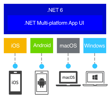
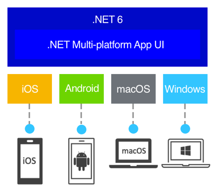
.NET MAUI 全称为 .NET Multi-platform App UI ,顾名思义就是.NET多平台应用 UI,是一个跨平台的框架,是 Xamarin.Forms 的演变,其使用C#和XAML创建本机移动和桌面应用,这里的XAML可以替换成RazorView。使用 .NET MAUI,可以开发可在 Android、iOS、macOS 和 Windows、Linux(社区支持)从单个共享代码库运行的应用,一套代码多端运行。
2.1 MAUI 优点:
从 XAML 和 C# 中的单个共享代码库编写跨平台 Visual Studio。
跨平台共享 UI 布局和设计。
跨平台共享代码、测试和业务逻辑。
另一个优点是跨框架重用
Razor组件,它可以实现为Razor类库 (RCL) 并与Blazor Server和WebAssembly共享。这允许最大限度地重用代码并从单个代码库生成移动、桌面和Web解决方案。
今天我们重点在实操,就不介绍那么多概念性的东西了。想了解更多关于 MAUI 的同学可以移步官方文档介绍 什么是 .NET MAUI?,本篇文章会带大家使用MAUI+Masa Blazor做一个移动端常见的时间轴页面,并加一点切换主题色的小功能,效果图如下:
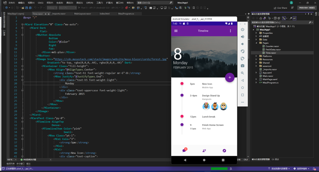
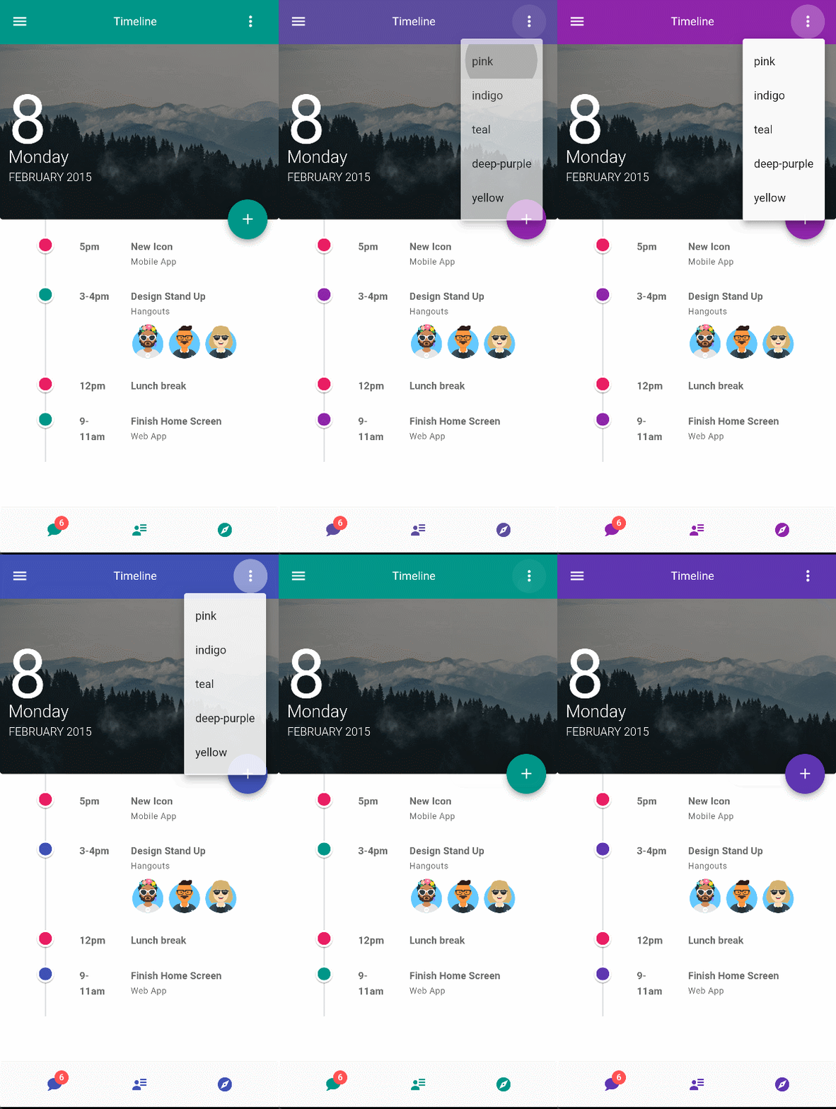
接下来让我们一步步去实现它。首先我们先准备好必备的环境。
注:文章示例演示环境为(Maui 6.0.200-preview.14.5 + Masa.Blazor 0.3.0)
3. MAUI 环境准备
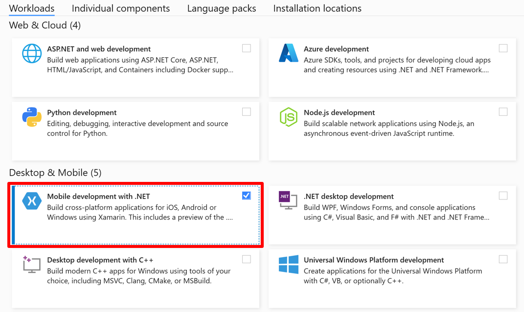
- 首先要确保安装了
最新版的 Visual Studio,并且安装了Mobile development with .NET工作负载。
- 启用硬件加速才能最大化 Android 模拟器性能,我们可以启用
Hyper-V或HAXM加速,这里只介绍第一种
- 在 Windows 搜索框中输入“Windows 功能”,然后在搜索结果中选择“打开或关闭 Windows 功能” 。在“Windows 功能”对话框中,启用“Hyper-V”和“Windows 虚拟机监控程序平台” :
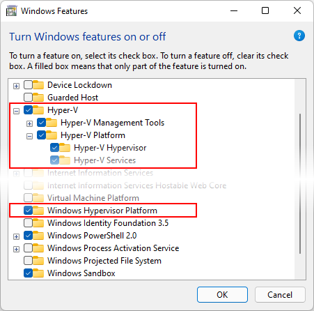
进行这些更改后,重新启动计算机。
请确保 在 Android Device Manager 中创建 的虚拟设备是 x86 64 或基于 x86 的系统映像。如果使用基于 Arm 的系统映像,则不会加速虚拟设备,并且运行速度会缓慢。启用 Hyper-v 后,可以运行加速 Android 仿真器。HAXM 加速和详细设置可参考:如何使用 Android 仿真程序 & 启用硬件加速
- 在 Windows 搜索框中输入“Windows 功能”,然后在搜索结果中选择“打开或关闭 Windows 功能” 。在“Windows 功能”对话框中,启用“Hyper-V”和“Windows 虚拟机监控程序平台” :
4. 创建 MAUI 应用并引入 Masa Blazor
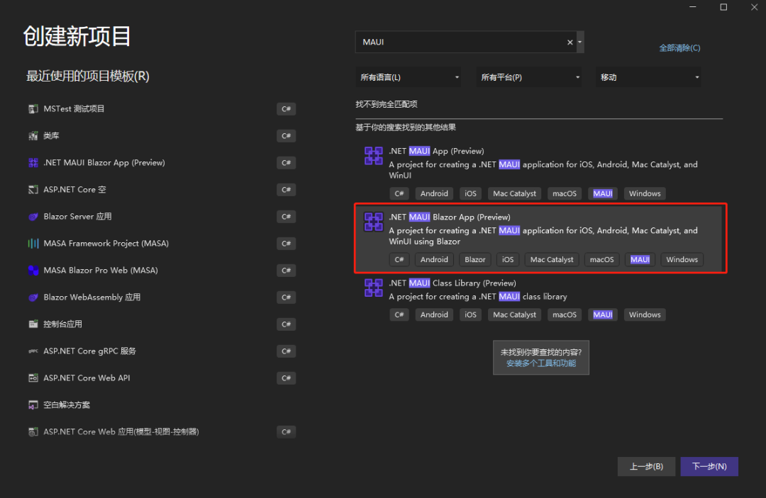
- 创建项目选择
.NET MAUI Blazor App。这样的话我们就能使用Blazor View来写 UI 界面了
- 在 nuget 中安装
Masa.Blazor,并在MauiProgram.cs文件中注册相关服务
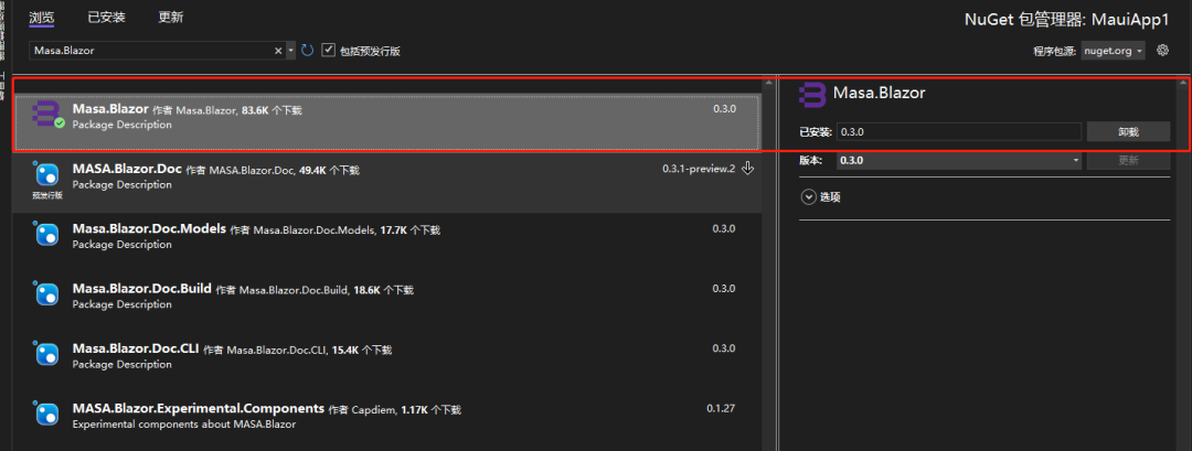
builder.Services.AddMasaBlazor();
CreateMauiApp()方法简单理解:在启动方法中,调用了RegisterBlazorMauiWebView()构建器对象的扩展方法,然后将BlazorWebView本身添加到具有该builder.Services属性的DI容器的 Services 集合中。这将执行依赖注入加载特定于平台的视图以呈现输出 HTML,因为每个平台都有自己的 Web 引擎,BlazorWebView(从View继承)控件,它能够在运行时处理 Razor 组件并生成其等效的 HTML。该 HTML 将使用平台的本机 Web 引擎呈现,而无需任何 Web 服务器的参与。
wwwroot/index.html中引入样式、字体、脚本

<link href="_content/Masa.Blazor/css/masa-blazor.css" rel="stylesheet" />
<link href="_content/Masa.Blazor/css/masa-extend-blazor.css" rel="stylesheet" />
<link
  href="https://cdn.masastack.com/npm/@mdi/font@5.x/css/materialdesignicons.min.css"
  rel="stylesheet"
/>
<link
  href="https://cdn.masastack.com/npm/materialicons/materialicons.css"
  rel="stylesheet"
/>
<link
  href="https://cdn.masastack.com/npm/fontawesome/v5.0.13/css/all.css"
  rel="stylesheet"
/>

<script src="_content/BlazorComponent/js/blazor-component.js"></script>
<script src="https://cdn.masastack.com/npm/echarts/5.1.1/echarts.min.js"></script>
<!-- echarts脚本文件不需要可以不引入 -->
注意:
- MAUI 项目中需要在
index.html中引入这些文件,而不是像 Blazor 那样是在Pages/_Layout.cshtml中。2.从 Masa Blazor0.3.0 开始采用和微软相同的命名规范(大驼峰),MASA 改成了 Masa 所以升级了 0.3.0 和之后的版本要注意别写错了,不然会找不到样式文件和 js 文件
- 在
_Imports.razor文件中引用Masa.Blazor,BlazorComponent命名空间,这样我们就不用每个文件都去引用一遍了
5. 时间轴功能实现
我们先在布局页MainLayout.razor中搞出我们页面的大概布局,顶部需要一个 Toolbar 工具条,底部是底部导航,中间是我们的子页面
这样一种常规的布局页面,点击工具条上面的菜单我们可以切换主题颜色,我们来用Masa Blazor简单实现下。
顶部工具条我们主要用到了MToolbar组件和MMenu组件,底部因为BottomNavigation组件官网暂时还没有,后面版本才会出来,影响不大,我们先用MFooter组件代替。这样我们布局模板页已经搞好了,全局的颜色我们通过变量存起来,通过MMenu选中的值来进行控制
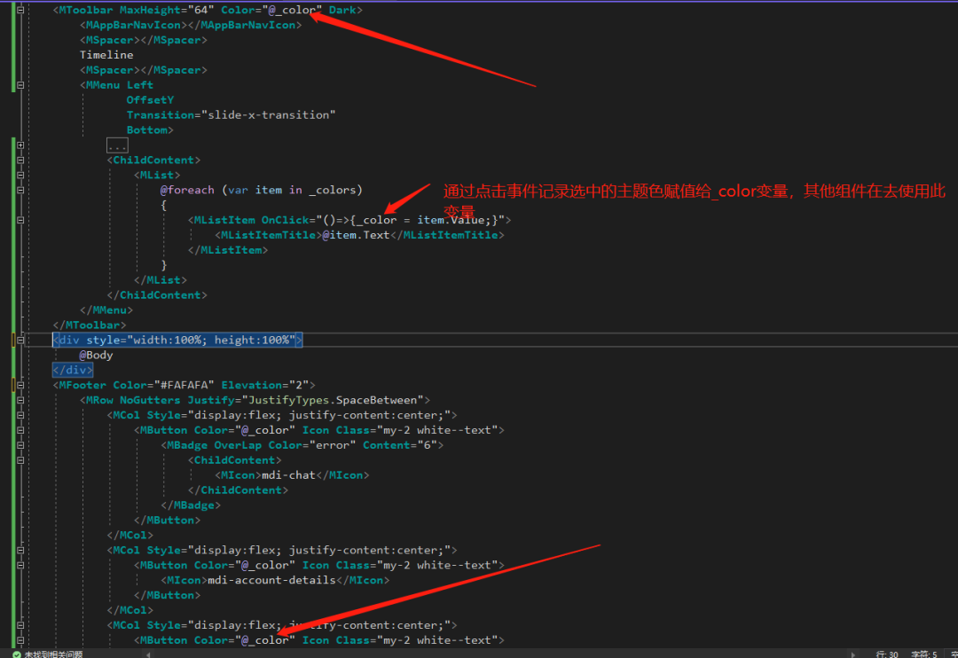
Mainlayout.razor 完整代码:
@inherits LayoutComponentBase

<MApp>
  <MToolbar MaxHeight="64" Color="@_color" Dark>
    <MAppBarNavIcon></MAppBarNavIcon>
    <MSpacer></MSpacer>
    Timeline
    <MSpacer></MSpacer>
    <MMenu Left OffsetY Transition="slide-x-transition" Bottom>
      <ActivatorContent>
        <MButton Icon @attributes="@context.Attrs">
          <MIcon>mdi-dots-vertical</MIcon>
        </MButton>
      </ActivatorContent>
      <ChildContent>
        <MList>
          @foreach (var item in _colors) {
          <MListItem OnClick="()=>{_color = item.Value;}">
            <MListItemTitle>@item.Text</MListItemTitle>
          </MListItem>
          }
        </MList>
      </ChildContent>
    </MMenu>
  </MToolbar>

  <div style="width:100%; height:100%">
    <CascadingValue Value="_color"> @Body </CascadingValue>
  </div>

  <MFooter Color="#FAFAFA" Elevation="2">
    <MRow NoGutters Justify="JustifyTypes.SpaceBetween">
      <MCol Style="display:flex; justify-content:center;">
        <MButton Color="@_color" Icon Class="my-2 white--text">
          <MBadge OverLap Color="error" Content="6">
            <ChildContent>
              <MIcon>mdi-chat</MIcon>
            </ChildContent>
          </MBadge>
        </MButton>
      </MCol>
      <MCol Style="display:flex; justify-content:center;">
        <MButton Color="@_color" Icon Class="my-2 white--text">
          <MIcon>mdi-account-details</MIcon>
        </MButton>
      </MCol>
      <MCol Style="display:flex; justify-content:center;">
        <MButton Color="@_color" Icon Class="my-2 white--text">
          <MIcon>mdi-compass</MIcon>
        </MButton>
      </MCol>
    </MRow>
  </MFooter>
</MApp>

@code{ private string _color = "purple darken-3"; private List<(string Text,
string Value)> _colors = new() { new("pink", "purple darken-1"), new("indigo",
"indigo"), new("teal", "teal"), new("deep-purple", "deep-purple darken-1"),
new("yellow", "yellow darken-4"), }; }
接下来我们再来实现 Body 页面,Body 页面就是我们的主要内容了。这里我们可以去Masa Blazor官网找一下Timelines组件直接使用,刚好官网有移动端Timeline的示例 demo,只是示例没有改变颜色的功能,没关系我们拿过来改一改。
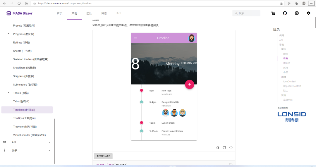
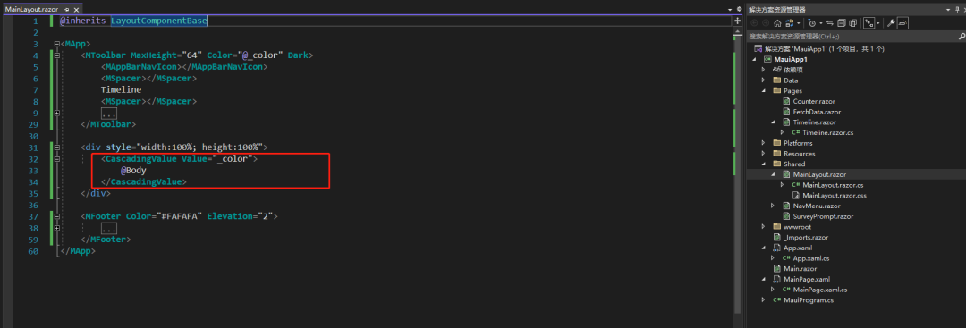
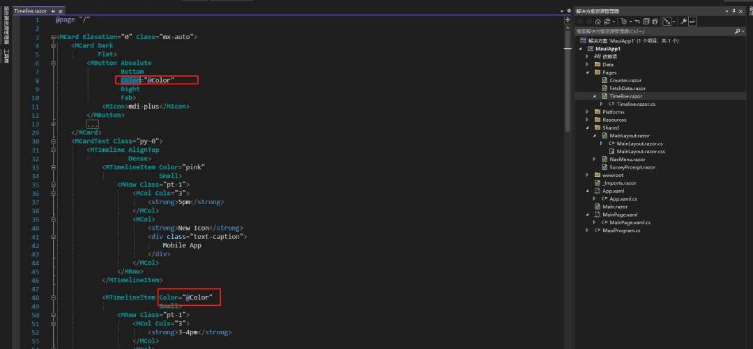
我们把代码 Copy 过来,去掉他顶部的工具条,因为我们顶部已经在布局页面里写过了,而且是应用在每个子页面的,所以这里就不用再写了。但是这里要考虑怎么把_color参数传到Timeline页面里面,这里我们用到了级联参数,通过 CascadingValue 来把参数传递给子页面,子页面通过CascadingParameter来接收,这样我们在子页面里就可以拿到颜色变量了。
Timeline.razor 完整代码:
@page "/"

<MCard Elevation="0" Class="mx-auto">
  <MCard Dark Flat>
    <MButton Absolute Bottom Color="@Color" Right Fab>
      <MIcon>mdi-plus</MIcon>
    </MButton>
    <MImage
      Src="https://cdn.masastack.com/stack/images/website/masa-blazor/cards/forest.jpg"
      Gradient="to top, rgba(0,0,0,.44), rgba(0,0,0,.44)"
      Dark
    >
      <MContainer Class="fill-height">
        <MRow Align="@AlignTypes.Center">
          <strong class="text-h1 font-weight-regular mr-6">8</strong>
          <MRow Justify="@JustifyTypes.End">
            <div class="text-h5 font-weight-light">Monday</div>
            <div class="text-uppercase font-weight-light">February 2015</div>
          </MRow>
        </MRow>
      </MContainer>
    </MImage>
  </MCard>
  <MCardText Class="py-0">
    <MTimeline AlignTop Dense>
      <MTimelineItem Color="pink" Small>
        <MRow Class="pt-1">
          <MCol Cols="3">
            <strong>5pm</strong>
          </MCol>
          <MCol>
            <strong>New Icon</strong>
            <div class="text-caption">Mobile App</div>
          </MCol>
        </MRow>
      </MTimelineItem>

      <MTimelineItem Color="@Color" Small>
        <MRow Class="pt-1">
          <MCol Cols="3">
            <strong>3-4pm</strong>
          </MCol>
          <MCol>
            <strong>Design Stand Up</strong>
            <div class="text-caption mb-2">Hangouts</div>
            <MAvatar>
              <MImage
                Src="https://avataaars.io/?avatarStyle=Circle&topType=LongHairFrida&accessoriesType=Kurt&hairColor=Red&facialHairType=BeardLight&facialHairColor=BrownDark&clotheType=GraphicShirt&clotheColor=Gray01&graphicType=Skull&eyeType=Wink&eyebrowType=RaisedExcitedNatural&mouthType=Disbelief&skinColor=Brown"
              ></MImage>
            </MAvatar>
            <MAvatar>
              <MImage
                Src="https://avataaars.io/?avatarStyle=Circle&topType=ShortHairFrizzle&accessoriesType=Prescription02&hairColor=Black&facialHairType=MoustacheMagnum&facialHairColor=BrownDark&clotheType=BlazerSweater&clotheColor=Black&eyeType=Default&eyebrowType=FlatNatural&mouthType=Default&skinColor=Tanned"
              ></MImage>
            </MAvatar>
            <MAvatar>
              <MImage
                Src="https://avataaars.io/?avatarStyle=Circle&topType=LongHairMiaWallace&accessoriesType=Sunglasses&hairColor=BlondeGolden&facialHairType=Blank&clotheType=BlazerSweater&eyeType=Surprised&eyebrowType=RaisedExcited&mouthType=Smile&skinColor=Pale"
              ></MImage>
            </MAvatar>
          </MCol>
        </MRow>
      </MTimelineItem>

      <MTimelineItem Color="pink" Small>
        <MRow Class="pt-1">
          <MCol Cols="3">
            <strong>12pm</strong>
          </MCol>
          <MCol>
            <strong>Lunch break</strong>
          </MCol>
        </MRow>
      </MTimelineItem>

      <MTimelineItem Color="@Color" Small>
        <MRow Class="pt-1">
          <MCol Cols="3">
            <strong>9-11am</strong>
          </MCol>
          <MCol>
            <strong>Finish Home Screen</strong>
            <div class="text-caption">Web App</div>
          </MCol>
        </MRow>
      </MTimelineItem>
    </MTimeline>
  </MCardText>
</MCard>

@code{ [CascadingParameter] public string Color { get; set; } }
然后我们把这个页面想要随着主题色变动的颜色改成通过 Color 变量控制就好了。
这样我们就完成了一个时间轴页面并且可以切换主题色,这里我们还可以基于这个示例加一些功能,比如点击这个+号按钮去弹窗再去添加一个时间任务去渲染到页面上,也是挺简单的,就不做演示了。本篇文章主要介绍了在MAUI中如何使用Masa Blazor,并做了一个小 demo。抛砖引玉,大家也可以尝试用MAUI + Blazor去做一些应用体验一下。
完整示例代码:codding-y/Maui.MasaBlazor (github.com)
开源地址
MASA.BuildingBlocks:https://github.com/masastack/MASA.BuildingBlocks
MASA.Contrib:https://github.com/masastack/MASA.Contrib
MASA.Utils:https://github.com/masastack/MASA.Utils
MASA.EShop:https://github.com/masalabs/MASA.EShop
MASA.Blazor:https://github.com/BlazorComponent/MASA.Blazor
如果你对我们的 MASA Framework 感兴趣,无论是代码贡献、使用、提 Issue,欢迎联系我们