Original: https://github.com/benruehl/adonis-ui
Translation: Desert End Wolf (with Google Translate assistance)
A lightweight UI toolkit for WPF applications that offers classic and enhanced Windows visuals:

Repository Info
- Repository URL: https://github.com/benruehl/adonis-ui
- Demo: https://github.com/benruehl/adonis-ui#demo

What's Included?
- Default styles and templates for nearly all WPF controls
- Additional styles that can be used as needed for convenience
- Two color schemes (Light and Dark) that are also available for custom styles
- Support for changing the color scheme at runtime
- Support for additional custom color schemes
- Extensions to built-in controls, providing features like watermarks
- A few custom controls for common use cases
Design Principles
- Stay close to WPF's original appearance
- No configuration required, but offer options for those who want to control global and individual behavior
- Support WPF's built-in control extensibility for creating new controls, so it can be a drop‑in replacement for existing applications
Documentation
Usage documentation: https://benruehl.github.io/adonis-ui/docs/getting-started/introduction/
Getting Started
- Reference
AdonisUIandAdonisUI.ClassicThemein your project. They are available via NuGet or manual download. Currently it requires at least.NET Framework 4.5or.NET Core 3.0.
Install-Package AdonisUI.ClassicTheme -Version 1.17.1
- Add the resources to your application's
App.xamllike this:
<Application xmlns:adonisUi="clr-namespace:AdonisUI;assembly=AdonisUI">
<Application.Resources>
<ResourceDictionary>
<ResourceDictionary.MergedDictionaries>
<ResourceDictionary Source="pack://application:,,,/AdonisUI;component/ColorSchemes/Light.xaml"/>
<ResourceDictionary Source="pack://application:,,,/AdonisUI.ClassicTheme;component/Resources.xaml"/>
</ResourceDictionary.MergedDictionaries>
</ResourceDictionary>
</Application.Resources>
</Application>
- Derive the window style from Adonis UI's default style as shown below:
<Window.Style>
<Style TargetType="Window" BasedOn="{StaticResource {x:Type Window}}"/>
</Window.Style>
Control Features
Switching Color Schemes at Runtime
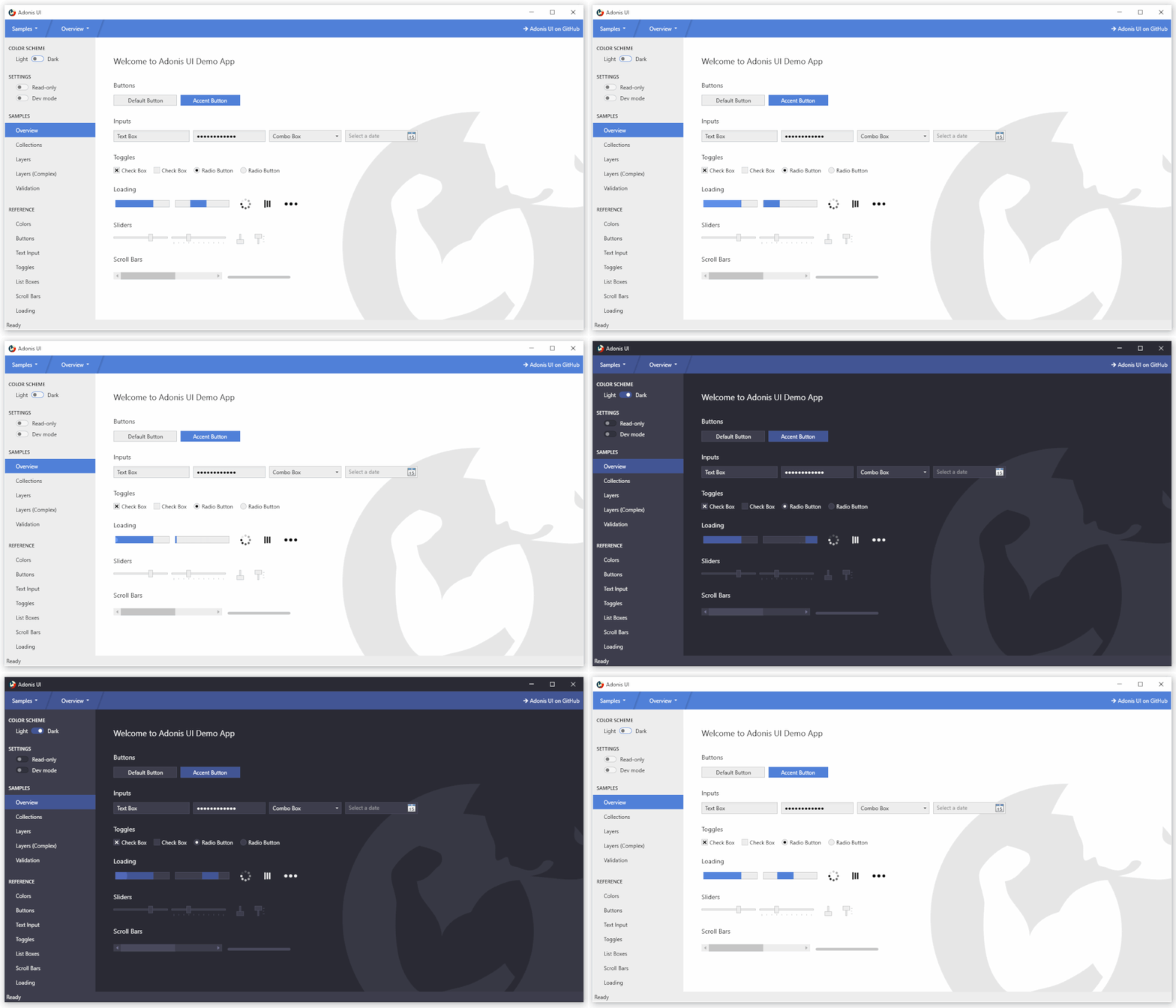
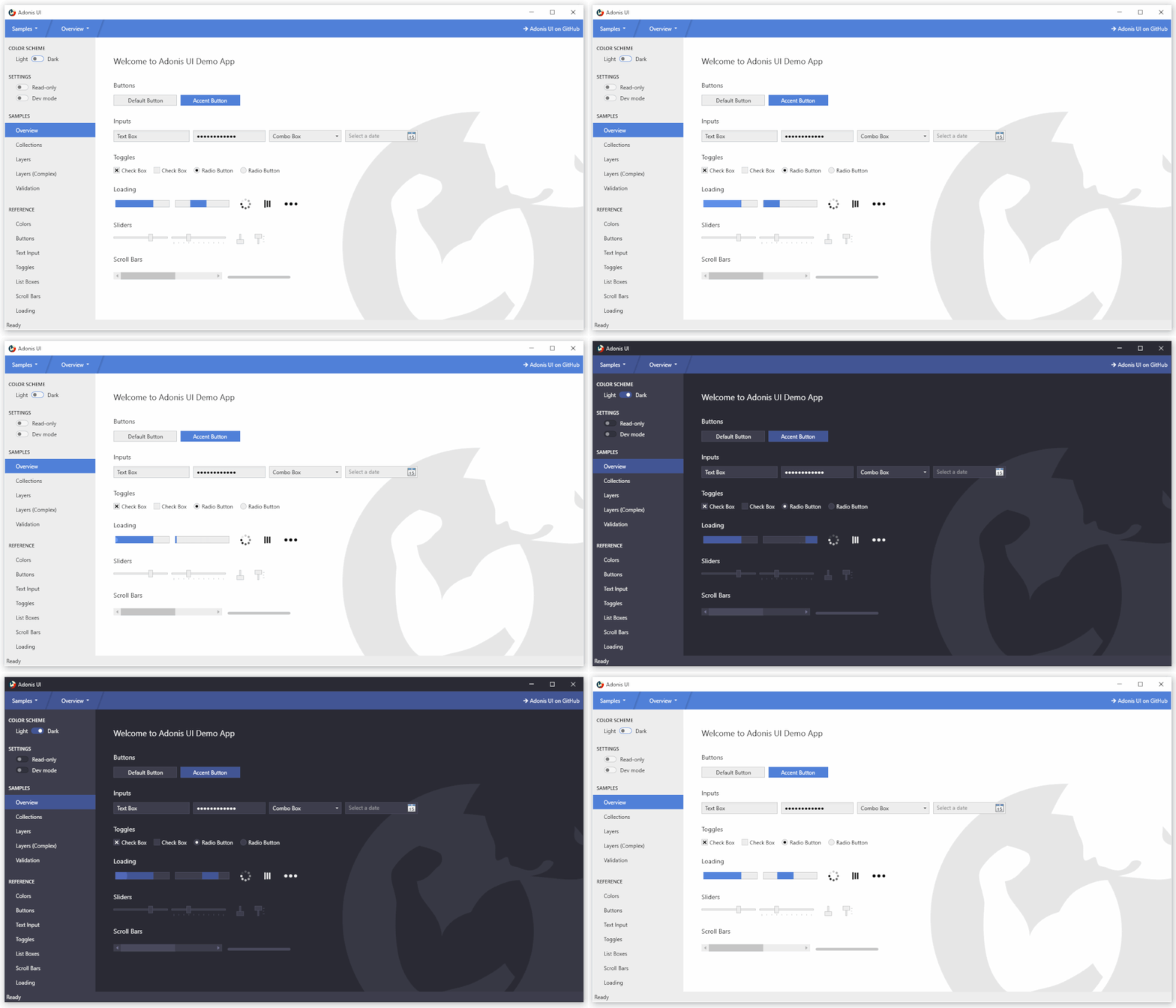
Adonis UI comes with light and dark color schemes. Custom color schemes can be added without restrictions.
| Light Scheme | Dark Scheme |
|---|---|
![]() |
![]() |
To switch color schemes at runtime, the ResourceDictionary containing all colors and brushes of the scheme needs to be removed from the application resources so that a different scheme can be added. This can be done using the built‑in ResourceLocator class, for example in a click event handler.
AdonisUI.ResourceLocator.SetColorScheme(Application.Current.Resources, ResourceLocator.DarkColorScheme);
The first parameter must be a reference to the ResourceDictionary that contains the color scheme as one of its MergedDictionaries. The second parameter is the URI of the color scheme to be added.
Read more about switching color schemes
Accent Colors
While relying on uniform colors for background areas and borders, accent colors can be used to visually highlight important points. By default, both color schemes use blue as the accent color. This can be changed by overriding the accent color values. A set of styles helps to display controls like buttons with the accent color.
Read more about colors and brushes
Custom Window Title Bar
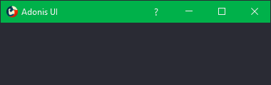
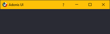
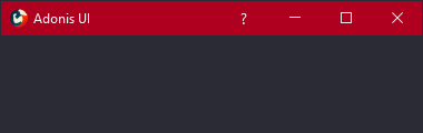
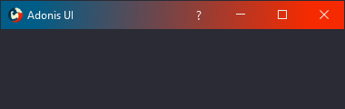
Adonis UI brings a custom window title bar that looks exactly like the Windows 10 title bar by default but has several advantages. First, it respects the current color scheme, so it darkens when switching to the dark scheme. Second, its color can also be set independently of the color scheme, e.g., through bindings and triggers. Third, its content can be easily customized, such as by hiding the icon, adding extra buttons, or placing labels in it. Derive your window from AdonisWindow to receive these features.
![]() |
![]() |
![]() |
![]() |
Cursor Spotlight Hover Effect
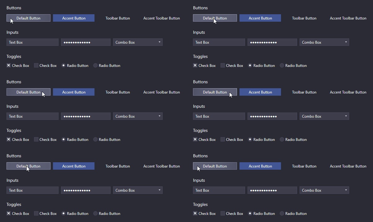
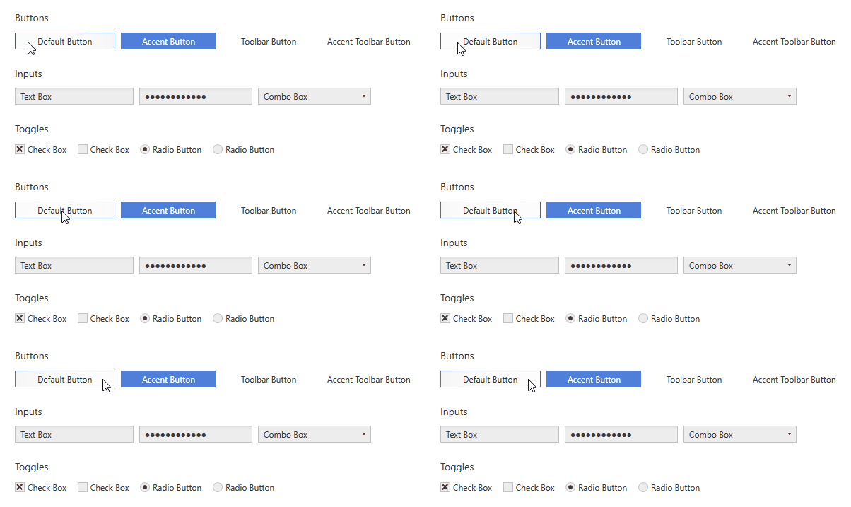
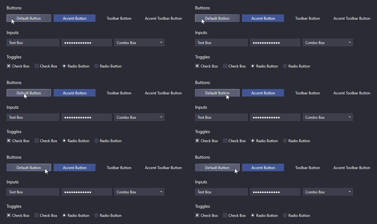
UI controls that rely on interaction (such as buttons, text boxes, combo boxes, list boxes, etc.) use a hover effect called Cursor Spotlight here. When hovering over a control, it makes the layer around the cursor visible. It works with both color schemes.
| Light Scheme | Dark Scheme |
|---|---|
![]() |
![]() |
Because it works with OpacityMasks, it is not limited to illuminating UI controls. It can be used to hide almost anything that can be rendered with WPF.
Read more about the Cursor Spotlight effect
Ripple Effect
By default, buttons and ContextMenuItems show a ripple effect when clicked. ListBoxItems also support it, but it is disabled by default.
| Light Scheme | Dark Scheme |
|---|---|
![]() |
![]() |
Read more about the Ripple effect
Layers
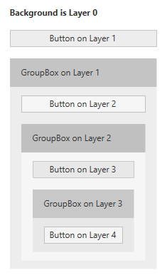
In UI design, it is common to group related items in containers. For example, in WPF this can be easily achieved with GroupBoxes. If containers are assigned different background colors to better distinguish grouped items from their surroundings, color contrast can become an issue. A grey button may look fine on a white application background initially, but when moved into a GroupBox that also has a grey background, it may lose visibility.
That is why Adonis UI introduces a simple layer system that automatically adjusts the colors of UI controls based on the layer they belong to. By default, all Adonis UI styles automatically adapt to the system, but it can also be disabled.
| Light Scheme | Dark Scheme |
|---|---|
![]() |
![]() |
These images show a simple layout of Buttons and GroupBoxes. All controls use their default styles, and no properties are set besides their content. The layer system takes care of slightly adjusting the button colors and GroupBox backgrounds per layer. It ensures that there is always a difference between the background of the container and the background of the controls inside the container. Without the system, all buttons would have exactly the same background color.
The system is fully customizable. Of course, it works for all controls, not just buttons. Each control can be configured to increase the layer for its children, but it is already enabled by default for some controls like GroupBoxes. Controls can also be forced to reside on a specific layer.
Read more about the layer system
Data Validation Support
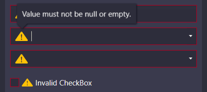
WPF's data validation mechanism provides the ability to validate property values and assign error messages when they are invalid. In Adonis UI, if a control is bound to an invalid property, the error is indicated in the control template by a red border and an error icon. When the control receives keyboard focus or the user hovers over the icon, the error message is displayed as a popup. To set validation errors, the IDataErrorInfo interface or WPF's built‑in validation can be used.
| Light Scheme | Dark Scheme |
|---|---|
![]() |
![]() |
By default, the error message popup appears on keyboard focus and mouse hover. Both can be disabled individually.
Read more about data validation
ComponentResourceKeys
Resources provided by Adonis UI have assigned ComponentResourceKeys so that they can be used in a straightforward manner. Resources exist in categories such as colors, brushes, dimensions, styles, templates, and icons. For example, the foreground brush of the current color scheme can be used by referencing its resource key like Foreground="{DynamicResource {x:Static adonisUi:Brushes.ForegroundBrush}}". ComponentResourceKeys enable IntelliSense autocompletion, which is handy when exploring available resources.
Space
Spacing between controls is usually controlled by margins, padding, and grid rows and columns. To ensure consistent spacing everywhere, a fixed size can be chosen and used everywhere (or its multiples). Adonis UI provides a system to support this. By default, the base value for space is 8, but it can be adjusted separately for horizontal and vertical spacing.
Space can be applied like this:
<RowDefinition Height="{adonisUi:Space 1}"/> <!-- equals Height="8" -->
<RowDefinition Height="{adonisUi:Space 2.5}"/> <!-- equals Height="20" -->
<RowDefinition Height="{adonisUi:Space 2.5+1}"/> <!-- equals Height="21" -->
<RowDefinition Height="{adonisUi:Space 2.5-1}"/> <!-- equals Height="19" -->
The same applies to thicknesses like margins and padding:
<Button Margin="{adonisUi:Space 1}"/> <!-- equals Margin="8,8,8,8" -->
<Button Margin="{adonisUi:Space 1, 2}"/> <!-- equals Margin="8,16,8,16" -->
<Button Margin="{adonisUi:Space 1, 1+2, 2, 3}"/> <!-- equals Margin="8,10,16,24" -->
Demo
A WPF demo application is included that shows most of the Adonis UI features. Please feel free to try it out.
License
MIT © Benjamin Rühl