Foreword
After three days and two nights (working until 2 AM), the Dotnet9 editor finally completed this article after repeated revisions and polishing (this article is quite long, so mobile readers please consider data usage). I can only say it wasn't easy, not easy at all.
After finishing this article, I can imagine the original authors and contributors of the HandyControl control library — spending days and nights coding, researching, and error-proofing. They are such passionate and generous people for sharing this excellent control library with the WPF community. Thank you!
Since this article is lengthy, I suggest readers refer to the navigation directory below and click based on personal interests. You can also press Ctrl+F to search for common control names. Of course, I hope readers can read through the article in order, haha.
I. The First Thing to Say
Recommended by blog garden friend @郭达·斯坦森, the Dotnet9 editor introduces the open-source C# WPF control library HandyControl. I hope you like it. You are also welcome to recommend excellent open-source WPF control libraries to me. Thank you for your attention and support to dotnet technology.
Comment at floor 51 of this article: "Dotnet9 Series - Open Source C# WPF Control Library 2: Panuon.UI.Silver - Strongly Recommended"

A bit about the impact of the two previous control library recommendation articles:
After the first two articles on open-source C# WPF control libraries (library 1, library 2) were well-recommended by netizens, the Dotnet9 editor was greatly encouraged. It felt like seeing the thriving dotnet era of the early 2000s again.
Thank you for your strong recommendations and dozens of comments on the blog garden, which have strengthened my belief in continuing to write high-quality C# WPF sharing articles. Below is a screenshot of a recent recommendation on the blog garden homepage: Blog Garden.

The site's daily IP visits have reached a new high of 500, another milestone. Thanks to all netizens.

Also, due to the popularity of those two articles, the Dotnet9 editor's personal blog site encountered a small hiccup. Here's the latest update from the site:

But this site will not stop sharing high-quality articles. The above is the statement from the site owner. Thank you for your continued support to the Dotnet9 editor.
II. About the HandyControl Library
2.1 Community
GitHub: https://github.com/HandyOrg/HandyControl
Contributors: NaBian, yanchao891012, ghost1372, guanguanchuangyu, noctwolf, DingpingZhang, xianyun666, M0n7y5, gitter-badger, afunc233, etc.
Recommended C# and WPF learning blogs from the author: 纳边, 林德熙, 吕毅, DinoChan, 玩命夜狼, etc.
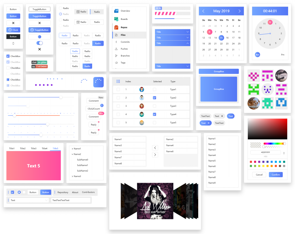
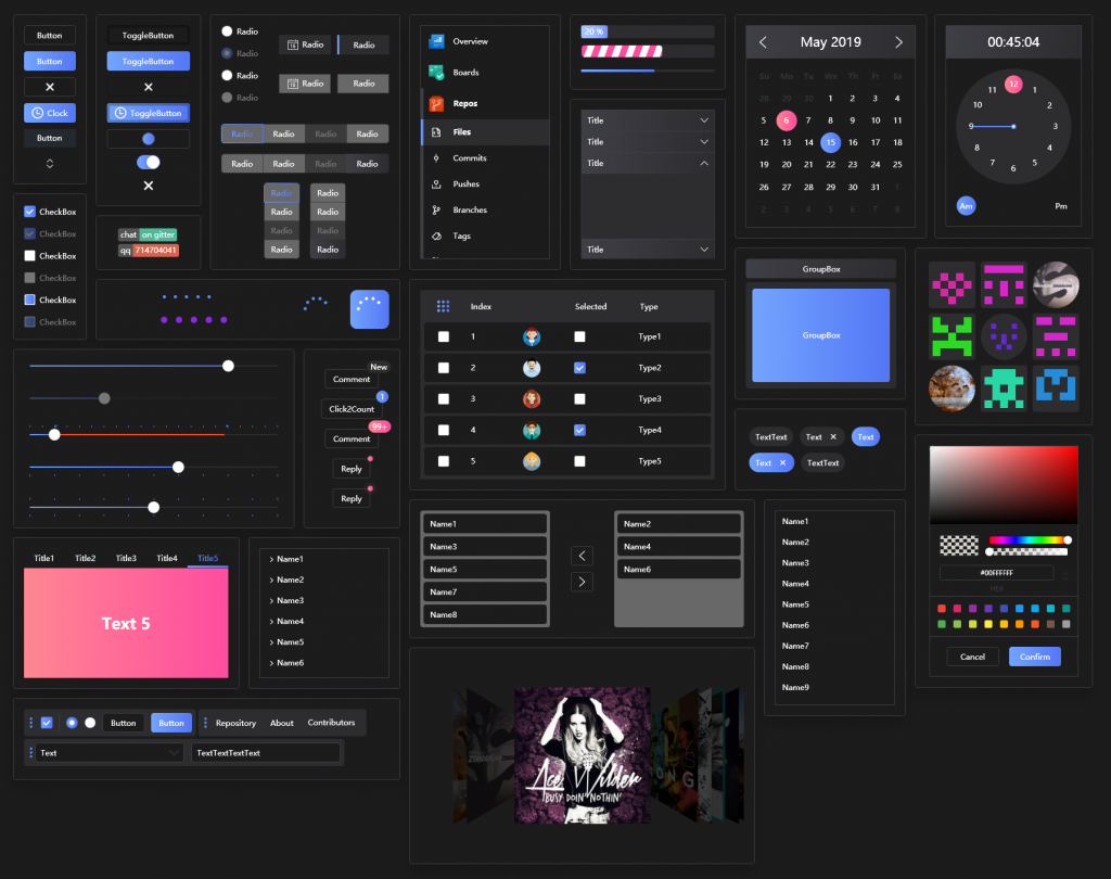
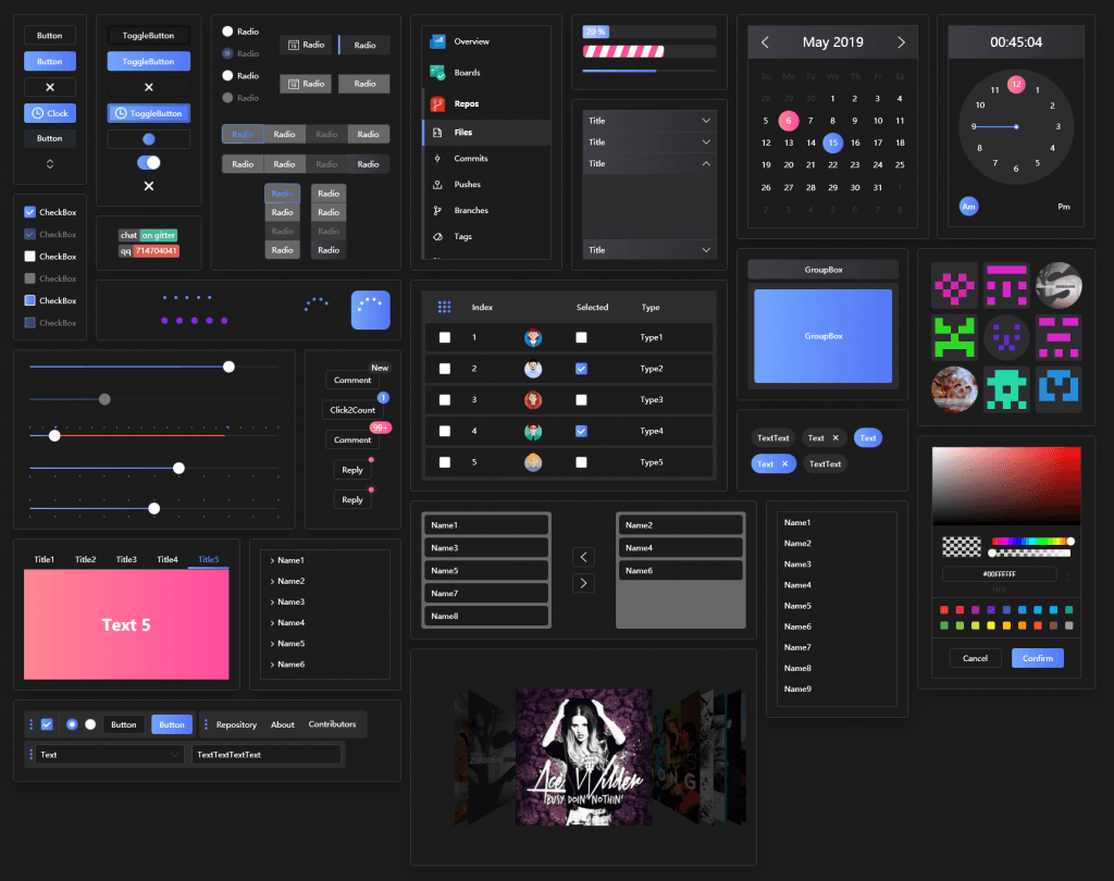
Below are overviews of the two theme styles. Let me first give you a general impression, then introduce classic cases and detailed control descriptions. I hope you like this style.
2.2 White Theme

2.3 Dark Theme

III. Classic Cases Based on the Library
An excellent control library naturally attracts like-minded friends. The two QQ groups created by the author show how many people use this library. The Dotnet9 editor and the author selected a few typical projects to showcase. Take a look — is HandyControl suitable for your project?
3.1 Case 1
Software: phpEnv, URL: https://www.phpenv.cn/
Description: phpEnv is a fully portable PHP integrated environment for Windows. It integrates Apache, Nginx, and other web components, supports multiple PHP versions, custom PHP versions, and custom MySQL versions. It is mainly for development environments but can also be used as a server environment. It offers features like removing PHP environment obstacles, releasing port occupancy, switching MySQL versions, modifying MySQL passwords, compatibility with other integrated environments, built-in Redis, MemCache, and other services, as well as Composer, a powerful CMD command line, TCP port process list, and other tools.
3.2 Case 2
Software: AutumnBox, URL: https://github.com/zsh2401/AutumnBox
What is AutumnBox? A desktop program that provides a GUI wrapper for Google's ADB toolkit, making it easy for beginners and helpful for veterans.
What can AutumnBox do?
- Flash a custom recovery to your device
- Push files to the device
- One-click activation of Black Dome service
- One-click activation of freezer
- Unlock System for full root access
- Extension module-based development philosophy, enabling more features in the future
- ...
IV. Detailed Introduction to Featured Controls
For introducing controls, screenshots and descriptions are essential. When writing this article, the Dotnet9 editor no longer needs to take screenshots or record GIFs because the HandyControl author is excellent — most image materials come from the author's GitHub repository. You can view them directly at: https://github.com/HandyOrg/HandyControl
Below, I will add my own usage experience and opinions. If you have different views or suggestions, please leave a comment below or join the author's QQ group to discuss. Let's grow together through technical exchange.
4.1 Various Buttons
The first thing that comes to mind when developing UI is buttons. Here are several types of buttons designed by HandyControl. Is there one you like?
4.1.1 Normal Button
For general desktop development, the following button styles should suffice. Of course, you can extend and modify based on the author's styles according to your company's designer requirements.

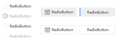
4.1.2 RadioButton
RadioButton is also beautiful and essential for polished interfaces.

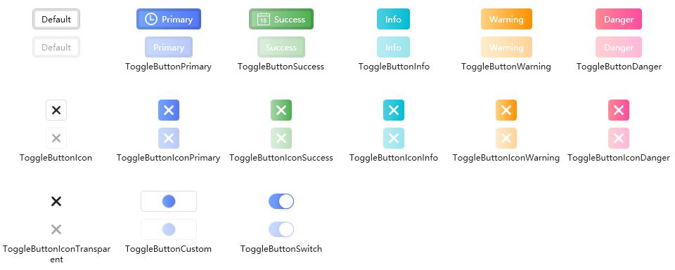
4.1.3 ToggleButton
ToggleButton: The HandyControl author designed several styles — convenient, right?

4.1.4 SplitButton
SplitButton: Useful for scenarios where clicking a button pops up a menu.

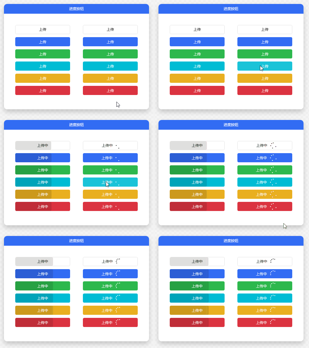
4.1.5 ProgressButton
ProgressButton: Displaying progress on a button is quite creative. Very convenient when uploading files with limited screen space.

4.1.6 ButtonGroup
ButtonGroup: This control can replace regular menus — suitable for single-level menus or similar operations.

4.1.7 Shield
Shield: The shield badge is intuitive for displaying real-time status statistics.

4.1.8 Pagination
Pagination: A common pagination control for tables, convenient for displaying large datasets. The pagination style is also popular.

4.2 Label-like Controls
There are many label-like controls. I group those similar to or extending Label into one category.
4.2.1 Label
Common Label: Beautiful, right? Typically used with TextBox for forms.

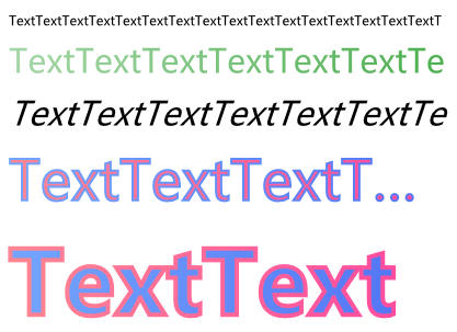
4.2.2 OutlineText
OutlineText: Text can look this good with various fonts.

4.2.3 Tag
Tag: Useful for search. Common search criteria can be displayed as tags for quick filtering — greatly improved user experience. Users will praise you.

4.2.4 Badge
Badge: Commonly used on websites to display library versions or prominent information — very eye-catching. Use it in your project now!

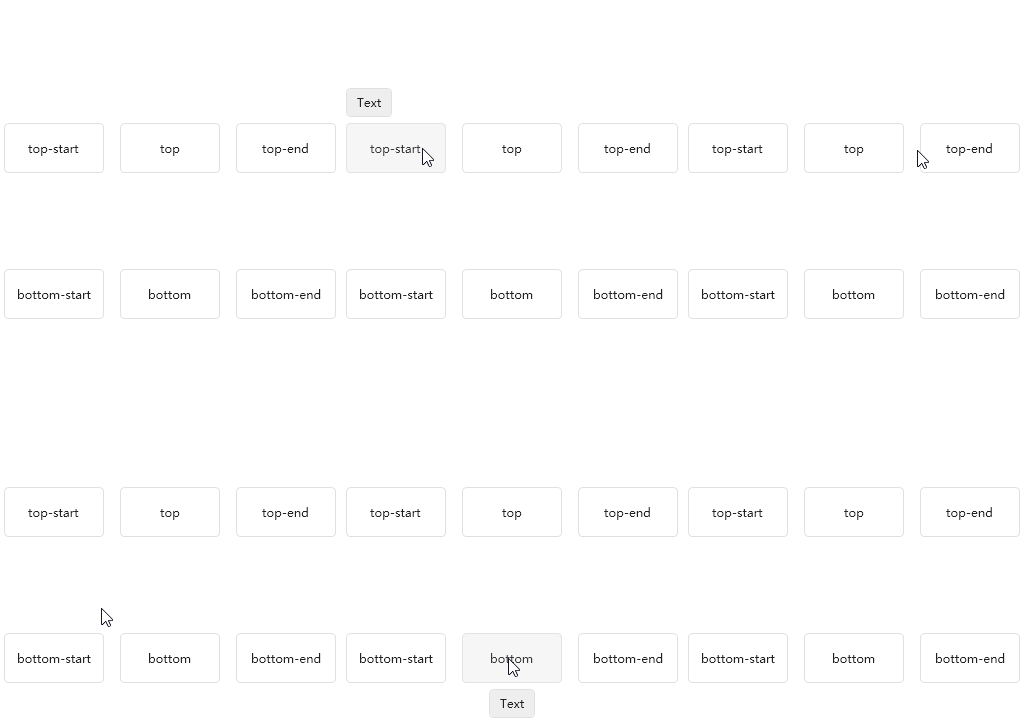
4.2.5 Poptip
Poptip: A bubble prompt control. Custom prompts made easy.

4.3 Various Block Controls
Common block controls include TextBlock, which is similar to Label. Below are the various block controls:
4.3.1 TextBlock
TextBlock: Common text display.

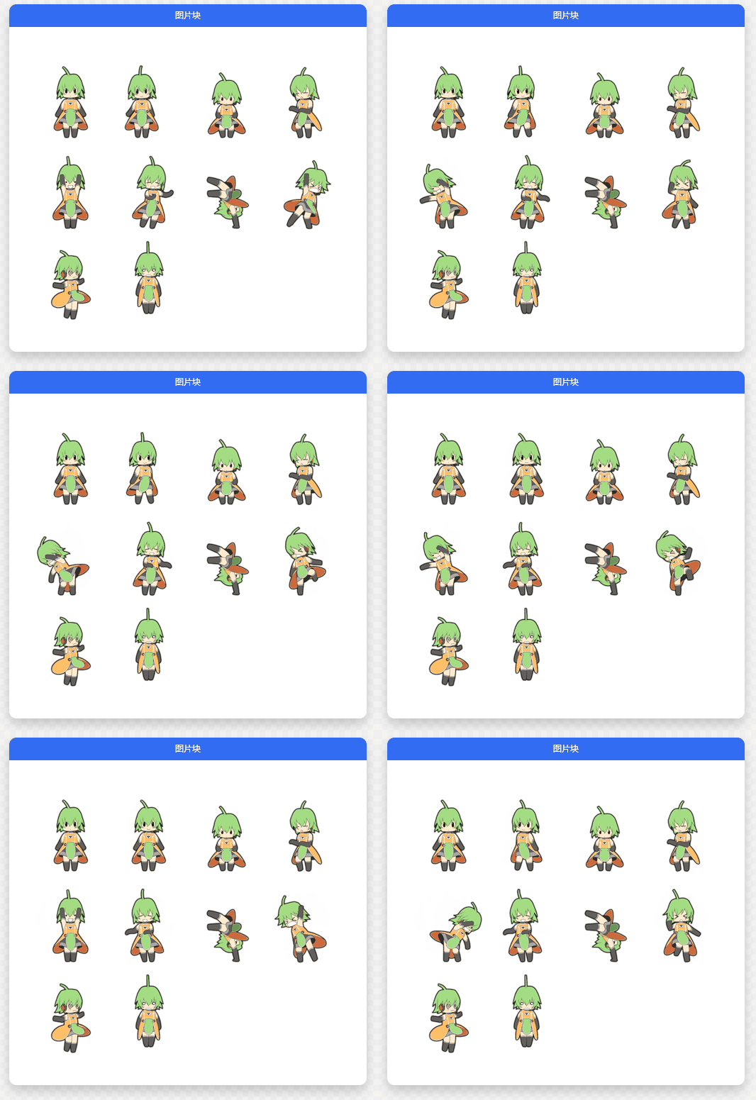
4.3.2 ImageBlock
ImageBlock: Image block display.

4.3.3 FloatingBlock
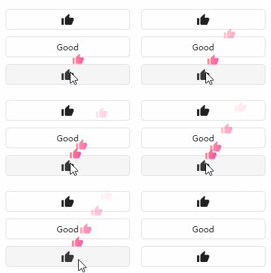
FloatingBlock: What does this remind you of? Maybe giving likes/sending flowers to a streamer during a live broadcast?

4.3.4 RunningBlock
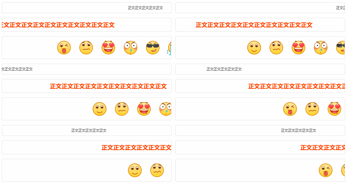
RunningBlock: Scrolling block, like a marquee effect. Great for rolling ads in desktop software, or for bullet comments in video player apps.

4.4 Input/Edit Controls
The author provides quite a few input/edit controls, such as text boxes, password boxes, etc.
4.4.1 TextBox
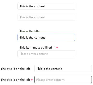
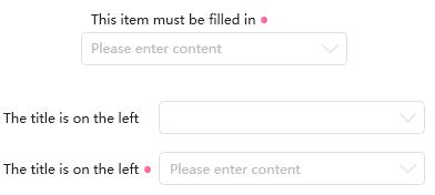
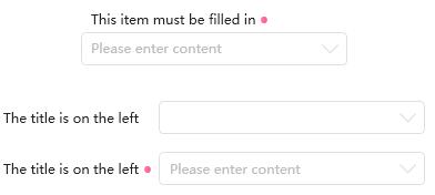
TextBox: A standard input text box. The author encapsulates Label and TextBox into a "combo box" control for quick layout.

4.4.2 RichTextBox
RichTextBox: A common rich text control.

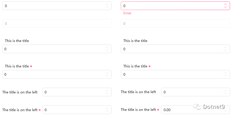
4.4.3 NumericUpDown
NumericUpDown: A numeric selection control, convenient for number input or validation. This can also be categorized as a selection control.

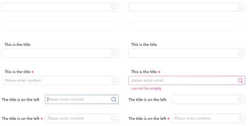
4.4.4 SearchBar
SearchBar: Offers several styles for selection. Do you have similar UI designs in your daily development? Use it directly to improve productivity.

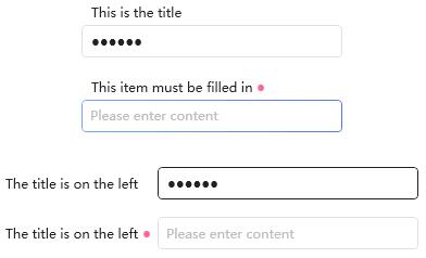
4.4.5 PasswordBox
The Dotnet9 editor tends to classify PasswordBox as a text box type. Here is the HandyControl password box.

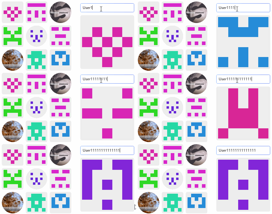
4.4.6 Gravatar
Gravatar: This control is fun — dynamically generating avatars. Like it? A very interesting control.

4.4.7 ComboBox
ComboBox: Much better looking than the native combo box — very clean.

4.5 Selection Controls
The Dotnet9 editor groups combo boxes, checkboxes, radio buttons, etc., into selection controls. See below:
4.5.1 Divider
Divider: A practical divider control.

4.5.2 HandyControl ComboBox
ComboBox: I already classified this under input/edit controls, but it also belongs to selection controls. It is composed of a text box and a list control. I haven't looked at the code yet, but I assume that's the case. Did the author do it this way?

4.5.3 Rate
Rate: A rating control. Looks familiar, right? Often used for rating articles or resources. Very good. The Dotnet9 editor likes it a lot.

4.5.4 Slider
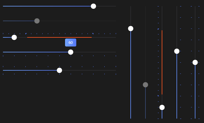
Slider: The color scheme looks great with the dark theme.

4.5.5 PreviewSlider
PreviewSlider: As the name suggests, it displays the current value in real time while dragging.

4.5.6 CheckBox
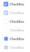
CheckBox: The style is quite professional.

4.5.7 StepBar
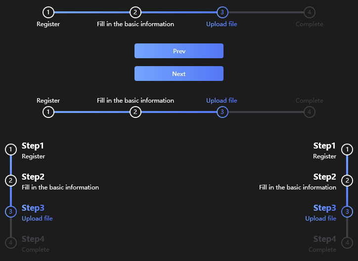
StepBar: Very convenient for workflow-related business — we often see it in "forgot password" scenarios that require step-by-step validation.

4.5.8 ColorPicker
ColorPicker: A handy color picker — a nice tool.

4.6 Time-related Controls
The Dotnet9 editor groups time-related controls together. The author implemented several similar controls, all excellent, giving you many choices.
4.6.1 FlipClock
FlipClock: A flip clock — cool, right? Looks like a flip calendar or a basketball scoreboard.

4.6.2 TimeBar
TimeBar: A time bar that can be extended for Gantt chart usage.

4.6.3 Calendar
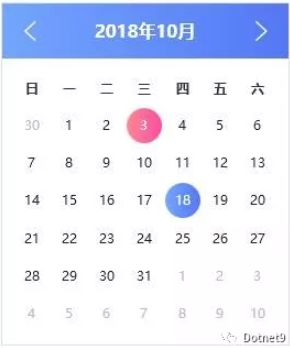
Calendar: A standard date control.

4.6.4 Clock
Clock: A standard clock control.

4.6.5 CalendarWithClock
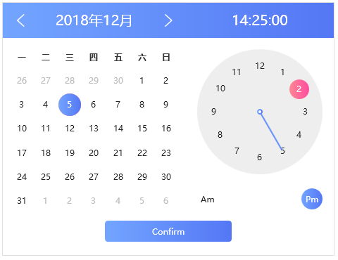
CalendarWithClock: A combined date and time control — very useful.

4.6.6 DatePicker
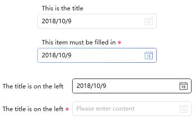
DatePicker: A commonly used date selection control.

4.6.7 TimePicker
TimePicker: A commonly used time selection control.

4.6.8 DateTimePicker
DateTimePicker: This combined date and time selector is perfect. I will definitely try it if I have such a scenario in future projects.

4.7 Menu Controls
The Dotnet9 editor groups menu and taskbar controls together for easier reading.
4.7.1 SideMenu
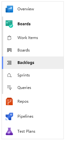
SideMenu: A sidebar menu — a common type that is very useful.

4.7.2 ContextMenu
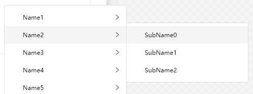
ContextMenu: A simple, clean context menu. I used to use similar ones — plain and refreshing.

4.7.3 ToolBar
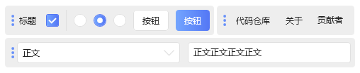
ToolBar: Often used with navigation menus — a classic combination.

4.7.4 CirclePanel
CirclePanel: I like to call it a circular menu. More common on mobile than desktop. If your project or product adds this control, user experience will go up a level — depending on business needs, of course.

4.7.5 NotifyIcon
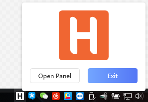
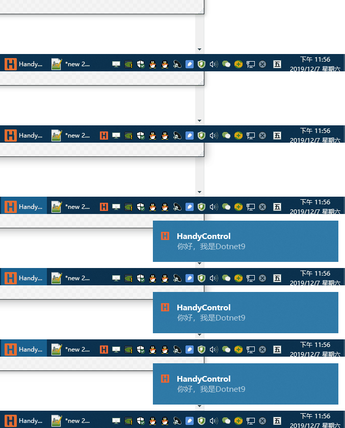
NotifyIcon: An upgraded version of the Windows system tray icon:

Supports tray icon blinking:

This control is easy to extend, allowing you to create tray menus similar to 360 Security Guard. That requires good coding skills. Below is a 360 Security Guard system tray menu — beautiful, right? The Dotnet9 editor has seen many software imitating 360's design, including myself. Note: This is not part of HandyControl; you need to implement it yourself, but it's not difficult.

4.8 Layout and Image Controls
The author implemented several interesting layout containers — all for user experience.
Image-related display controls are similar to layout controls, so I group them together for easy reference.
4.8.1 Border
Border: Very nice for displaying images with graphical borders.

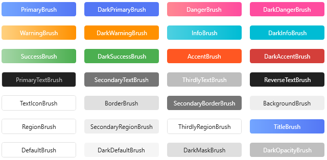
4.8.2 Brush
Brush: Provides 28 commonly used brushes — a great resource.

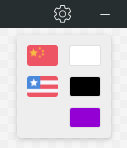
4.8.3 SwitchConfig
SwitchConfig: Configuration selection, often used for internationalization language selection. Convenient, right?

4.8.4 Expander
Expander: A standard control.

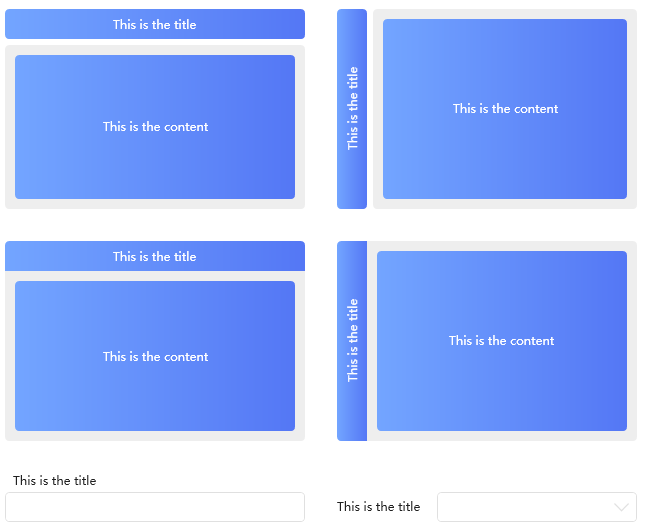
4.8.5 GroupBox
GroupBox: A standard control.

4.8.6 ScrollViewer
ScrollViewer: Also commonly used.

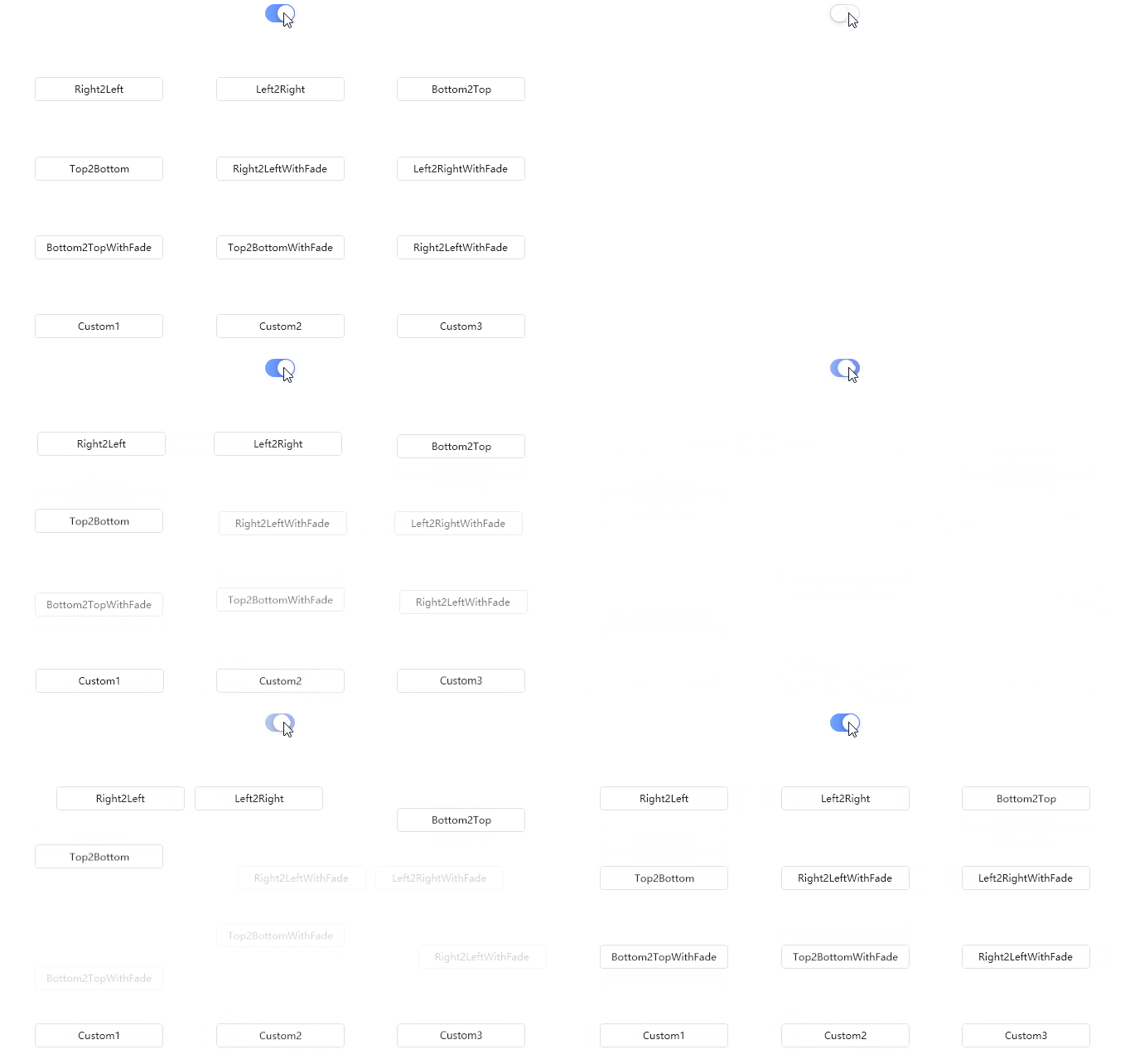
4.8.7 TransitioningContentControl
TransitioningContentControl: A content transition control — looks nice, right?

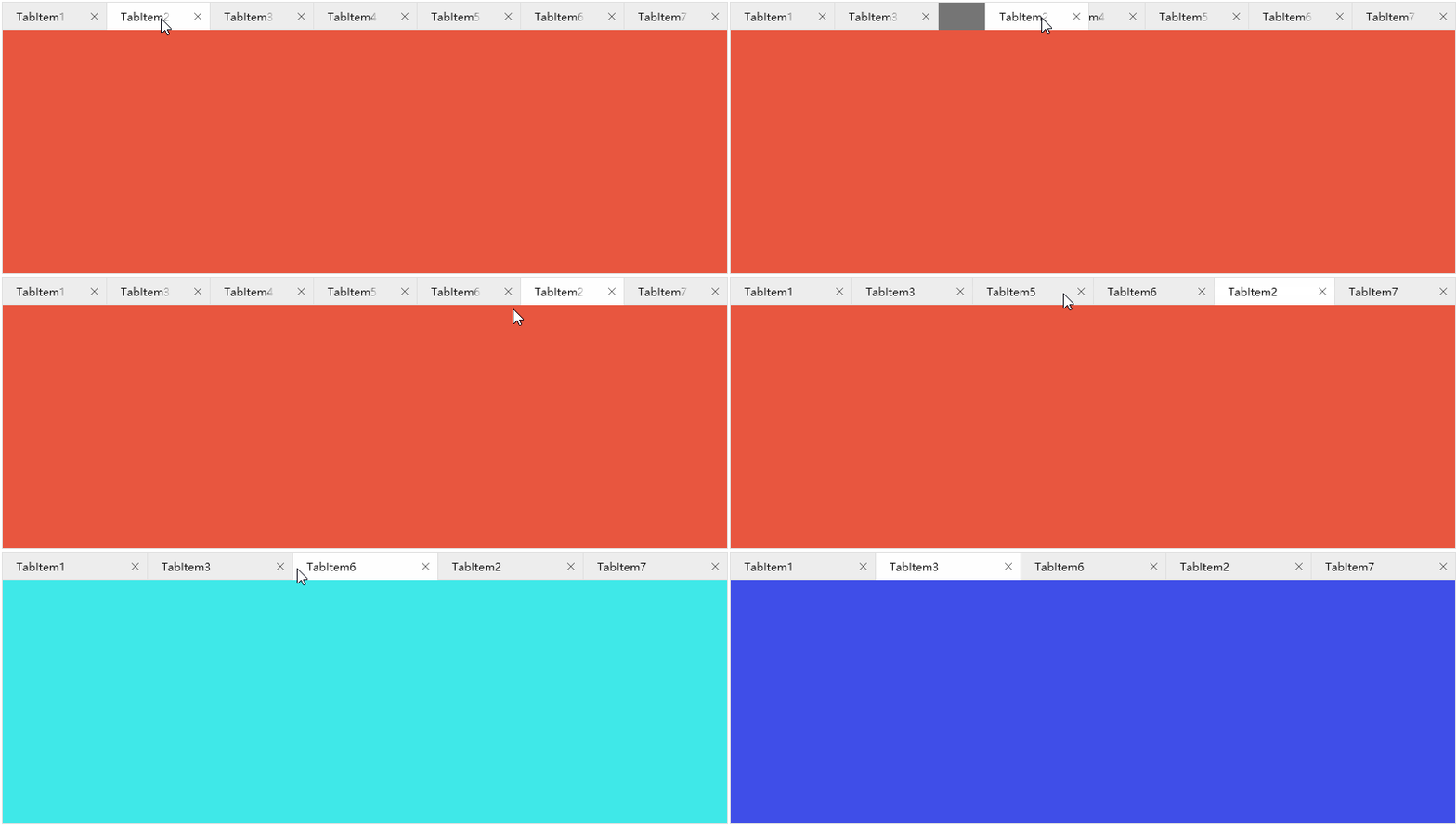
4.8.8 TabControl1
TabControl1: Tab control style one.

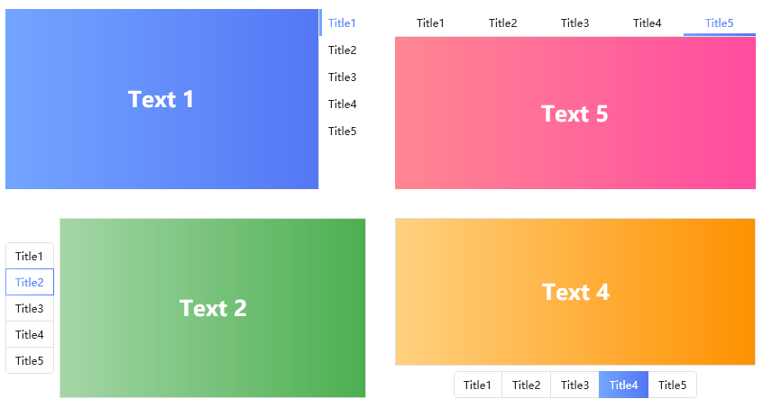
4.8.9 TabControl2
TabControl2: Tab control style two.

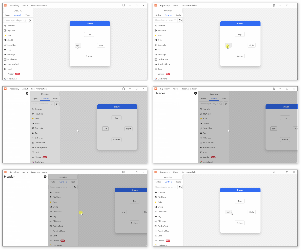
4.8.10 Drawer
Drawer: A drawer-like layout control, useful when space is limited.

4.8.11 HoneycombPanel
HoneycombPanel: An interesting layout control.

4.8.12 Magnifier
Magnifier: A magnifier control — similar to JD or Taobao where hovering over a product image shows a magnified view. Very convenient.

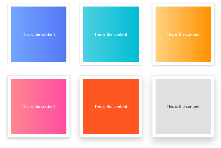
4.8.13 Card
Card:

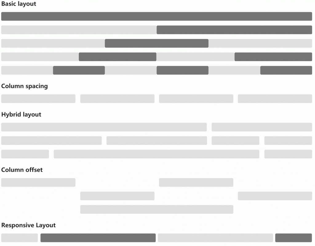
4.8.14 Grid
Grid: Grid layout.

4.8.15 AnimationPath
AnimationPath: Path animation — quite cool.

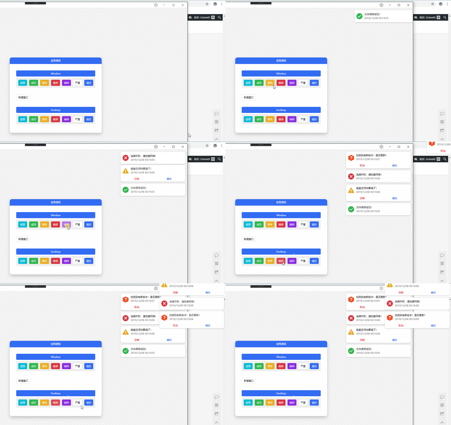
4.8.16 Growl
Growl: Information notification. Useful for alerting users, e.g., in monitoring software. Notifications can be shown inside the software window or pop up on the desktop even if the software is not in focus.

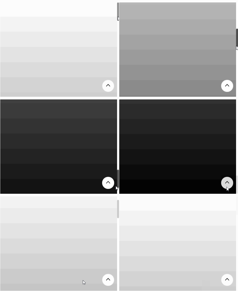
4.8.17 GoToTop
GoToTop:

4.8.18 Transfer
Transfer: Transfer shuttle box — useful when moving items between lists.

4.8.19 CoverFlow
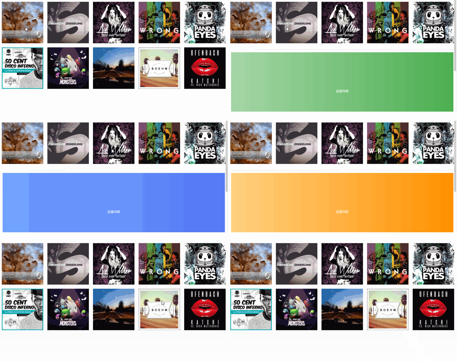
CoverFlow: Cover flow — a form of image browsing.

4.8.20 CoverView
CoverView: Cover view.

4.8.21 Carousel
Carousel: Auto-playing advertisement carousel.

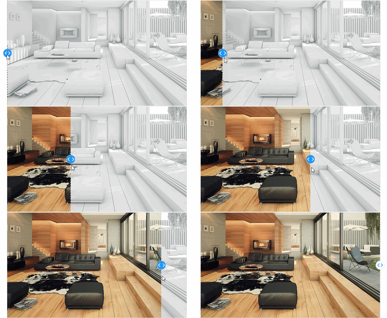
4.8.22 CompareSlider-h
CompareSlider-h: Horizontal comparison slider.

4.8.23 CompareSlider-v
CompareSlider-v: Vertical comparison slider.

4.8.24 ImageBrowser
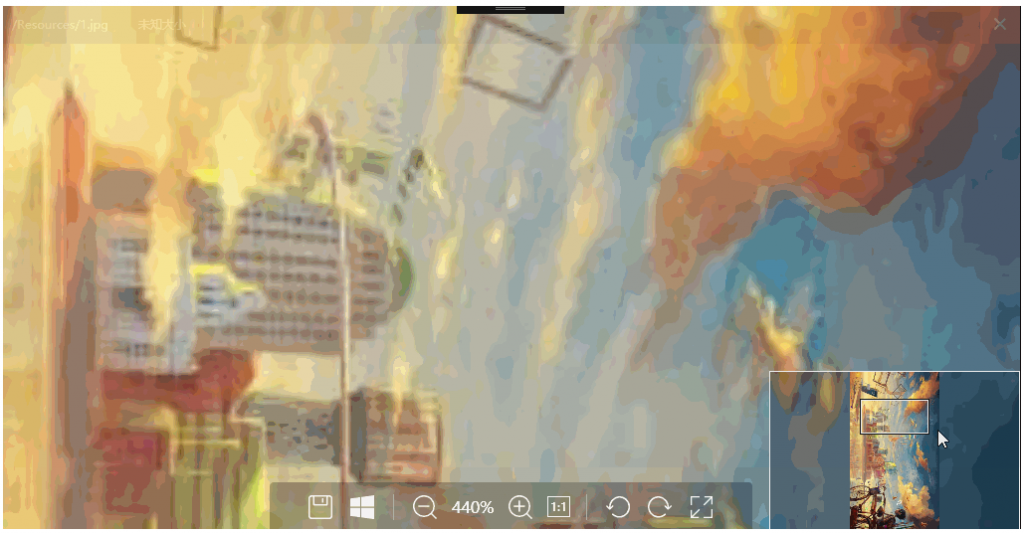
ImageBrowser: A powerful image browsing control. It displays thumbnails as cards; when a user finds an image interesting, this control makes viewing easy. Since the recorded GIF exceeds 9MB, I won't show the animation — you can download and experience it yourself.

4.8.25 WaterfallPanel
WaterfallPanel: Waterfall layout.

4.9 Loading/Progress Controls
4.9.1 ProgressBar
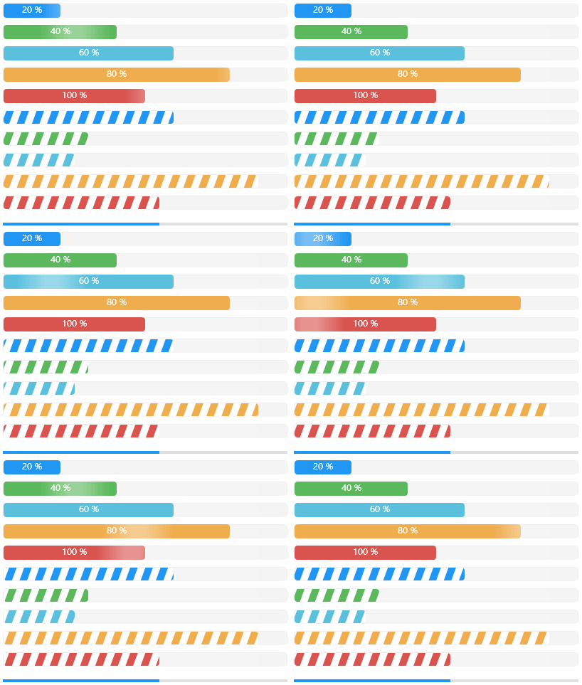
ProgressBar: Several styles below look great — choose as you like.

4.9.2 WaveProgressBar
WaveProgressBar: Water wave progress bar — cool, right?

4.9.3 CircleProgressBar
CircleProgressBar: Circular progress bar.

4.9.4 Loading
Loading: Loading indicator. Use it while waiting for data — let users watch a small animation instead of staring at a frozen screen.

4.10 WPF Extended Controls
Some features are not natively supported in C# WPF, such as displaying animated GIFs (the Image control shows only the first frame). HandyControl implements this well, which is commendable.
4.10.1 GeometryAnimation
GeometryAnimation:

4.10.2 GifImage
GifImage: GIF playback. Microsoft doesn't provide this functionality natively, so the open-source community has to implement it. The HandyControl author's implementation has low memory usage.

4.11 Data Display Controls
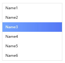
4.11.1 ListBox
ListBox:

4.11.2 ListView
ListView:

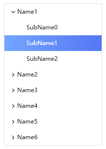
4.11.3 TreeView
TreeView:

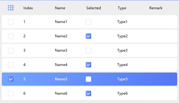
4.11.4 DataGrid
DataGrid:

4.11.5 Dark Theme
Dark Theme:

4.12 Window Controls
The Dotnet9 editor groups custom windows, message boxes, etc., as window controls.
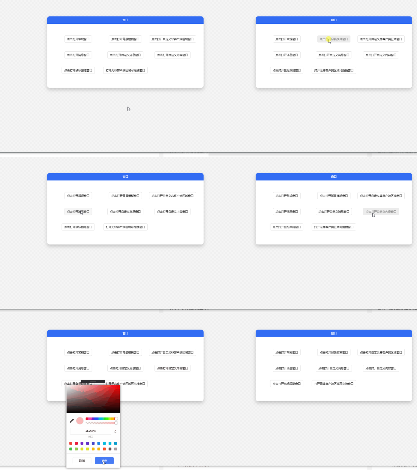
4.12.1 BlurWindow
BlurWindow: Various window styles for you to choose from.

4.12.2 Dialog
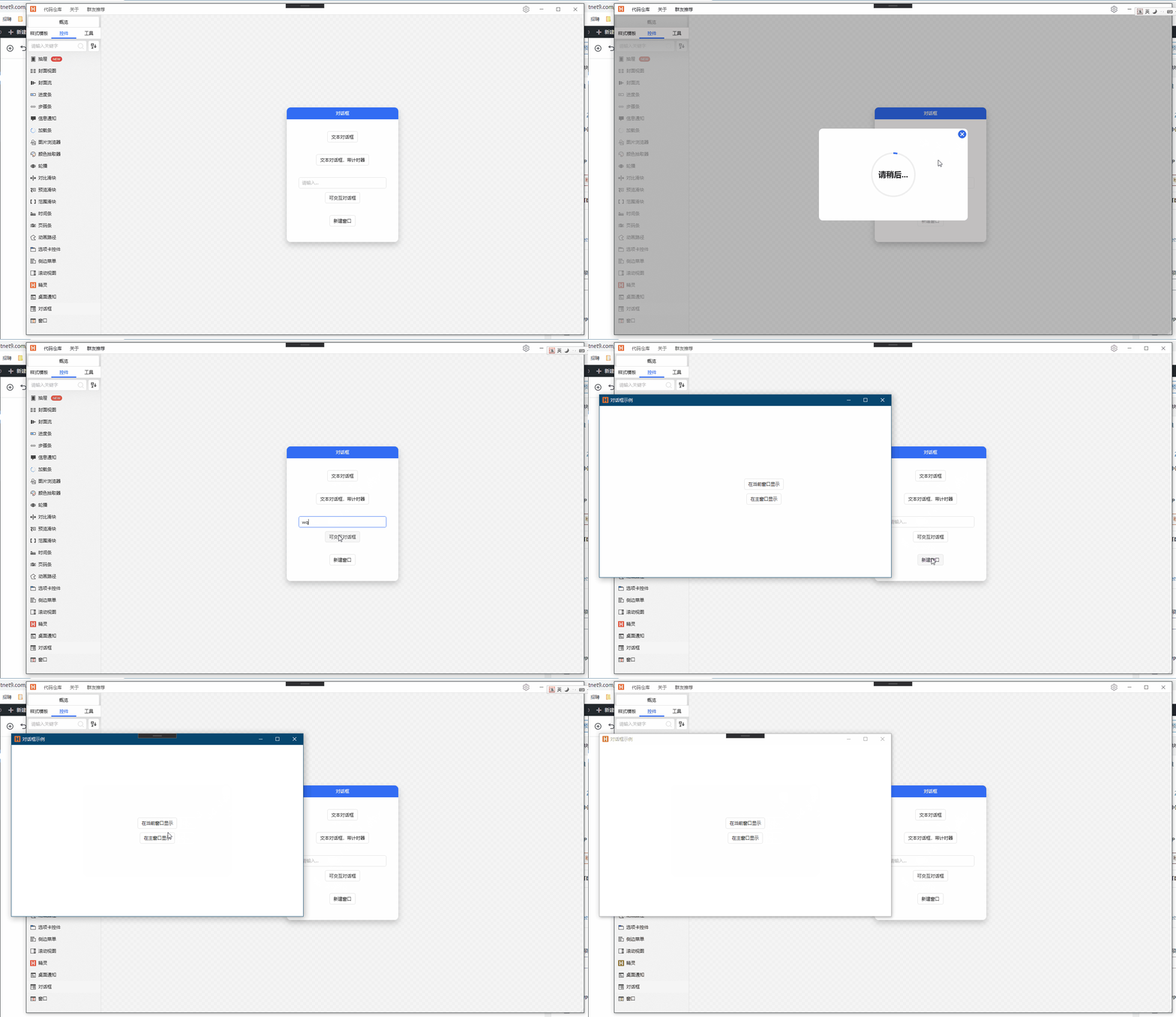
Dialog: Masked dialog using web-style overlay. Can distinguish between parent form and main application window masking, providing flexible control.

4.12.3 MessageBox
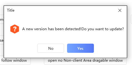
MessageBox:

4.12.4 ChatBubble
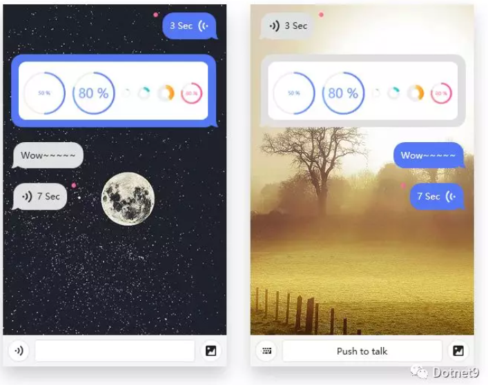
ChatBubble: Chat bubble — very useful for IM software.

Below is a simulated brief greeting between the editor and the HandyControl library author:

V. Final Words
This is the third article by the Dotnet9 editor introducing open-source C# WPF control libraries. During writing, I personally downloaded, compiled, and debugged the HandyControl library, explored it thoroughly, and studied classic cases based on it. I believe it won't disappoint you.
After playing with the HC library for several days and organizing about 90 screenshots, I think I have a good understanding of it. The library contains a rich variety of controls — almost everything I've seen in my work. I recommend using it in your projects (this article contains 97 images totaling nearly 30MB — mobile readers, your data is well spent, and I hope you found it valuable).
The above is only a sample of HandyControl controls. The author and contributors are constantly updating the repository, adding new controls like sprites. For more control examples, please visit the GitHub repository to download and study: https://github.com/HandyOrg/HandyControl.
If you have questions about using these controls or other suggestions, please leave a comment below — I will reply promptly. If you plan to use this library, you can download the repository, compile, and learn. You can also join the QQ group created by the author. The group number is listed in section 2.1: HandyControl Community.