
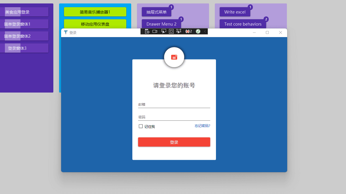
本文只是简单的登录界面布局,没有太重要的功能效果。
1. 实现效果
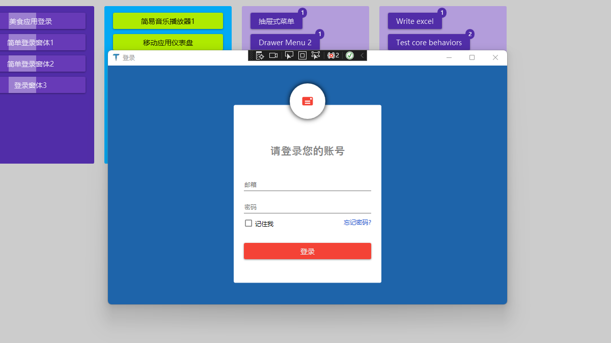
2. 业务场景
常规业务
3. 编码实现
3.1 添加 NuGet 库
使用 .NET Core 3.1 创建名为 “Login” 的 WPF 解决方案,添加 1 个 NuGet 库:MaterialDesignThemes。
3.2 工程结构
2 个文件变动:
- App.xaml:添加 MD 控件样式
- MainWindow.xaml:主窗口实现效果
3.2.1 App.xaml 引入 MD 控件样式
关键样式引用代码
<Application.Resources>
  <ResourceDictionary>
    <ResourceDictionary.MergedDictionaries>
      <ResourceDictionary
        Source="pack://application:,,,/MaterialDesignThemes.Wpf;component/Themes/MaterialDesignTheme.Light.xaml"
      />
      <ResourceDictionary
        Source="pack://application:,,,/MaterialDesignThemes.Wpf;component/Themes/MaterialDesignTheme.Defaults.xaml"
      />
    </ResourceDictionary.MergedDictionaries>
    <!--Primary-->
    <SolidColorBrush x:Key="PrimaryHueLightBrush" Color="#FFCDD2" />
    <SolidColorBrush x:Key="PrimaryHueLightForegroundBrush" Color="#FF333333" />
    <SolidColorBrush x:Key="PrimaryHueMidBrush" Color="#f44336" />
    <SolidColorBrush x:Key="PrimaryHueMidForegroundBrush" Color="#FFEEEEEE" />
    <SolidColorBrush x:Key="PrimaryHueDarkBrush" Color="#b71c1c" />
    <SolidColorBrush x:Key="PrimaryHueDarkForegroundBrush" Color="#FFFFFFFF" />
    <!--Accent-->
    <SolidColorBrush x:Key="SecondaryAccentBrush" Color="#ff1744" />
    <SolidColorBrush x:Key="SecondaryAccentForegroundBrush" Color="#FFFFFF" />
  </ResourceDictionary>
</Application.Resources>
3.2.2 主窗体 MainWindow.xaml
全部代码,登录窗口布局
<Window
x:Class="WpfApp2.MainWindow"
xmlns="http://schemas.microsoft.com/winfx/2006/xaml/presentation"
xmlns:x="http://schemas.microsoft.com/winfx/2006/xaml"
xmlns:d="http://schemas.microsoft.com/expression/blend/2008"
xmlns:mc="http://schemas.openxmlformats.org/markup-compatibility/2006"
xmlns:local="clr-namespace:WpfApp2"
mc:Ignorable="d"
xmlns:materialDesign="http://materialdesigninxaml.net/winfx/xaml/themes"
Title="登录"
Height="450"
Width="800"
>
<Grid Background="#FF1E64AA">
<Grid Width="300" Height="400">
<Border
CornerRadius="3"
HorizontalAlignment="Center"
Width="290"
Height="350"
VerticalAlignment="Center"
Background="White"
Margin="0 35 0 0"
>
<StackPanel Margin="0 50 0 0">
<TextBlock
Text="请登录您的账号"
HorizontalAlignment="Center"
Foreground="Gray"
Margin="30"
FontSize="21"
FontFamily="Champagne & Limousines"
FontWeight="SemiBold"
/>
<TextBox Margin="20 10" materialDesign:HintAssist.Hint="邮箱" />
<PasswordBox Margin="20 10" materialDesign:HintAssist.Hint="密码" />
<Grid Margin="20 0">
<CheckBox Content="记住我" HorizontalAlignment="Left" />
<TextBlock
Text="忘记密码?"
Foreground="#FF2259D1"
HorizontalAlignment="Right"
Cursor="Hand"
/>
</Grid>
<button Content="登录" Margin="20 30" />
</StackPanel>
</Border>
<Border
Width="70"
Height="70"
HorizontalAlignment="Center"
VerticalAlignment="Top"
Background="White"
CornerRadius="50"
>
<Border.Effect>
<DropShadowEffect BlurRadius="15" ShadowDepth="0" />
</Border.Effect>
<materialDesign:PackIcon
Kind="Mail"
Foreground="{StaticResource PrimaryHueMidBrush}"
HorizontalAlignment="Center"
VerticalAlignment="Center"
Width="25"
Height="25"
/>
</Border>
</Grid>
</Grid>
</Window>
4. 本文参考
- Design com WPF 大神的学习视频:First Impressions and new VS 2019
- 开源控件库:MaterialDesignInXamlToolkit
- 本站对 MD 开源控件库的介绍:控件介绍
5. 代码下载
GitHub 源码下载:HelloDotNetCore