

这是我参与 2022 首次更文挑战的第 6 天,活动详情查看:2022 首次更文挑战
问:为什么要使用 flex 布局?
答:因为好用。
在面试的时候,当面试官问我们为什么要使用 flex 布局的时候,首先我们得先明白一点,问这个问题面试官到底想要了解什么?简单的回答”好用“肯定是不行的,任何方案和技术的出现都是为了弥补之前的缺陷,所以相比传统的布局方案存在的痛点,flex 布局肯定有存在的优势和价值。所以接下来我们得说传统的布局是怎样的形式,然后使用了 flex 布局又是什么样的形式。
布局的传统解决方案,基于盒子模型,依赖 display,position,float 等属性。它对于那些特殊布局非常不方便。
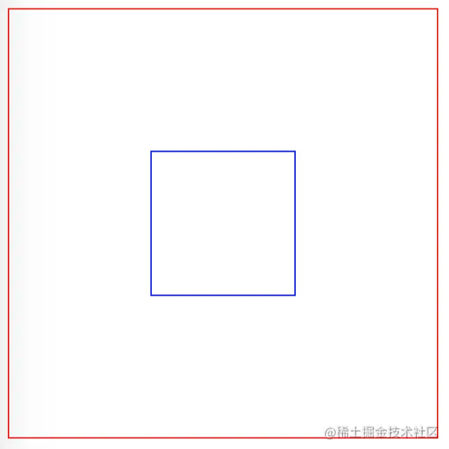
比如,垂直居中就不容易实现。我们可能要 position + transform 才能配合完成。
<div class="wrap">
  <div class="box"></div>
</div>
.wrap {
  width: 300px;
  height: 300px;
  border: 1px solid red;
  position: relative;
}

.box {
  height: 100px;
  width: 100px;
  border: 1px solid blue;
  position: absolute;
  left: 50%;
  top: 50%;
  transform: translate3d(-50%, -50%, 0);
}
新的方案 flex 布局,可以简便、完整、响应式地实现各种页面布局。
使用了 flex 布局的盒子模型设置垂直居中就非常简单了,只需要设置 align-items:center; 属性。
.wrap {
  width: 300px;
  height: 300px;
  border: 1px solid red;
  display: flex;
  justify-content: center;
  align-items: center;
}

.box {
  height: 100px;
  width: 100px;
  border: 1px solid blue;
}
Flex 是 Flexible Box 的缩写,意为"弹性布局",用来为盒状模型提供最大的灵活性。
1. 两栏布局
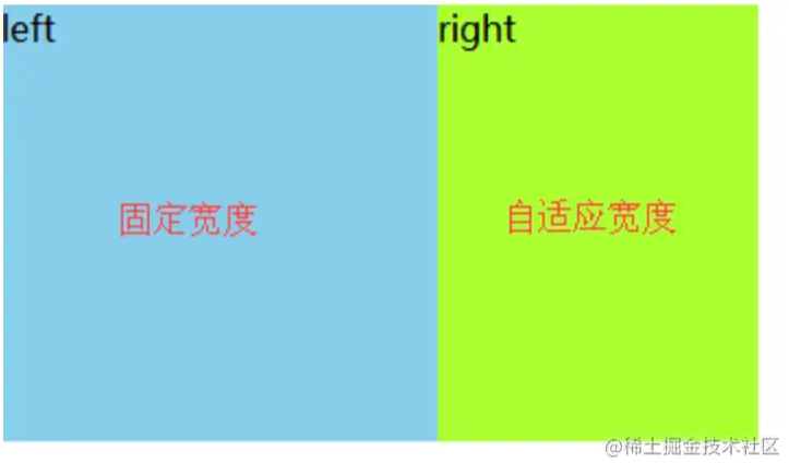
如果我们需要实现页面两栏布局的效果,一栏固定宽度,一栏自适应。
1.1 方法 1
左侧 float:left,右侧 margin-left。
.left {
  float: left;
  width: 200px;
}
.right {
  margin-left: 200px;
}
浮动的元素是在页面中脱离文档流,没有了自己的位置,说以后面的元素被浮动的元素覆盖,通过 margin 或者 padding 撑开。
1.2 方法 2
左侧 float:left,右侧 overflow:hidden。
.left {
  float: left;
  width: 200px;
}
.right {
  overflow: hidden;
}
还可以通过 overflow: hidden; 清除浮动。
1.3 方法 3
利用定位 position
.wrap {
  position: relative;
}
.left {
  width: 200px;
}
.right {
  position: absolute;
  top: 0;
  left: 200px;
}
1.4 方法 4
利用弹性布局 flex
.wrap {
  display: flex;
}
.left {
  width: 200px;
}
.right {
  flex: 1;
}
2. 属性
问:align-items 和 justify-content 的区别
采用 Flex 布局的元素,称为 Flex 容器(flex container),简称"容器"。容器默认存在两根轴:水平的主轴(main axis)和垂直的交叉轴(cross axis)。
flex-direction 属性决定主轴的方向(也就是排列方向)。有 4 个属性值可以设置。
- row(默认值):主轴为水平方向,起点在左端。
- row-reverse:主轴为水平方向,起点在右端。
- column:主轴为垂直方向,起点在上沿。
- column-reverse:主轴为垂直方向,起点在下沿。
注意:面试的时候不要说:水平方向是主轴,这样不太准确,因为主轴可能是水平和垂直方向。因为 flex-direction 属性决定主轴的方向。
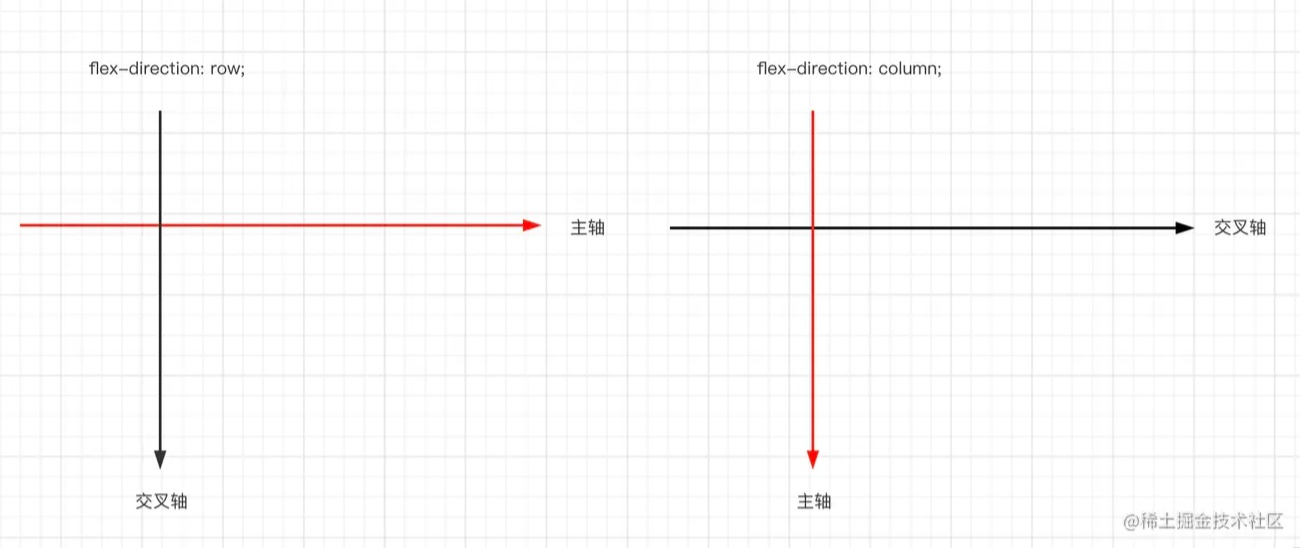
- align-items 属性定义项目在交叉轴上如何对齐。
- justify-content 属性定义了项目在主轴上的对齐方式。
问:flex:1;代表什么意思
flex 属性是 flex-grow, flex-shrink 和 flex-basis 的简写,默认值为 0 1 auto。后两个属性可选。
flex-grow 属性定义项目的放大比例,默认为 0,即如果存在剩余空间,也不放大。如果所有项目的 flex-grow 属性都为 1,则它们将等分剩余空间(如果有的话)。如果一个项目的 flex-grow 属性为 2,其他项目都为 1,则前者占据的剩余空间将比其他项多一倍。
flex-shrink 属性定义了项目的缩小比例,默认为 1,即如果空间不足,该项目将缩小。如果所有项目的 flex-shrink 属性都为 1,当空间不足时,都将等比例缩小。如果一个项目的 flex-shrink 属性为 0,其他项目都为 1,则空间不足时,前者不缩小。
flex-basis 属性定义了在分配多余空间之前,项目占据的主轴空间。浏览器根据这个属性,计算主轴是否有多余空间。它的默认值为 auto,即项目的本来大小。
flex 属性属性有两个快捷值:auto (1 1 auto) 和 none (0 0 auto)。
建议优先使用这个属性,而不是单独写三个分离的属性,因为浏览器会推算相关值。
所以 flex: 1 表示的含义是等分剩余空间。