
大家好,我是沙漠尽头的狼。
.NET是免费,跨平台,开源,用于构建所有应用的开发人员平台。
本文演示如何在WPF中使用Blazor开发漂亮的UI,为客户端开发注入新活力。
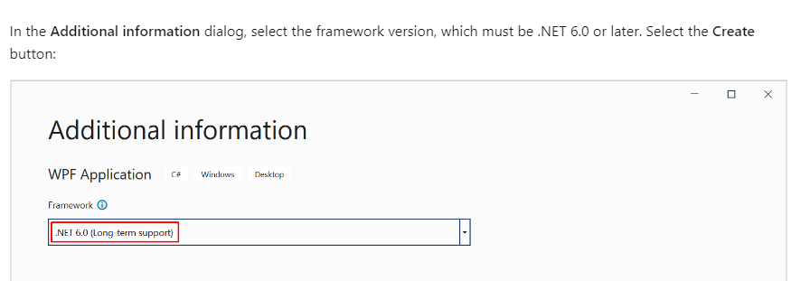
注 要使WPF支持Blazor,.NET版本必须是 6.0 或更高版本,本文所有示例使用的.NET 7.0,版本要求见链接,截图看如下文字:
1. WPF默认程序
本文从创建WPF Hello World开发:
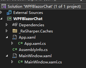
使用WPF模板创建一个默认程序,取名【WPFBlazorChat】,项目组织结构如下:
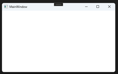
运行项目,一个空白窗口:
接着往下看,我们添加Blazor支持,本小节代码在这WPF默认程序源码。
2. 添加Blazor支持
依然使用上面的工程,添加Blazor支持,此部分参考微软文档生成 Windows Presentation Foundation (WPF) Blazor 应用,本小节快速略过。
2.1 编辑工程文件
双击工程文件WPFBlazorChat.csproj,修改处如下:
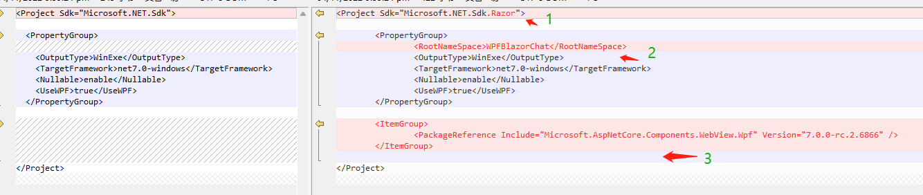
- 在项目文件的顶部,将 SDK 更改为
Microsoft.NET.Sdk.Razor。 - 添加节点
<RootNameSpace>WPFBlazorChat</RootNameSpace>,将项目命名空间WPFBlazorChat设置为应用的根命名空间。 - 添加
NuGet包Microsoft.AspNetCore.Components.WebView.Wpf,版本看你选择的.NET版本而定。
2.2 添加_Imports.razor文件
_Imports.razor文件类似一个Global using文件,专门给Razor组件使用,放置一些用的比较多的全局的命名空间,精简代码。
内容如下,引入了一个命名空间Microsoft.AspNetCore.Components.Web,这是Razor常用命名空间,包含用于向 Blazor 框架提供有关浏览器事件的信息的类型。:
@using Microsoft.AspNetCore.Components.Web
2.3 添加wwwroot\index.html文件
和Vue、React一样,需要一个html文件承载Razor组件,页面内容类似:
<!DOCTYPE html>
<html lang="en">

<head>
    <meta charset="utf-8" />
    <meta name="viewport" content="width=device-width, initial-scale=1.0" />
    <title>WPFBlazorChat</title>
    <base href="/" />
    <link href="css/app.css" rel="stylesheet" />
    <link href="WpfBlazor.styles.css" rel="stylesheet" />
</head>

<body>
<div id="app">Loading...</div>

<div id="blazor-error-ui">
    An unhandled error has occurred.
    <a href="" class="reload">Reload</a>
    <a class="dismiss">🗙</a>
</div>
<script src="_framework/blazor.webview.js"></script>
</body>

</html>
app.css文件在下面给出定义。- 看
<div id="app">Loading...</div>,这里是承载Razor组件的地方,后面所有加载的Razor组件都是在这里渲染出来的。 - 其他暂时不管。
2.4 添加wwwroot\css\app.css文件
页面的基本样式,通用的样式可放在这个文件:
html, body {
    font-family: 'Helvetica Neue', Helvetica, Arial, sans-serif;
}

h1:focus {
    outline: none;
}

a, .btn-link {
    color: #0071c1;
}

.btn-primary {
    color: #fff;
    background-color: #1b6ec2;
    border-color: #1861ac;
}

.valid.modified:not([type=checkbox]) {
    outline: 1px solid #26b050;
}

.invalid {
    outline: 1px solid red;
}

.validation-message {
    color: red;
}

#blazor-error-ui {
    background: lightyellow;
    bottom: 0;
    box-shadow: 0 -1px 2px rgba(0, 0, 0, 0.2);
    display: none;
    left: 0;
    padding: 0.6rem 1.25rem 0.7rem 1.25rem;
    position: fixed;
    width: 100%;
    z-index: 1000;
}

#blazor-error-ui .dismiss {
    cursor: pointer;
    position: absolute;
    right: 0.75rem;
    top: 0.5rem;
}
2.5 添加一个Razor组件
加一个Razor的经典组件Counter.razor,Blazor的Hello World程序就有这么一个组件,文件路径:/RazorViews/Counter.razor,之所以放RazorViews目录,是为了和WPF常用的Views目录区分,该组件内容如下:
<h1>Counter</h1>

<p>好开心,你点我了,现在是:<span style="color: red;">@currentCount</span></p>

<button class="btn btn-primary" @onclick="IncrementCount">快快点我</button>

@code {
    private int currentCount = 0;

    private void IncrementCount()
    {
        currentCount++;
    }
}
一个按钮【快快点我】,点击@onclick="IncrementCount"使变量currentCount自增,同时页面显示此变量值,相信你能看懂。
2.6 Blazor与WPF窗体关联
这是两者产生关系的关键一步,打开窗体MainWindow.xaml,修改如下:

如上代码,要点如下:
- 添加上面引入的
NuGet包Microsoft.AspNetCore.Components.WebView.Wpf的命名空间,命名为blazor,主要是要使用BlazorWebView组件; BlazorWebView组件属性HostPage指定承载的html文件,Services指定razor组件的Ioc容器,看下面MainWindow()里标红的代码;RootComponent的Selector="#app"属性指示Razor组件渲染的位置,看index.html中id为app的html元素,ComponentType指示需要在#app中渲染的Razor组件类型。
打开MainWindow.xaml.cs,修改如下:
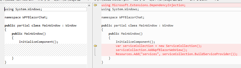
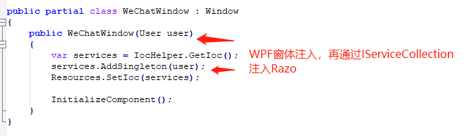
在WPF里可以使用Prism等框架提供的Unity、DryIoc等Ioc容器实现视图与服务的注入;Razor组件这里,默认使用ASP.NET Core的IServiceCollection容器;如果WPF窗体与Razor组件需要共享数据,可以通过后面要说的Messager发送消息,也可以通过Ioc容器注入的方式实现,比如从WPF窗体中注入的数据(通过MainWindow构造函数注入),通过IServiceCollection容器再注入Razor组件使用,这里后面也有提到。
上面步骤做完后,运行程序:
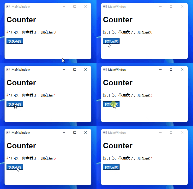
OK,WPF与Blazor集成成功,打完收工?
等等,还没完呢,本小节源码在这WPF中添加Blazor,接着往下看。
3. 自定义窗体
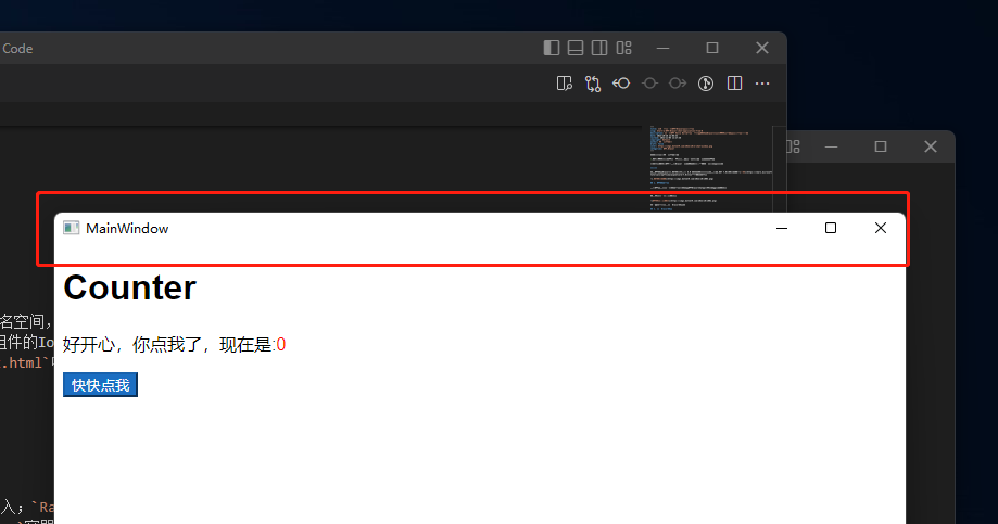
看上图,窗体边框是WPF默认的样式,有时会感觉比较丑,或者不丑,设计师有其他的窗体风格设计,往往我们要自定义窗体,本节分享部分WPF与Blazor的自定义窗体实现,更多定制化功能可能需要您自行研究。
3.1 WPF自定义窗体
一般实现是设置窗体的三个属性WindowStyle="None" AllowsTransparency="True" Background="Transparent",即可隐藏默认窗体的边框,然后在内容区自己画标题栏、最小化、最大化、关闭按钮、客户区等。
MainWindow.xaml:隐藏WPF默认窗体边框
<Window
    x:Class="WPFBlazorChat.MainWindow"
    xmlns="http://schemas.microsoft.com/winfx/2006/xaml/presentation"
    xmlns:x="http://schemas.microsoft.com/winfx/2006/xaml"
    xmlns:blazor="clr-namespace:Microsoft.AspNetCore.Components.WebView.Wpf;assembly=Microsoft.AspNetCore.Components.WebView.Wpf"
    xmlns:d="http://schemas.microsoft.com/expression/blend/2008"
    xmlns:mc="http://schemas.openxmlformats.org/markup-compatibility/2006"
    xmlns:razorViews="clr-namespace:WPFBlazorChat.RazorViews"
    Title="MainWindow"
    Width="800"
    Height="450"
    AllowsTransparency="True"
    Background="Transparent"
    WindowStyle="None"
    mc:Ignorable="d">
    <Grid>
        <blazor:BlazorWebView HostPage="wwwroot\index.html" Services="{DynamicResource services}">
            <blazor:BlazorWebView.RootComponents>
                <blazor:RootComponent ComponentType="{x:Type razorViews:Counter}" Selector="#app" />
            </blazor:BlazorWebView.RootComponents>
    </Grid>
</Window>
上面的代码只是隐藏了WPF默认窗体的边框,运行程序如下:
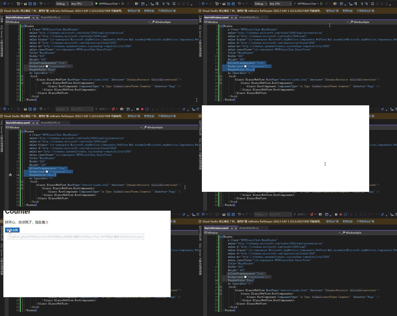
看上图,点击窗体中的按钮(其实是Razor组件的按钮),但未执行按钮点击事件,且窗体消失了,这是怎么回事?您可以尝试研究下为什么,我没有研究个所以然来,暂时加个背景处理BlazorWebView穿透的问题。
简单的WPF自定义窗体样式
我们加上自定义窗体的基本样式看看:
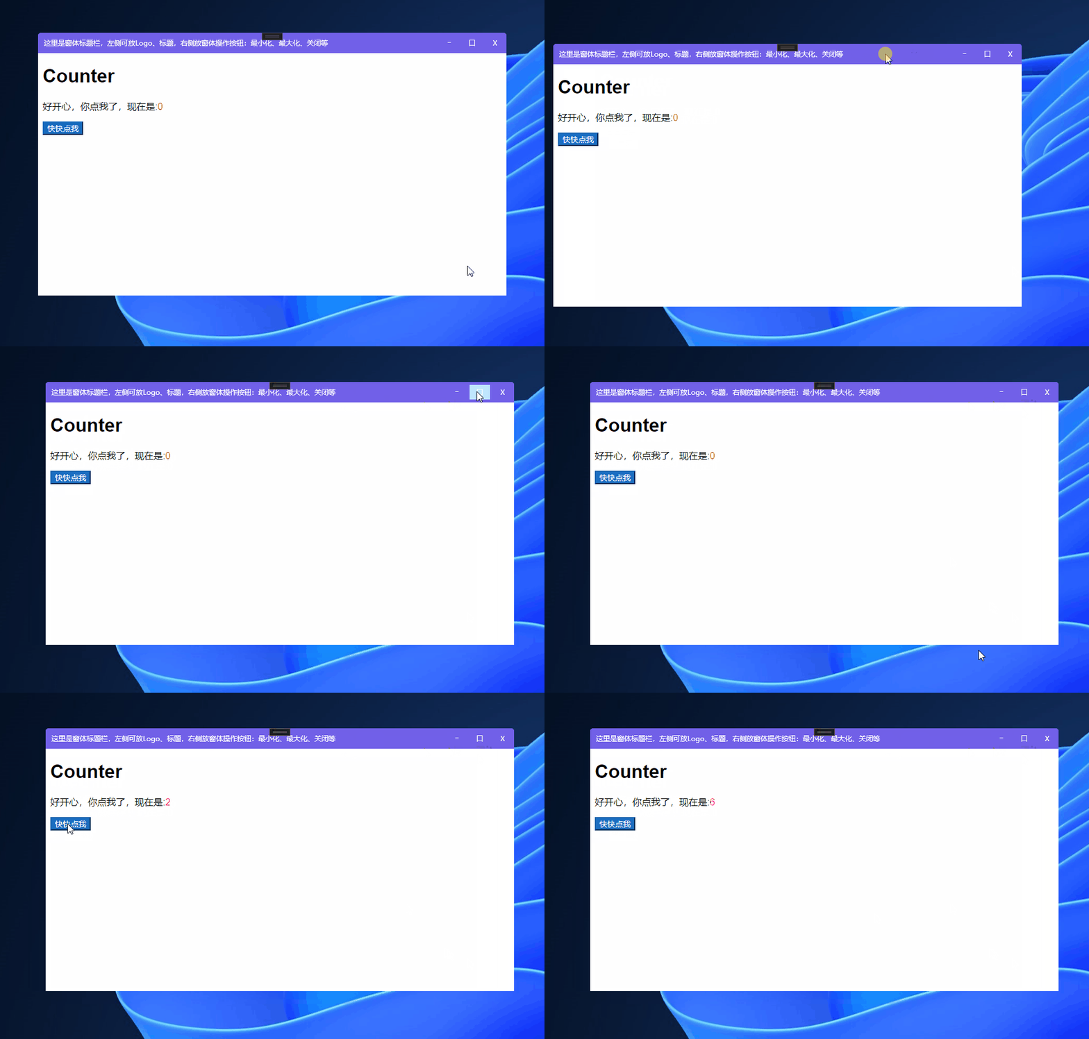
MainWindow.xaml代码如下:
<Window
    x:Class="WPFBlazorChat.MainWindow"
    xmlns="http://schemas.microsoft.com/winfx/2006/xaml/presentation"
    xmlns:x="http://schemas.microsoft.com/winfx/2006/xaml"
    xmlns:blazor="clr-namespace:Microsoft.AspNetCore.Components.WebView.Wpf;assembly=Microsoft.AspNetCore.Components.WebView.Wpf"
    xmlns:d="http://schemas.microsoft.com/expression/blend/2008"
    xmlns:mc="http://schemas.openxmlformats.org/markup-compatibility/2006"
    xmlns:razorViews="clr-namespace:WPFBlazorChat.RazorViews"
    Title="MainWindow"
    Width="800"
    Height="450"
    AllowsTransparency="True" Background="Transparent" WindowStyle="None"
    mc:Ignorable="d">
    <Window.Resources>
        <Style TargetType="{x:Type Button}">
            <Setter Property="Width" Value="35" />
            <Setter Property="Height" Value="25" />
            <Setter Property="Margin" Value="2" />
            <Setter Property="Background" Value="Transparent" />
            <Setter Property="BorderThickness" Value="0" />
            <Setter Property="Foreground" Value="White" />
        </Style>
    </Window.Resources>
    <Border Background="#7160E8" CornerRadius="5">
        <Grid>
            <Grid.RowDefinitions>
                <RowDefinition Height="35" />
                <RowDefinition Height="*" />
            </Grid.RowDefinitions>
            <Border
                Background="#7160E8" CornerRadius="5 5 0 0" MouseLeftButtonDown="MoveWindow_MouseLeftButtonDown">
                <Grid>
                    <TextBlock
                        Margin="10,10,5,5"
                        Foreground="White"
                        Text="这里是窗体标题栏,左侧可放Logo、标题,右侧放窗体操作按钮:最小化、最大化、关闭等" />
                    <StackPanel HorizontalAlignment="Right" Orientation="Horizontal">
                        <Button Click="MinimizeWindow_Click" Content="―" />
                        <Button Click="MaximizeWindow_Click" Content="口" />
                        <Button Click="CloseWindow_Click" Content="X" />
                    </StackPanel>
                </Grid>
            </Border>
            <blazor:BlazorWebView Grid.Row="1" HostPage="wwwroot\index.html" Services="{DynamicResource services}">
                <blazor:BlazorWebView.RootComponents>
                    <blazor:RootComponent ComponentType="{x:Type razorViews:Counter}" Selector="#app" />
                </blazor:BlazorWebView.RootComponents>
            </blazor:BlazorWebView>
        </Grid>
    </Border>
</Window>
我们给整个窗体客户端区域加了一个背景Border(您可以去掉Border背景色,点击界面按钮试试),然后又套了一个Grid,用于放置自定义的标题栏(标题和窗体控制按钮)和BlazorWebView(用于渲染Razor组件的浏览器组件),下面是窗体控制按钮的响应事件:
using Microsoft.Extensions.DependencyInjection;
using System.Windows;

namespace WPFBlazorChat;

public partial class MainWindow : Window
{
    public MainWindow()
    {
        InitializeComponent();
        var serviceCollection = new ServiceCollection();
        serviceCollection.AddWpfBlazorWebView();
        Resources.Add("services", serviceCollection.BuildServiceProvider());
    }

    private void MoveWindow_MouseLeftButtonDown(object sender, System.Windows.Input.MouseButtonEventArgs e)
    {
        if (e.ClickCount == 1)
        {
            this.DragMove();
        }
        else
        {
            MaximizeWindow_Click(null, null);
        }
    }

    private void CloseWindow_Click(object sender, RoutedEventArgs e)
    {
        this.Close();
    }

    private void MinimizeWindow_Click(object sender, RoutedEventArgs e)
    {
        this.WindowState = WindowState.Minimized;
    }

    private void MaximizeWindow_Click(object sender, RoutedEventArgs e)
    {
        this.WindowState = this.WindowState == WindowState.Maximized ? WindowState.Normal : WindowState.Maximized;
    }
}
代码简单,处理了窗体最小化、窗体最大化(还原)、关闭、标题栏双击窗体最大化(还原),上面的实现不是一个完美的自定义窗体实现,至少有这两个问题:
- 当您尝试最大化后,窗体铺满了整个操作系统桌面(连任务栏区域也占用了);
- 窗体任务栏两个圆角未生效(红色矩形框选的部分),即窗体下面的两个圆角,站长未找到让
BlazorWebView出现圆角的属性或其他方法;标题栏区域(绿色矩形框选的部分)是WPF控件,所以圆角显示正常。
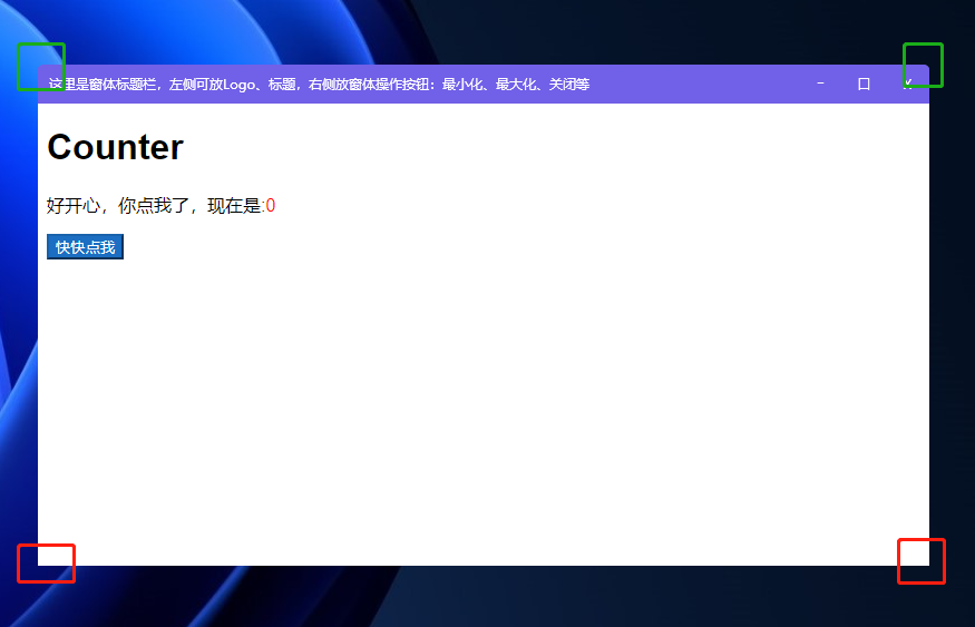
在后面的3.4小节,站长使用一个第三库实现了窗体圆角问题,更多比较好的WPF自定义窗体实现可看这篇文章:WPF三种自定义窗体的实现,本小节中示例源码在这WPF自定义窗体。
3.2 WPF异形窗体
异形窗体的需求,使用WPF实现是比较方便的,本来打算写写的,感觉偏离主题太远了,给篇文章自行看看吧:WPF异形窗体演示,文中异形窗体效果如下:

下面介绍将窗体的标题栏也放Razor组件中实现的方式。
3.3 Blazor实现自定义窗体效果
上面使用了WPF制作自定义窗体,有没有这种需求,把菜单放置到标题栏?这个简单,WPF能很好实现。
如果放Tab类控件呢?Tab Header是在标题栏显示,TabItem是在客户端区域,Tab Header与TabItem风格统一,在一套代码里面实现和维护也方便,那么在WPF+Blazor混合开发的情况怎么实现呢?相信通过本节Razor组件实现标题栏的介绍,你能做出来。
MainWindow.xaml恢复代码,只设置隐藏WPF默认窗体边框,并给BlazorWebView套一层背景:
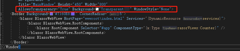
后面的代码有参考 BlazorDesktopWPF-CustomTitleBar 开源项目实现。
我们把标题栏做到Counter.razor组件,即标题栏、客户区放一个组件里,当然你也可以分离,这里我们方便演示:
Counter.razor
@using WPFBlazorChat.Services

<div class="titlebar" @ondblclick="WindowService.Maximize" @onmouseup="WindowService.StopMove" @onmousedown="WindowService.StartMove">
    <button class="titlebar-btn" onclick="alert('js alert: navigation pressed');">
        <img src="svg/navigation.svg" />
    </button>
    <div class="window-title">
        测试窗体标题
    </div>
    <div style="flex-grow:1"></div>
    <button class="titlebar-btn" onclick="alert('js alert: settings pressed');">
        <img src="svg/settings.svg" />
    </button>
    <button class="titlebar-btn" @onclick="WindowService.Minimize">
        <img src="svg/minimize.svg" />
    </button>
    <button class="titlebar-btn" @onclick="WindowService.Maximize">
        @if (WindowService.IsMaximized())
        {
            <img src="svg/restore.svg" />
        }
        else
        {
            <img src="svg/maximize.svg" />
        }
    </button>
    <button class="titlebar-cbtn" @onclick="()=>WindowService.Close(false)">
        <img src="svg/dismiss.svg" />
    </button>
</div>

<p>好开心,你点我了,现在是:<span style="color: red;">@currentCount</span></p>

<button class="btn btn-primary" @onclick="IncrementCount">快快点我</button>

@code {
    private int currentCount = 0;

    protected override void OnInitialized()
    {

        WindowService.Init();
        base.OnInitialized();
    }

    private void IncrementCount()
    {
        currentCount++;
    }
}
下面给出代码简单说明:
- 第一个
div充做窗体的标题栏区域,注册了双击事件调用窗体最大化(还原)方法、鼠标按下与释放调用窗体的移动开始与结束方法; - 在第一个
div里,其中有3个按钮,即窗体的控制按钮,调用窗体最小化、最大化(还原)、关闭方法调用; - 另有两个按钮,演示单击调用
JavaScript的alert方法弹出消息。
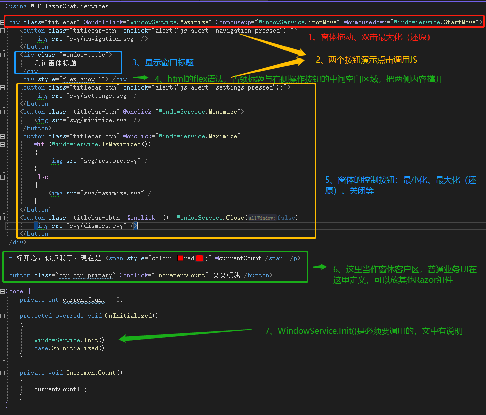
运行效果如下:

实现这个效果,还有一些代码:
- 上面的代码调用了一些方法实现窗体操作最小化、关闭等,代码如下;
- 因为是
Razor组件,即html实现的界面,界面的html元素也定义了一些css样式,代码也一并给出。 - 标题栏的按钮使用了一些
svg图片,在仓库里,可自行获取。
窗体拖动
首先添加NuGet包Simplify.Windows.Forms,用于获取鼠标光标的位置:
<PackageReference Include="Simplify.Windows.Forms" Version="1.1.2" />
添加窗体帮助类:Services\WindowService.cs
using System;
using System.Linq;
using System.Windows;
using System.Windows.Forms;
using System.Windows.Threading;
using Application = System.Windows.Application;

namespace WPFBlazorChat.Services;

public class WindowService
{
    private static bool _isMoving;
    private static double _startMouseX;
    private static double _startMouseY;
    private static double _startWindLeft;
    private static double _startWindTop;

    public static void Init()
    {
        DispatcherTimer dispatcherTimer = new();
        dispatcherTimer.Tick += UpdateWindowPos;
        dispatcherTimer.Interval = TimeSpan.FromMilliseconds(17);
        dispatcherTimer.Start();
    }

    public static void StartMove()
    {
        _isMoving = true;
        _startMouseX = GetX();
        _startMouseY = GetY();
        var window = GetActiveWindow();
        if (window == null)
        {
            return;
        }

        _startWindLeft = window.Left;
        _startWindTop = window.Top;
    }

    public static void StopMove()
    {
        _isMoving = false;
    }

    public static void Minimize()
    {
        var window = GetActiveWindow();
        if (window != null)
        {
            window.WindowState = WindowState.Minimized;
        }
    }

    public static void Maximize()
    {
        var window = GetActiveWindow();
        if (window != null)
        {
            window.WindowState =
                window.WindowState == WindowState.Maximized ? WindowState.Normal : WindowState.Maximized;
        }
    }


    public static bool IsMaximized()
    {
        var window = GetActiveWindow();
        if (window != null)
        {
            return window.WindowState == WindowState.Maximized;
        }

        return false;
    }

    public static void Close(bool allWindow = false)
    {
        if (allWindow)
        {
            Application.Current?.Shutdown();
            return;
        }

        var window = GetActiveWindow();
        if (window != null)
        {
            window.Close();
        }
    }


    private static void UpdateWindowPos(object? sender, EventArgs e)
    {
        if (!_isMoving)
        {
            return;
        }

        double moveX = GetX() - _startMouseX;
        double moveY = GetY() - _startMouseY;
        Window? window = GetActiveWindow();
        if (window == null)
        {
            return;
        }

        window.Left = _startWindLeft + moveX;
        window.Top = _startWindTop + moveY;
    }

    private static int GetX()
    {
        return Control.MousePosition.X;
    }

    private static int GetY()
    {
        return Control.MousePosition.Y;
    }

    private static Window? GetActiveWindow()
    {
        return Application.Current.Windows.Cast<Window>().FirstOrDefault(currentWindow => currentWindow.IsActive);
    }
}
上面的代码用于窗体的最小化、最大化(还原)、关闭等实现,需要在Razor组件里正确的调用这些方法:
Counter.razor组件的OnInitialized初始化生命周期方法里调用WindowService.Init();,如上代码,这个方法开启定时器,定时调用UpdateWindowPos方法检查鼠标是否按下,如果按下,检查间隔内窗体的位置变化范围,然后修改窗体位置,从而实现窗体位置移动(移动窗体无法使用WPF的DragMove方法,您可以尝试使用看看它报什么错),移动窗体有更好的方法欢迎留言。Razor组件里窗体控制按钮的使用看上面的代码不难理解,不过多解释。
上面效果的样式文件修改如下,wwwroot\css\app.css:
/*
BlazorDesktopWPF-CustomTitleBar - © Copyright 2021 - Jam-Es.com
Licensed under the MIT License (MIT). See LICENSE in the repo root for license information.
*/

html, body {
    font-family: 'Helvetica Neue', Helvetica, Arial, sans-serif;
    padding: 0;
    margin: 0;
}

.valid.modified:not([type=checkbox]) {
    outline: 1px solid #26b050;
}

.invalid {
    outline: 1px solid red;
}

.validation-message {
    color: red;
}

#blazor-error-ui {
    background: lightyellow;
    bottom: 0;
    box-shadow: 0 -1px 2px rgba(0, 0, 0, 0.2);
    display: none;
    left: 0;
    padding: 0.6rem 1.25rem 0.7rem 1.25rem;
    position: fixed;
    width: 100%;
    z-index: 1000;
}

#blazor-error-ui .dismiss {
    cursor: pointer;
    position: absolute;
    right: 0.75rem;
    top: 0.5rem;
}

.page-container {
    display: flex;
    flex-direction: column;
    height: 100vh;
}

.content-container {
    padding: 0px 20px 20px 20px;
    flex-grow: 1;
    overflow-y: scroll;
}

.titlebar {
    width: 100%;
    height: 32px;
    min-height: 32px;
    background-color: #7160E8;
    display: flex;
    flex-direction: row;
}

.titlebar-btn, .titlebar-cbtn {
    width: 46px;
    background-color: #7160E8;
    color: white;
    border: none;
    border-radius: 0;
}

.titlebar-btn:hover {
    background-color: #5A5A5A;
}

.titlebar-btn:focus, .titlebar-cbtn:focus {
    outline: 0;
}

.titlebar-cbtn:hover {
    background-color: #E81123;
}

.window-title {
    display: flex;
    flex-direction: column;
    justify-content: center;
    margin-left: 5px;
    color: white;
}
上面的一些代码即实现了由Razor组件实现窗体的标题显示、窗体的最小化、最大化(还原)、关闭、移动等操作,然而还是会有3.1结尾出现的问题,即窗体圆角和窗体最大化铺满操作系统桌面任务栏的问题,下面一小节我们尝试解决他。
小节总结:通过上面的代码,如果放Tab控件铺满整个窗体,是不是有思路了?
本小节源码在这Razor组件实现窗体标题栏功能
3.4 Blazor与WPF比较完美的实现效果
其实上面的代码可以当做学习,即使有不小瑕疵(哈哈),本小节我们还是使用第三包解决窗体圆角和最大化问题。
首先添加NuGet包ModernWpfUI,该WPF控件库本站介绍链接开源WPF控件库:ModernWpf:
<PackageReference Include="ModernWpfUI" Version="0.9.7-preview.2" />
然后打开App.xaml,引用上面开源WPF控件的样式:
<Application x:Class="WPFBlazorChat.App"
             xmlns="http://schemas.microsoft.com/winfx/2006/xaml/presentation"
             xmlns:x="http://schemas.microsoft.com/winfx/2006/xaml"
             xmlns:ui="http://schemas.modernwpf.com/2019"
             StartupUri="MainWindow.xaml">
    <Application.Resources>
        <ResourceDictionary>
            <ResourceDictionary.MergedDictionaries>
                <ui:ThemeResources />
                <ui:XamlControlsResources />
            </ResourceDictionary.MergedDictionaries>
        </ResourceDictionary>
    </Application.Resources>
</Application>
最后打开MainWindow.xaml,修改如下(主要是引入的几个属性ui:xxxxx):
<Window x:Class="WPFBlazorChat.MainWindow"
        xmlns="http://schemas.microsoft.com/winfx/2006/xaml/presentation"
        xmlns:d="http://schemas.microsoft.com/expression/blend/2008"
        xmlns:x="http://schemas.microsoft.com/winfx/2006/xaml"
        xmlns:mc="http://schemas.openxmlformats.org/markup-compatibility/2006"
        xmlns:ui="http://schemas.modernwpf.com/2019"
        xmlns:blazor="clr-namespace:Microsoft.AspNetCore.Components.WebView.Wpf;assembly=Microsoft.AspNetCore.Components.WebView.Wpf"
        xmlns:razorViews="clr-namespace:WPFBlazorChat.RazorViews"
        mc:Ignorable="d"
        Title="MainWindow" Height="450" Width="800"
        ui:TitleBar.ExtendViewIntoTitleBar="True"
        ui:TitleBar.IsBackButtonVisible="False"
        ui:TitleBar.Style="{DynamicResource AppTitleBarStyle}"
        ui:WindowHelper.UseModernWindowStyle="True">
    <Border Background="#7160E8" CornerRadius="5">
        <blazor:BlazorWebView HostPage="wwwroot\index.html" Services="{DynamicResource services}">
            <blazor:BlazorWebView.RootComponents>
                <blazor:RootComponent Selector="#app" ComponentType="{x:Type razorViews:Counter}" />
            </blazor:BlazorWebView.RootComponents>
        </blazor:BlazorWebView>
    </Border>
</Window>
就上面三处修改,我们运行看看:
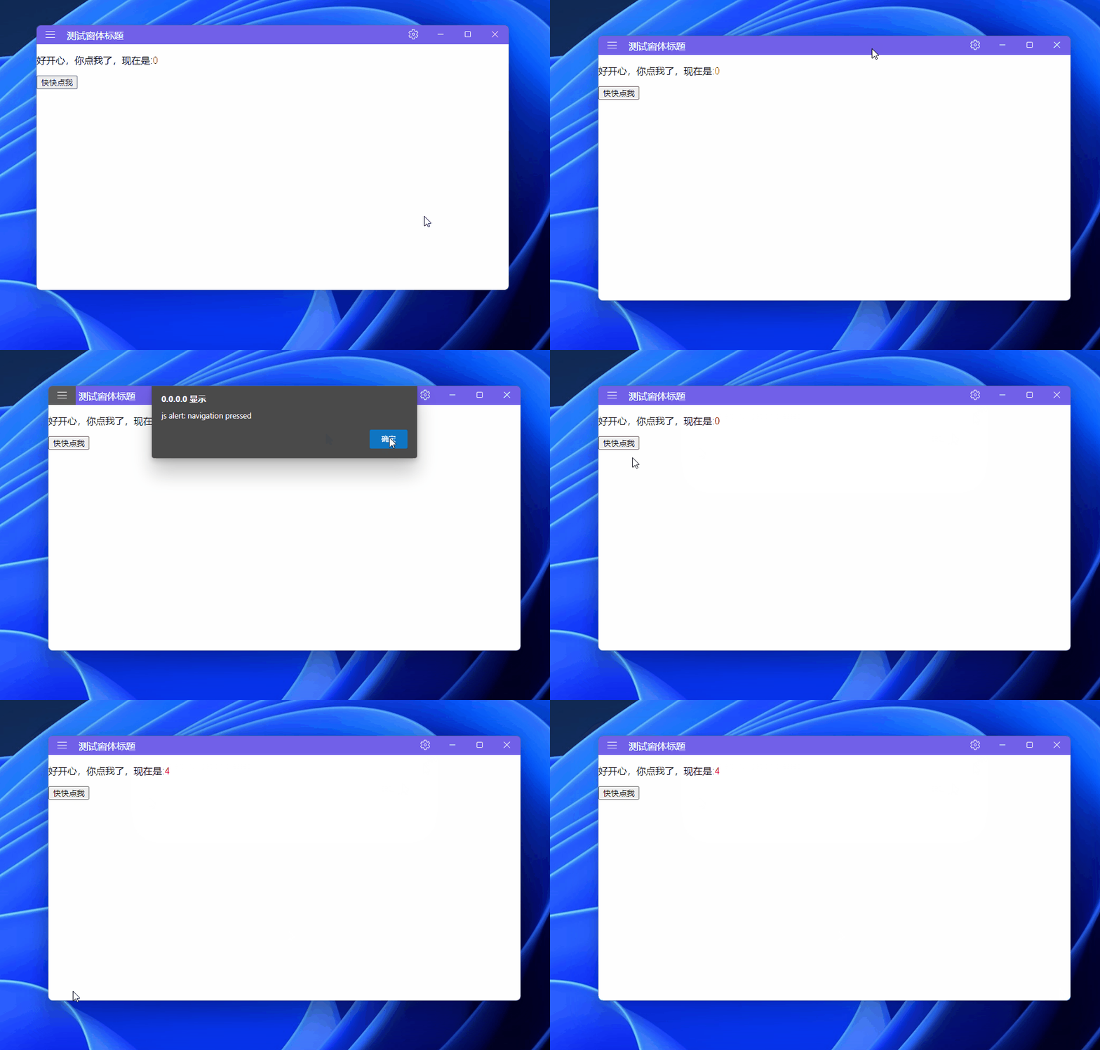
是不是和3.3效果一样?其实仔细看,窗体下面的圆角也有了:
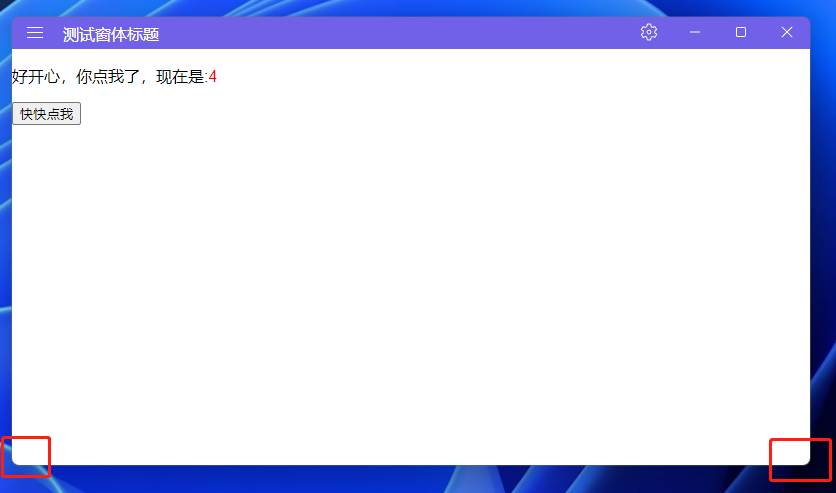
最终还是WPF解决了所有问题...

具体怎么实现的窗体最大化未占操作系统的任务栏,以及窗体圆角问题的解决(竟然能让BlazorWebView部分透明了)可以查看该组件相关代码,本文不过多深究。
另外,WPF熟手可能比较清楚,前面的代码还不能正常的拖动改变窗体大小(不知道你发现没,我当你没发现。),使用该库后也解决了:
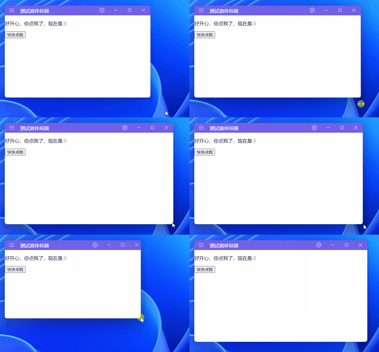
本小节源码在这解决圆角和最大化问题,下面开始本文的下半部分了,好累,终于到这了。

4. 添加第三方Blazor组件
工欲善其事,必先利其器!
鉴于大部分同学前端基础可能不是太好,即使使用Blazor可以少用或者不用JavaScript,但有那么一款漂亮、便捷的Blazor组件库,这不是如虎添翼吗?本文使用Masa Blazor做示例展示,如今Blazor组件库众多,选择自己喜欢的、顺手的就成:

站长前些日子介绍过MAUI使用Masa blazor组件库一文,本小节思路也是类似,且看我表演。

打开Masa Blazor文档站点:https://blazor.masastack.com/getting-started/installation,一起来往WPF中引入这款Blazor组件库吧。
4.1 引入Masa.Blazor包
打开工程文件WPFBlazorChat.csproj直接复制下面的包版本,或通过NuGet包管理器搜索Masa.Blazor安装:
<PackageReference Include="Masa.Blazor" Version="0.6.0" />
4.2 添加Masa.Blazor带来的资源
打开wwwroot\index.html,在<head></head>节点添加如下资源:
<link href="_content/Masa.Blazor/css/masa-blazor.min.css" rel="stylesheet" />

<link href="https://cdn.masastack.com/npm/@mdi/font@5.x/css/materialdesignicons.min.css" rel="stylesheet">
<link href="https://cdn.masastack.com/npm/materialicons/materialicons.css" rel="stylesheet">
<link href="https://cdn.masastack.com/npm/fontawesome/v5.0.13/css/all.css" rel="stylesheet">

<script src="_content/BlazorComponent/js/blazor-component.js"></script>
完整代码如下:
<!DOCTYPE html>
<html lang="en">

<head>
    <meta charset="utf-8" />
    <meta name="viewport" content="width=device-width, initial-scale=1.0" />
    <title>WPFBlazorChat</title>
    <base href="/" />
    <link href="css/app.css" rel="stylesheet" />
    <link href="WpfBlazor.styles.css" rel="stylesheet" />

    <link href="_content/Masa.Blazor/css/masa-blazor.min.css" rel="stylesheet" />

    <link href="https://cdn.masastack.com/npm/@mdi/font@5.x/css/materialdesignicons.min.css" rel="stylesheet">
    <link href="https://cdn.masastack.com/npm/materialicons/materialicons.css" rel="stylesheet">
    <link href="https://cdn.masastack.com/npm/fontawesome/v5.0.13/css/all.css" rel="stylesheet">

    <script src="_content/BlazorComponent/js/blazor-component.js"></script>
</head>

<body>
<div id="app">Loading...</div>

<div id="blazor-error-ui">
    An unhandled error has occurred.
    <a href="" class="reload">Reload</a>
    <a class="dismiss">🗙</a>
</div>
<script src="_framework/blazor.webview.js"></script>
</body>

</html>
4.3 引入Masa.Blazor命名空间
打开_Imports.razor文件,修改如下:
@using Microsoft.AspNetCore.Components.Web
@using Masa.Blazor
@using BlazorComponent
4.4 Razor组件添加Masa.Blazor
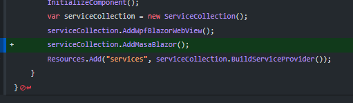
打开MainWindow.xaml.cs,添加一行代码 serviceCollection.AddMasaBlazor();
4.5 尝试Masa.Blazor案例
上面4步的准备工作做好后,我们简单来使用下Masa.Blazor组件。
打开Tab组件链接:https://blazor.masastack.com/components/tabs,尝试这个Demo:
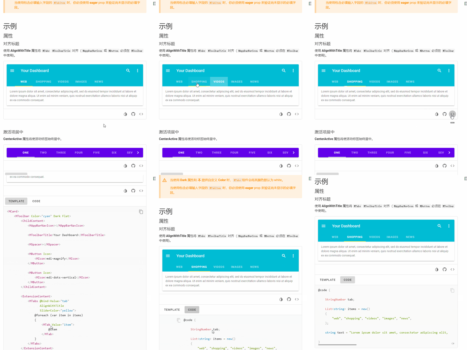
Demo的代码我几乎不变的引入,打开RazorViews\Counter.razor文件,保留3.4节的标题栏,替换了客户区域内容,代码如下:
@using WPFBlazorChat.Services

<MApp>
    <!--上一小节的标题栏开始-->
    <div class="titlebar" @ondblclick="WindowService.Maximize" @onmouseup="WindowService.StopMove" @onmousedown="WindowService.StartMove">
        <button class="titlebar-btn" onclick="alert('js alert: navigation pressed');">
            <img src="svg/navigation.svg"/>
        </button>
        <div class="window-title">
            测试窗体标题
        </div>
        <div style="flex-grow: 1"></div>
        <button class="titlebar-btn" onclick="alert('js alert: settings pressed');">
            <img src="svg/settings.svg"/>
        </button>
        <button class="titlebar-btn" @onclick="WindowService.Minimize">
            <img src="svg/minimize.svg"/>
        </button>
        <button class="titlebar-btn" @onclick="WindowService.Maximize">
            @if (WindowService.IsMaximized())
            {
                <img src="svg/restore.svg"/>
            }
            else
            {
                <img src="svg/maximize.svg"/>
            }
        </button>
        <button class="titlebar-cbtn" @onclick="() => WindowService.Close(false)">
            <img src="svg/dismiss.svg"/>
        </button>
    </div>
    <!--上一小节的标题栏结束-->

    <!--新增的Masa.Blazor Tab案例代码开始-->
    <MCard>
        <MToolbar Color="cyan" Dark Flat>
            <ChildContent>
                <MAppBarNavIcon></MAppBarNavIcon>

                <MToolbarTitle>Your Dashboard</MToolbarTitle>

                <MSpacer></MSpacer>

                <MButton Icon>
                    <MIcon>mdi-magnify</MIcon>
                </MButton>

                <MButton Icon>
                    <MIcon>mdi-dots-vertical</MIcon>
                </MButton>
            </ChildContent>

            <ExtensionContent>
                <MTabs @bind-Value="tab"
                       AlignWithTitle
                       SliderColor="yellow">
                    @foreach (var item in items)
                    {
                        <MTab Value="item">
                            @item
                        </MTab>
                    }
                </MTabs>
            </ExtensionContent>
        </MToolbar>

        <MTabsItems @bind-Value="tab">
            @foreach (var item in items)
            {
                <MTabItem Value="item">
                    <MCard Flat>
                        <MCardText>@text</MCardText>
                    </MCard>
                </MTabItem>
            }
        </MTabsItems>
    </MCard>
    <!--新增的Masa.Blazor Tab案例代码结束-->
</MApp>

@code {

    #region Masa.Blazor Tab案例C#代码
    StringNumber tab;

    List<string> items = new()
    {
        "web", "shopping", "videos", "images", "news",
    };

    string text = "Lorem ipsum dolor sit amet, consectetur adipiscing elit, sed do eiusmod tempor incididunt ut labore et dolore magna aliqua. Ut enim ad minim veniam, quis nostrud exercitation ullamco laboris nisi ut aliquip ex ea commodo consequat.";

    #endregion


    protected override void OnInitialized()
    {
        WindowService.Init();
        base.OnInitialized();
    }
}
运行效果如下:
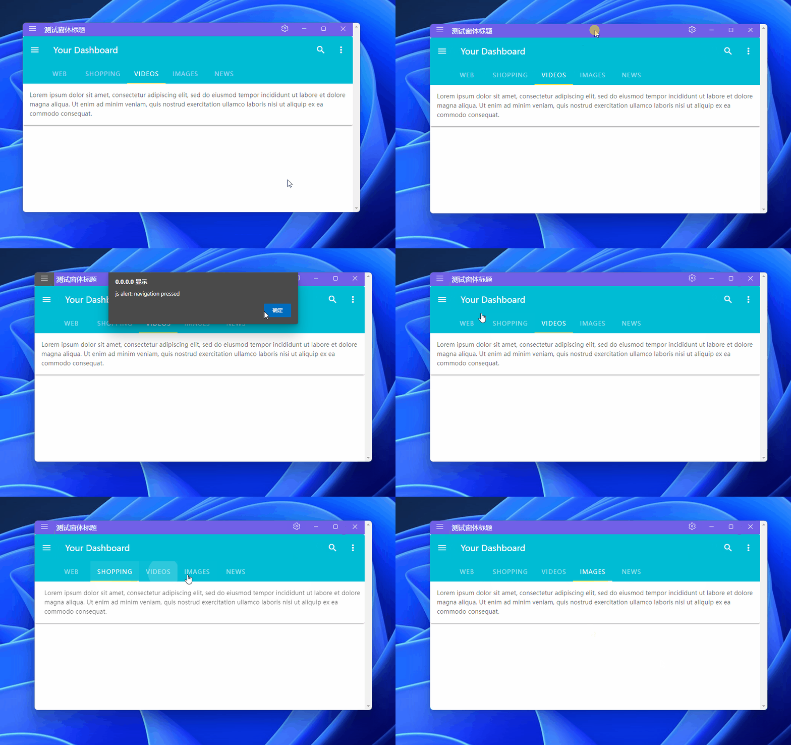
是不是有那味儿了?再尝试把Tab移到标题栏,前面有提过的效果:
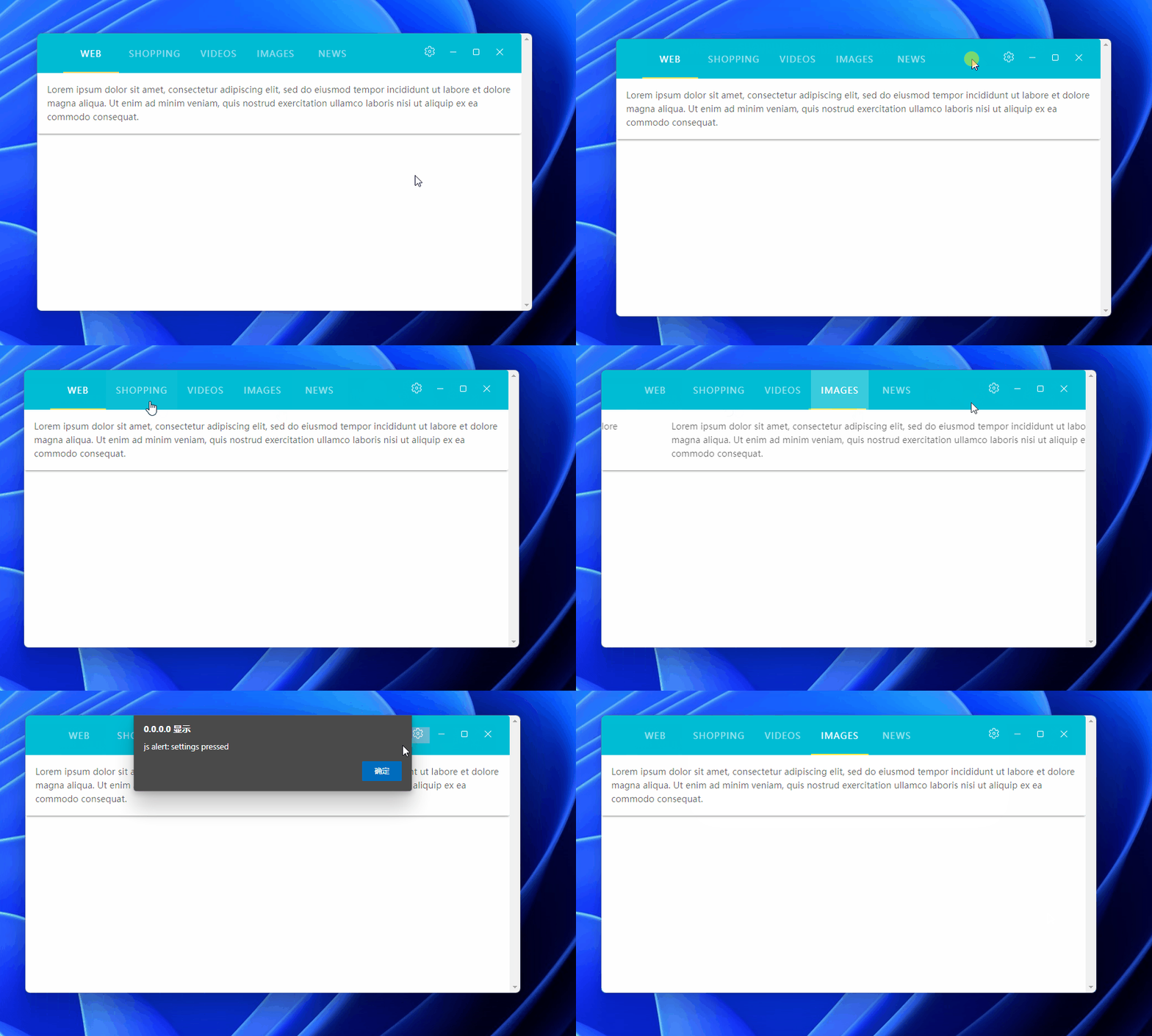
上面的效果,代码修改如下,删除了原标题栏代码,将窗体操作按钮放到了MToolbar里面,并使用MToolbar添加了双击事件、鼠标按下、释放事件实现窗体拖动:
<MApp>

    <!--新增的Masa.Blazor Tab案例代码开始-->
    <MCard>
        <MToolbar Color="cyan" Dark Flat @ondblclick="WindowService.Maximize" @onmouseup="WindowService.StopMove" @onmousedown="WindowService.StartMove">
            <MTabs @bind-Value="tab"
                   AlignWithTitle
                   SliderColor="yellow">
                @foreach (var item in items)
                {
                    <MTab Value="item">
                        @item
                    </MTab>
                }
            </MTabs>

            <div style="flex-grow: 1"></div>
            <button class="titlebar-btn" onclick="alert('js alert: settings pressed');">
                <img src="svg/settings.svg"/>
            </button>
            <button class="titlebar-btn" @onclick="WindowService.Minimize">
                <img src="svg/minimize.svg"/>
            </button>
            <button class="titlebar-btn" @onclick="WindowService.Maximize">
                @if (WindowService.IsMaximized())
                {
                    <img src="svg/restore.svg"/>
                }
                else
                {
                    <img src="svg/maximize.svg"/>
                }
            </button>
            <button class="titlebar-cbtn" @onclick="() => WindowService.Close(false)">
                <img src="svg/dismiss.svg"/>
            </button>
        </MToolbar>

        <MTabsItems @bind-Value="tab">
            @foreach (var item in items)
            {
                <MTabItem Value="item">
                    <MCard Flat>
                        <MCardText>@text</MCardText>
                    </MCard>
                </MTabItem>
            }
        </MTabsItems>
    </MCard>
    <!--新增的Masa.Blazor Tab案例代码结束-->
</MApp>
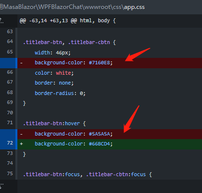
窗体操作按钮的背景色也做部分修改:
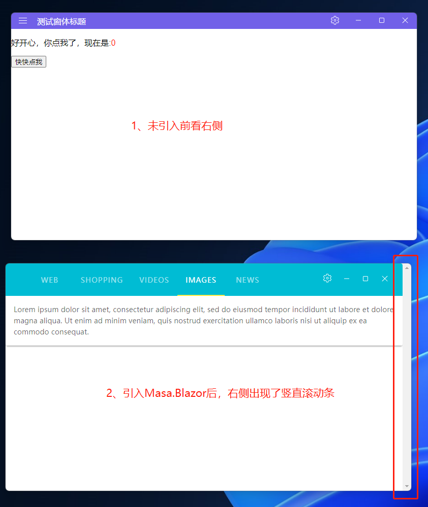
其实上面的窗体效果还是有点瑕疵,注意到窗体右侧的竖直滚动条了吗?在没引入Masa.Blazor之前,右侧正常显示,引入后多了一个竖直滚动条:
这个想去掉也简单,在wwwroot\css\app.css追加样式(当时也是折腾了好一会儿,最后在Masa.Blazor群里群友给出了解决方案,十分感谢):

问题解决css代码:
::-webkit-scrollbar {
    width: 0px;
}
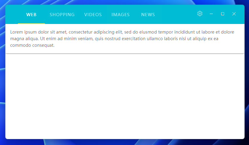
因为Razor组件是在BlazorWebView里渲染的,即BlazorWebView就是个小型的浏览器呀,上面的样式即把浏览器的滚动条宽度设置为0,它不就没有了吗?现在效果如下,是不是舒服了?
添加Masa.Blazor就介绍到这里,本小节示例代码在这里WPF中使用Masa.Blazor,下面讲解WPF与Blazor混合开发后多窗体消息通知问题。
5. 多窗体消息通知
一般C/S窗体之间通信使用委托、事件,而在WPF开发中,可以使用一些框架提供的抽象事件订阅\发布组件,比如Prism的事件聚集器IEventAggregator,或MvvmLight的Messager。在B/S开发中,进程内事件通知可能就使用MediatR组件居多了,不论是在C/S还是B/S开发,这些组件在一定程度上,各大程序模板可以通用的,更不用说分布式的消息队列RabbitMQ 和 Kafka是万能的进程间通信标准选择了。
上面是一些套话,站长根据Prism的事件聚集器和MvvmLight的Messager源码阅读,简单封装了一个Messager,可以适用于一般的业务需求。
5.1 Messager封装
本来不想贴代码直接给源码链接的,想想代码也不多,直接上吧。
Message
消息抽象类,用于定义消息类型,具体的消息需要继承该类,比如后面的打开子窗体消息OpenSecondViewMessage。
using System;

namespace WPFBlazorChat.Messages;

public abstract class Message
{
    protected Message(object sender)
    {
        this.Sender = sender ?? throw new ArgumentNullException(nameof(sender));
    }

    public object Sender { get; }
}
IMessenger
消息接口,只定义了三个接口:
- Subscribe:消息订阅
- Unsubscribe:取消消息订阅
- Publish:消息发送
using System;

namespace WPFBlazorChat.Messages;

public interface IMessenger
{
    void Subscribe<TMessage>(object recipient, Action<TMessage> action,
        ThreadOption threadOption = ThreadOption.PublisherThread) where TMessage : Message;

    void Unsubscribe<TMessage>(object recipient, Action<TMessage>? action = null) where TMessage : Message;

    void Publish<TMessage>(object sender, TMessage message) where TMessage : Message;
}

public enum ThreadOption
{
    PublisherThread,
    BackgroundThread,
    UiThread
}
Messenger
消息的管理,消息中转等实现:
using System;
using System.Collections.Generic;
using System.Linq;
using System.Threading;
using System.Threading.Tasks;

namespace WPFBlazorChat.Messages;

public class Messenger : IMessenger
{
    public static readonly Messenger Default = new Messenger();
    private readonly object registerLock = new object();

    private Dictionary<Type, List<WeakActionAndToken>>? recipientsOfSubclassesAction;

    public void Subscribe<TMessage>(object recipient, Action<TMessage> action, ThreadOption threadOption)
        where TMessage : Message
    {
        lock (this.registerLock)
        {
            var messageType = typeof(TMessage);

            this.recipientsOfSubclassesAction ??= new Dictionary<Type, List<WeakActionAndToken>>();

            List<WeakActionAndToken> list;

            if (!this.recipientsOfSubclassesAction.ContainsKey(messageType))
            {
                list = new List<WeakActionAndToken>();
                this.recipientsOfSubclassesAction.Add(messageType, list);
            }
            else
            {
                list = this.recipientsOfSubclassesAction[messageType];
            }

            var item = new WeakActionAndToken
            { Recipient = recipient, ThreadOption = threadOption, Action = action };

            list.Add(item);
        }
    }

    public void Unsubscribe<TMessage>(object? recipient, Action<TMessage>? action) where TMessage : Message
    {
        var messageType = typeof(TMessage);

        if (recipient == null || this.recipientsOfSubclassesAction == null ||
            this.recipientsOfSubclassesAction.Count == 0 || !this.recipientsOfSubclassesAction.ContainsKey(messageType))
        {
            return;
        }

        var lstActions = this.recipientsOfSubclassesAction[messageType];
        for (var i = lstActions.Count - 1; i >= 0; i--)
        {
            var item = lstActions[i];
            var pastAction = item.Action;

            if (pastAction != null
                && recipient == pastAction.Target
                && (action == null || action.Method.Name == pastAction.Method.Name))
            {
                lstActions.Remove(item);
            }
        }
    }

    public void Publish<TMessage>(object sender, TMessage message) where TMessage : Message
    {
        var messageType = typeof(TMessage);

        if (this.recipientsOfSubclassesAction != null)
        {
            var listClone = this.recipientsOfSubclassesAction.Keys.Take(this.recipientsOfSubclassesAction.Count)
                .ToList();

            foreach (var type in listClone)
            {
                List<WeakActionAndToken>? list = null;

                if (messageType == type || messageType.IsSubclassOf(type) || type.IsAssignableFrom(messageType))
                {
                    list = this.recipientsOfSubclassesAction[type]
                        .Take(this.recipientsOfSubclassesAction[type].Count)
                        .ToList();
                }

                if (list is { Count: > 0 })
                {
                    this.SendToList(message, list);
                }
            }
        }
    }

    private void SendToList<TMessage>(TMessage message, IEnumerable<WeakActionAndToken> weakActionsAndTokens)
        where TMessage : Message
    {
        var list = weakActionsAndTokens.ToList();
        var listClone = list.Take(list.Count()).ToList();

        foreach (var item in listClone)
        {
            if (item.Action is { Target: { } })
            {
                switch (item.ThreadOption)
                {
                    case ThreadOption.BackgroundThread:
                        Task.Run(() => { item.ExecuteWithObject(message); });
                        break;
                    case ThreadOption.UiThread:
                        SynchronizationContext.Current!.Post(_ => { item.ExecuteWithObject(message); }, null);
                        break;
                    default:
                        item.ExecuteWithObject(message);
                        break;
                }
            }
        }
    }
}

public class WeakActionAndToken
{
    public object? Recipient { get; set; }

    public ThreadOption ThreadOption { get; set; }

    public Delegate? Action { get; set; }

    public string? Tag { get; set; }

    public void ExecuteWithObject<TMessage>(TMessage message) where TMessage : Message
    {
        if (this.Action is Action<TMessage> factAction)
        {
            factAction.Invoke(message);
        }
    }
}
有兴趣的看上面的代码,封装代码上面简单全部给上,后面的消息通知都是基于上面的三个类实现的,比较核心。
5.2 代码整理
第 5 节涉及到多窗体及多Razor组件了,需要创建一些目录存放这些文件,方便分类管理。
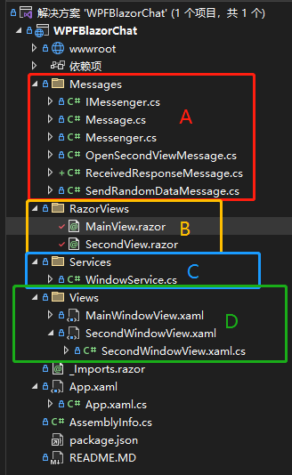
A:放
Message,即一些消息通知类;B:放
Razor组件,如果需要与Maui\Blazor Server(Wasm)等共享Razor组件,可以创建Razor类库存储;C:放通用服务,这里只放了一个窗体管理静态类,实际情况可以放
Redis服务、RabbitMQ消息服务等;D:放
WPF视图,本示例WPF窗体只是一个壳,承载BlazorWebView使用;
5.3 示例及代码说明
先看本示例效果,再给出相关代码说明:
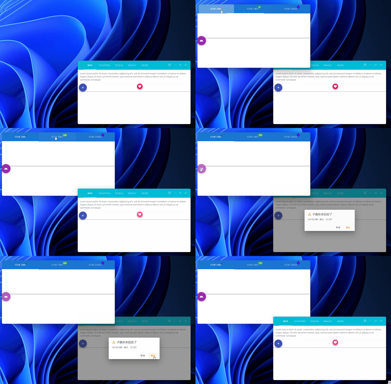
图中有三个操作:
- 点击主窗体A的【+】按钮,发送了
OpenSecondViewMessage消息,打开子窗体B; - 打开子窗体B后,再点击主窗体A的【桃心】按钮,发送了
SendRandomDataMessage消息,子窗体B的第二个TabItem Header显示了消息传来的数字; - 点击子窗体B的【安卓】图标按钮,给主窗体A响应了消息
ReceivedResponseMessage,主窗体收到后弹出一个对话框。
三个消息类定义如下:
public class OpenSecondViewMessage : Message
{
    public OpenSecondViewMessage(object sender) : base(sender)
    {
    }
}

public class SendRandomDataMessage : Message
{
    public SendRandomDataMessage(object sender, int number) : base(sender)
    {
        Number = number;
    }

    public int Number { get; set; }
}

public class ReceivedResponseMessage : Message
{
    public ReceivedResponseMessage(object sender) : base(sender)
    {
    }
}
除了SendRandomDataMessage传递了一个业务Number属性,另两个消息只是起到通知作用(所以没有额外属性定义),实际开发时可能需要传递业务数据。
5.3.1 打开多窗体
即上面的第一个操作:点击主窗体A的【+】按钮,发送了OpenSecondViewMessage消息,打开子窗体B。
在RazorViews\MainView.razor中执行按钮点击,发送打开子窗体消息:
...
<MCol>
    <MButton class="mx-2" Fab Dark Color="indigo" OnClick="OpenNewSecondView">
        <MIcon>mdi-plus</MIcon>
    </MButton>
</MCol>
...

@code{
...
void OpenNewSecondView()
{
	Messenger.Default.Publish(this, new OpenSecondViewMessage(this));
}
...
}
在App.xaml.cs里订阅打开子窗体消息:
public partial class App : Application
{
    public App()
    {
        // 订阅打开子窗口消息,在主窗口点击【+】按钮
        Messenger.Default.Subscribe<OpenSecondViewMessage>(this, msg =>
        {
            var chatWin = new SecondWindowView();
            chatWin.Show();
        }, ThreadOption.UiThread);
    }
}
实际开发可能情况更复杂,发送的消息OpenSecondViewMessage里带WPF窗体路由(定义的一套路径规则寻找窗体或ViewModel),订阅的地方也可能不在主程序,在子模块的Module类里。
5.3.2 发送业务数据
即第二个操作:打开子窗体B后,再点击主窗体A的【桃心】按钮,发送了SendRandomDataMessage消息,子窗体B的第二个TabItem Header显示了消息传来的数字。
- 在
RazorViews\MainView.razor中执行按钮点击,发送业务消息(就当前时间的Millisecond):
...
<MCol>
    <MButton class="mx-2" Fab Small Dark Color="pink" OnClick="SendNumber">
        <MIcon>mdi-heart</MIcon>
    </MButton>
</MCol>
...

@code{
...
void SendNumber()
{
	Messenger.Default.Publish(this, new SendRandomDataMessage(this, DateTime.Now.Millisecond));
}
...
}
- 在
RazorViews\SecondView.razor的OnInitialized()方法里订阅业务消息通知:
@using WPFBlazorChat.Messages
<MApp>
    <MToolbar>
        <MTabs BackgroundColor="primary" Grow Dark>
            <MTab>
                <MBadge Color="pink" Dot>
                    Item One
                </MBadge>
            </MTab>
            <MTab>
                <MBadge Color="green" Content="tagCount">
                    Item Two
                </MBadge>
            </MTab>
            <MTab>
                <MBadge Color="deep-purple accent-4" Icon="mi-masa">
                    Item Three
                </MBadge>
            </MTab>
        </MTabs>
    </MToolbar>

    <MRow>
        <MButton class="mx-2" Fab Dark Large Color="purple" OnClick="ReponseMessage">
            <MIcon>
                mdi-android
            </MIcon>
        </MButton>
    </MRow>
</MApp>

@code
{
    private int tagCount = 6;

    protected override void OnInitialized()
    {
    	// 订阅业务消息,在主窗口点击桃心按钮时触发
        Messenger.Default.Subscribe<SendRandomDataMessage>(this, msg =>
        {
            this.InvokeAsync(() => { this.tagCount = msg.Number; });
            this.StateHasChanged();
        }, ThreadOption.UiThread);
    }

    void ReponseMessage()
    {
        // 通知主窗体,我已经收到消息,请不要再发
        Messenger.Default.Publish(this, new ReceivedResponseMessage(this));
    }
}
注意看,上面收到消息时有两个方法要简单说一下,看OnInitialized()里的代码:
- InvokeAsync:将
Number赋值给变量tagCount的代码是在InvokeAsync方法里执行的,这个和WPF里的Dispatcher.Invoke是一个意思,相当于接收数据是在子线程,而赋值这个操作会即时的绑定到<MBadge Color="green" Content="tagCount">上,就需要UI线程同步。 - StateHasChanged:相当于WPF MVVM里的
PropertyChanged事件通知,通知UI这里有值变化了,请你刷新一下,我要看看最新值。
上面的代码把子窗体消息回应也贴上了,即点击安卓图标按钮时发送了ReceivedResponseMessage消息,在主窗体RazorViews\MainView.razor里也订阅了这个消息,和上面的代码类似:
...
    <!--确认对话框开始-->
    <PConfirm Visible="_showComfirmDialog"
              Title="子窗体来回应了"
              Type="AlertTypes.Warning"
              OnCancel="() => _showComfirmDialog = false"
              OnOk="() => _showComfirmDialog = false">
        说你别没事一直发,它们烦!
    </PConfirm>
    <!--确认对话框结束-->
</MApp>

@code{
...
	// 是否显示确认对话框
    bool _showComfirmDialog;
	protected override void OnInitialized()
    {
        WindowService.Init();

    // 订阅子窗体响应的消息,它已经收到消息了,我可以休息下再发
        Messenger.Default.Subscribe<ReceivedResponseMessage>(this, msg =>
        {
            this.InvokeAsync(() => { _showComfirmDialog = true; });
            this.StateHasChanged();
        }, ThreadOption.UiThread);
        base.OnInitialized();
    }
...
}
在OnInitialized()方法里订阅消息ReceivedResponseMessage,收到后将变量_showComfirmDialog置为true,即上面对话框的属性Visible绑定的值,同理需要在InvokeAsync()中处理数据接收,也需要调用StateHasChanged通知UI数据变化。
上面说了部分代码,可能讲的不太清楚,可以看本节示例源码:多窗体消息通知。
6. 本文示例
本来想写完整Demo说明的,发现上面把基本要点都拉了一遍,再粘贴一些重复代码有点没完没了了,有兴趣的拉源码WPF与Blazor混合开发Demo查看、运行,下面是项目代码结构:
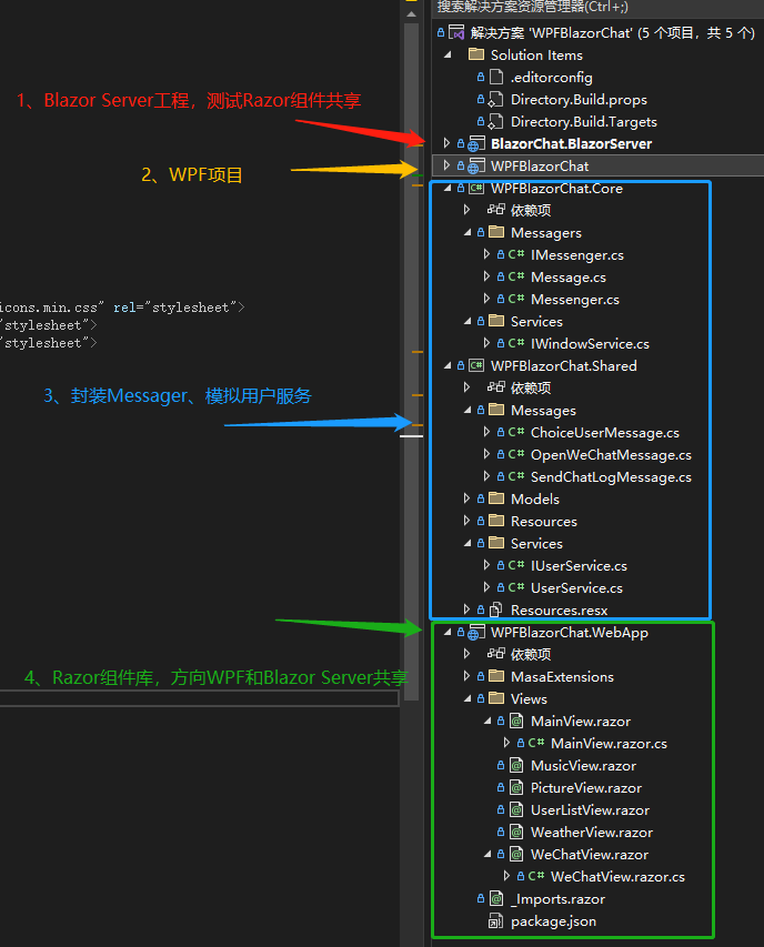
下面是最后的示例效果图,前面部分文章已经发过,再发一次,哈哈:
用户列表窗口
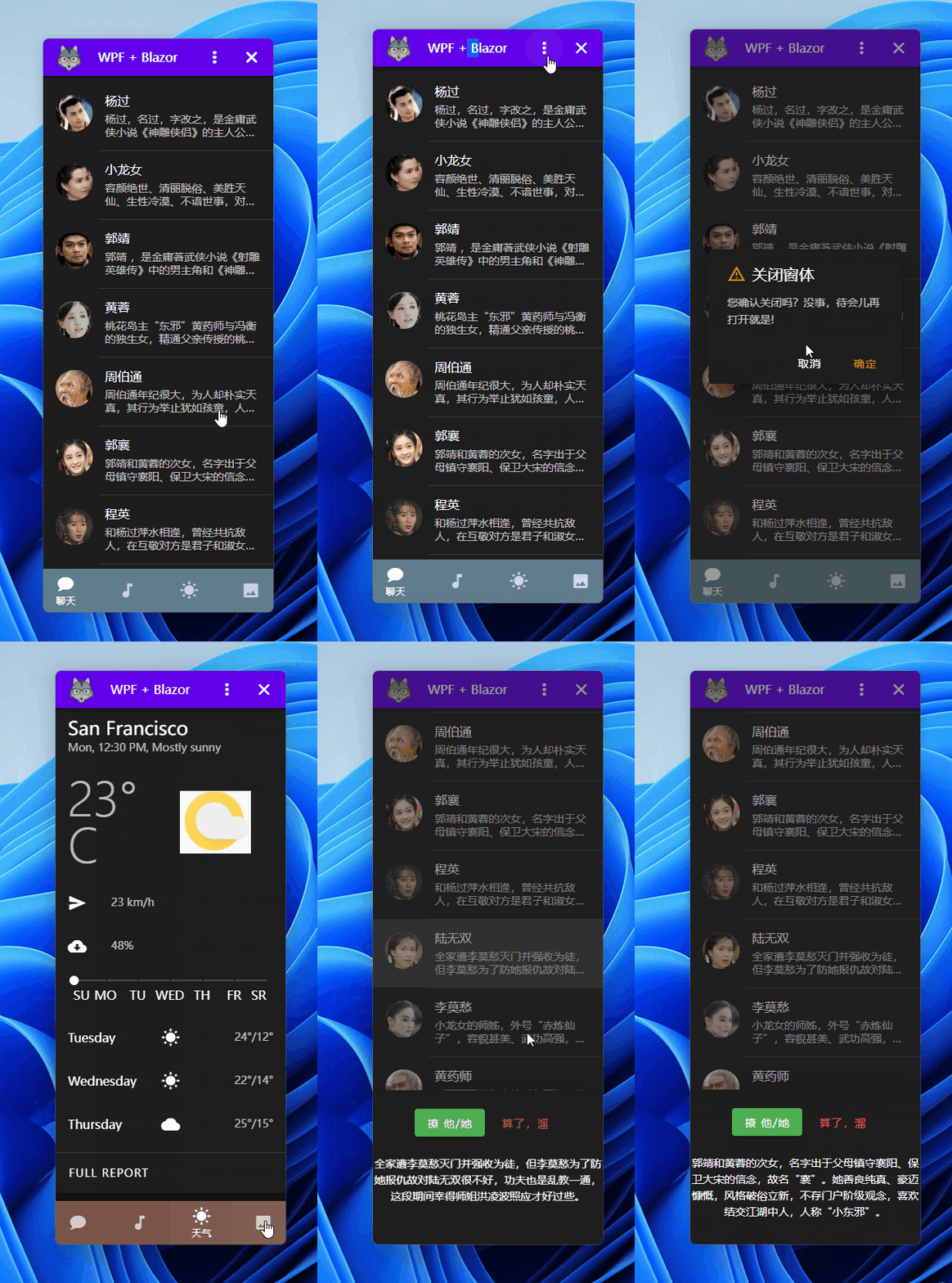
打开子窗口

聊天窗口
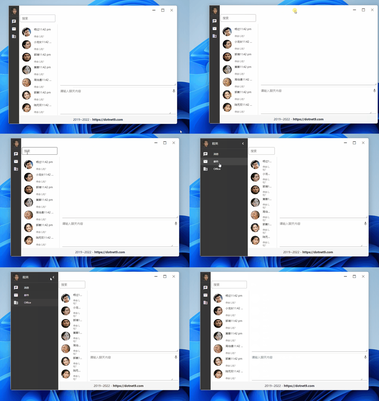
演示发送消息
7. Click Once发布尝试
上一篇文章链接:快速创建软件安装包-ClickOnce,本文示例Click Once安装页面:https://dotnet9.com/WPFBlazorChat
8. Q&A
8.1 为啥要在WPF里使用Blazor?吃饱了撑的?
WPF虽然相较Winform做出比较好看的UI相对容易一些,但比起Blazor,或者直接说html开发界面,还是差了一点点,更何况html的资源更多一点,尝试一下为何不可?
8.2 WPF + Blazor支持哪些操作系统
最低支持Windows 7 SP1吧,有群友已经尝试在Windows 7正常运行成功,这是本文示例Click Once安装页面:https://dotnet9.com/WPFBlazorChat
8.3 Blazor 混合开发还支持哪些已有框架?
Blazor混合开发的话,除了WPF,还有MAUI(跨平台框架,支持平台包括Windows\Mac\Linux\Android\iOS等)、Winform(同WPF,只能在Windows平台运行)等,建议阅读微软文档继续学习,本文只是个引子:

8.4 Blazor组件库除了Masa.Blazor还有哪些?
开源的
Blazor组件有:Ant Design Blazor、Bootstrap Blazor、MudBlazor、Blazorise,以及微软自家的FAST Blazor等,当然还有不少开源的Blazor组件。收费的
Blazor组件:DevExpress、Telerik、Syncfusion等
8.5 本文示例代码?
文中各小节代码、最后的示例代码都给出了相应链接,您可返回查看。