

★ 首先这篇文章适合以下背景的人阅读:
- 熟悉 HTML、CSS
- 知道如何正确引用 Bootstrap 4
- 欲了解一些 Bootstrap 4 的通用模式的人
在正式开始之前,我们先来说说使用 Bootstrap 4 与不使用之间的差异到底在哪里?
简单来说,若是我们不使用 Bootstrap 4,而是用手刻的方式来撰写网页,HTML 的内容我们得要自己写(废话),CSS 我们也得要一个一个自己设定(又一个废话),可是若是使用 Bootstrap 4 的话,很多常用的 CSS 他已经预先帮我们写好了,我们只要熟悉 Bootstrap 4 的文件,知道他预写的 CSS 是用哪一个 class 名,届时只要直接套用到标签上就可以了,我们先用一个非常简单的案例来说明,请看下面的 codepen。
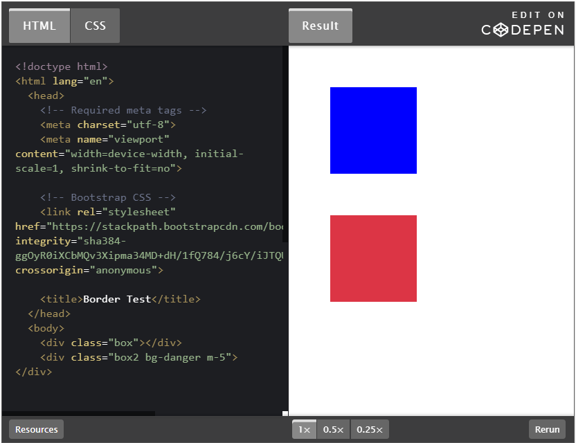
当然要启用 Bootstrap 4 我们的 HTML 环境就必须包含一个必要的 <link> 和三个必要的<script>,这个可以直接在 Bootstrap 4 文件中找到程式码可以 copy 我就不再赘述,我只讲关键的程式码就好。
首先是第一个 <div> 标签
<div class="box"></div>
然后他的 CSS 是这个样子
.box {
  width: 100px;
  height: 100px;
  background: blue;
  margin: 48px;
}
这个 .box 的<div>,我们设定了 width 与 height 各 100px,并且设定 background:blue 以及 margin:48px 若有 HTML 及 CSS 基础,应该会很容易的判断出来,这就是一个长宽各 100px 的蓝色正方型,然后四个边各有一个 48px 的外距。
再来第二个 <div> 我们则套用了 Bootstrap 4 的 class。
<div class="box2 bg-danger m-5"></div>
而 CSS 只有这样
.box2 {
  width: 100px;
  height: 100px;
}
这个 .box2 的<div>,我们自写的 CSS 只有 width 与 height 的各 100px,其中 bq-danger 以及 m-5 都是 Bootstrap 4 的 class,而 bq-danger 代表的是背景使用 danger 主题色,而 danger 主题色在 Bootstrap 4 预设的色码是#dc3545,另外 m-5 英文的 m 代表的是 margin 而数字 5 代表的是间距大小,1 代表的是 0.25 倍的 rem,2 代表的是 0.5 倍的 rem,3 代表的是 1 倍的 rem,4 代表的是 1.5 倍的 rem,5 代表的是 3 倍的 rem,而 Bootstrap 4 预设的 1rem 是 16px,所以 m-5 就是 margin: 48px 的意思。这就是一个长宽各 100px 的 #dc3545 色正方型,然后四个边各有一个 48px 的外距。
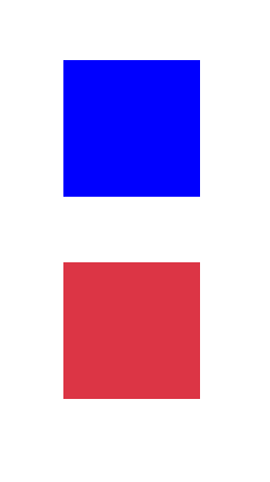
所以使用 Bootstrap 4 可以让我们更快速的开发网页,因为很多很多的常用 class 它,都写好了,我们只要熟练,然后在需要的标签上直接添加上去对应的 class 名称就可以了,这边只是简单的举一个范例,基本上 Bootstrap 4 都是这样的概念就是了。
Spacing
很简单的,其实就是我们很常用的 margin 与 padding 我们先熟悉这些代码吧。
m:margin
p:padding
t:top
r:right
b:bottom
l:left
x:-right和-left
y:-top 和 -bottom
若把上面排列组合就可以组合成下面的意思
m:margin
mt:margin-top
mr:margin-right
mb:margin-bottom
ml:margin-left
mx:margin-right 和 margin-left
my:margin-top 和 margin-bottom

p:padding
pt:padding-top
pr:padding-right
pb:padding-bottom
pl:padding-left
px:padding-right 和 padding-left
py:padding-top 和 padding-bottom
再来就是数字,Bootstrap 4 有一个基本的单位就是 1rem,1rem = 16px,前面的代码后面会接数字,代表着要有多少的内距或是外距。
1:0.25 * 1rem = 0.25px
2:0.5 * 1rem = 8px
3:1 * 1rem = 16px
4:1.5 * 1rem = 24px
5:3 * 1rem = 48px
所以,以后我们只要需要用到 margin 或是 padding 我们就可以写成像是下面这样
mt-3 → margin top:16px
pb-4 → padding bottom:24px
m-2 → margin:8px;
Colors
Bootstrap 4 在颜色的设定上除了使用主题色的方式外,在颜色前面接上对象,例如 text-primary 代表着文字使用 primary 主题色或是 bq-secondary 代表背景使用 secondary 主题色,来看一个简单的 codepen吧。
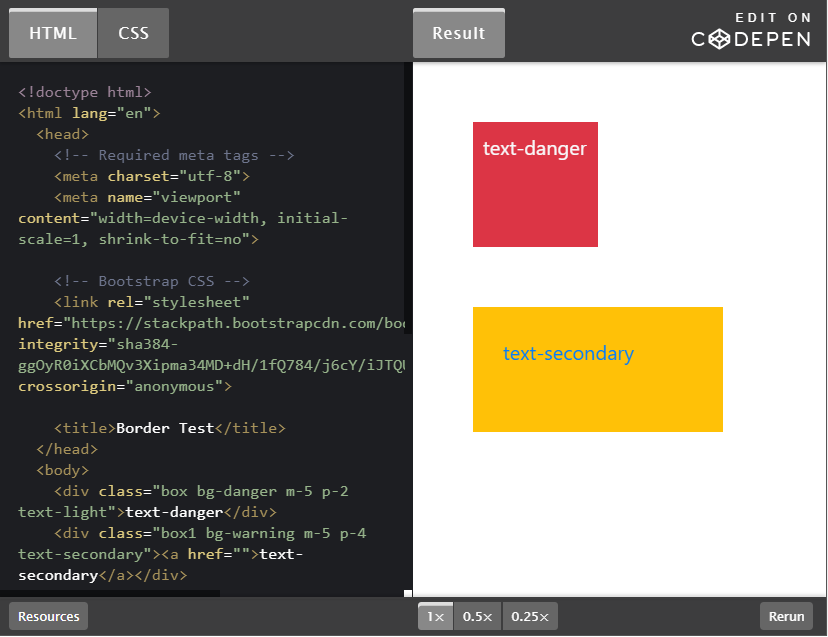
<div class="box bg-danger m-5 p-2 text-light">text-danger</div>
<div class="box1 bg-warning m-5 p-4 text-secondary">
  <a href="">text-secondary</a>
</div>
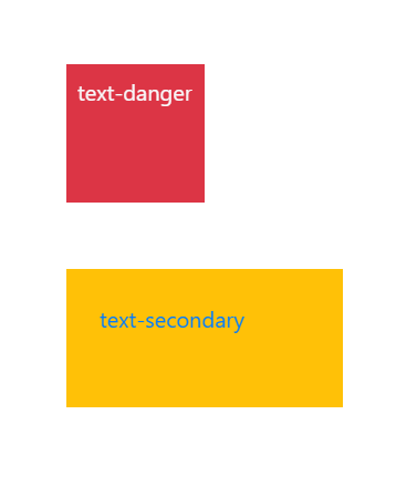
这两个<div>,我的 CSS 都只有写宽高的 width 及 height 而已,所有样式我都是用 Bootstrap 4 的预写 class 名写在标签内,所以画面呈现下面这样。不管是文字的颜色,或是背景的颜色,还有他们的 margin 和 padding 都是用预写 class 设定的,当你滑鼠滑过去第二个<div>,因为里面还有一个 <a> 标签,所以还会产生 hover 效果喔。
Display
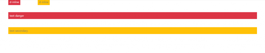
我们都知道每一个 HTML 标签都有他预设的 display 属性,若要更改他的预设属性,就必须用 CSS 来去重新设定 display 的值,看是要用行内 inline 或是 block 都可以,但是现在也是一样都可以直接用预写 class 写在标签内就可以啰,像是 d-inline 或是 d-block,就可以直接改值啰,看一下 codepen 吧。
d-block → display: block
d-inline → display: inline

<div class="bg-danger m-5 p-2 text-light d-inline">d-inline</div>
<div class="bg-warning m-5 p-2 text-secondary d-inline">d-inline</div>
<span class="bg-danger m-5 p-2 text-light d-block">text-danger</span>
<span class="bg-warning m-5 p-2 text-secondary d-block">text-secondary</span>
我们看看这里有两个 <div> 和两个 <span> 标签,原本 <div> 是区块元素,但是被我在 class 上直接加上了 d-inline 更改为行内元素了,原本 <span> 是行内元素,我直接在 class 上加了 d-block 更改为区块元素了这样是不是很方便呢?
Border
相信 border 也是我们很常用的功能,先来看 codepen 吧。
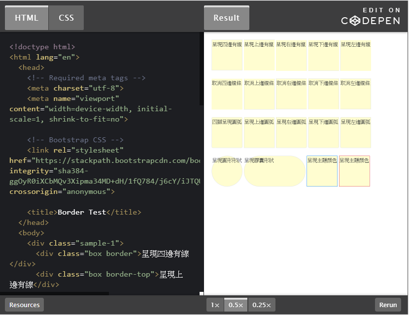
在 Bootstrap 4 的世界里,可以直接写在 class 内,像是这样用 border-方向 来为他加上边框。
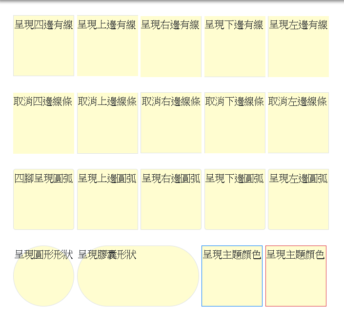
<div class="box border">呈現四邊有線</div>
<div class="box border-top">呈現上邊有線</div>
<div class="box border-right">呈現右邊有線</div>
<div class="box border-bottom">呈現下邊有線</div>
<div class="box border-left">呈現左邊有線</div>
若是有三个边要呈现,只有一个边要取消的话,可以用下面这种写法,用 border-方向-0 的方式来取消某一边。
<div class="box border-0">取消四邊線條</div>
<div class="box border border border-top-0">取消上邊線條</div>
<div class="box border border-right-0">取消右邊線條</div>
<div class="box border border-bottom-0">取消下邊線條</div>
<div class="box border border-left-0">取消左邊線條</div>
或是为四个角加上 border-radius 圆弧 rounded-方向。
<div class="box border rounded">四腳呈現圓弧</div>
<div class="box border rounded-top">呈現上邊圓弧</div>
<div class="box border rounded-right">呈現右邊圓弧</div>
<div class="box border rounded-bottom">呈現下邊圓弧</div>
<div class="box border rounded-left">呈現左邊圓弧</div>
或者是把他们变成圆形 rounded-circle 或是胶囊形状 rounded-pill。
<div class="box border rounded-circle">呈現圓形形狀</div>
<div class="box box1 border rounded-pill">呈現膠囊形狀</div>
或是帮线条加上主题颜色。
<div class="box border border-primary">呈現主題顏色</div>
<div class="box border border-danger">呈現主題顏色</div>
所以就呈现下面的样子啰。
以上 Spacing、Colors、Display 及 Border 是我认为几个基础不过的 Bootstrap 4 通用模式,许多的细节都是可以用客制的方式在 _variable.scss 里面更改的喔,以上介绍希望大家喜欢,谢谢~~
参考资料: